
Daily UI - 100 Day Challenge
Duration: April 6, 2021 - 🤷🏼♂️ Sometime in the future
Research / Design
I decided to start Daily UI's 100 day design challenge because I felt it would be very important for me to enhance my deisgn skills, and because that this challenge would be the perfect way to do so. If you would be interested in taking on this challenge I'd strongly recommend giving it a shot. To begin the challenge, simply visit dailyui.co and insert your email. The following day you'll recieve the first day's challenge in your inbox, and everyday for the next 100 days, except on weekends which provides a nice break and time to review past challenges. Below are all of my current completed challenges. It would mean the world to me if you gave it a thumbs up on Bēhance and or Dribbble. Thank you!
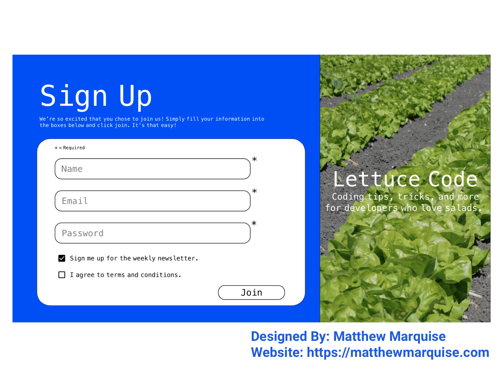
Day 001 :: Sign Up Page
Deisgn Notes:
This is the first day of Daily UI's 100 day design challenge. I've done multiple takes on this first day of having to create a sign up form. Visit my profile to view my other take and consider following so you can see my next projects over the next 100 days!
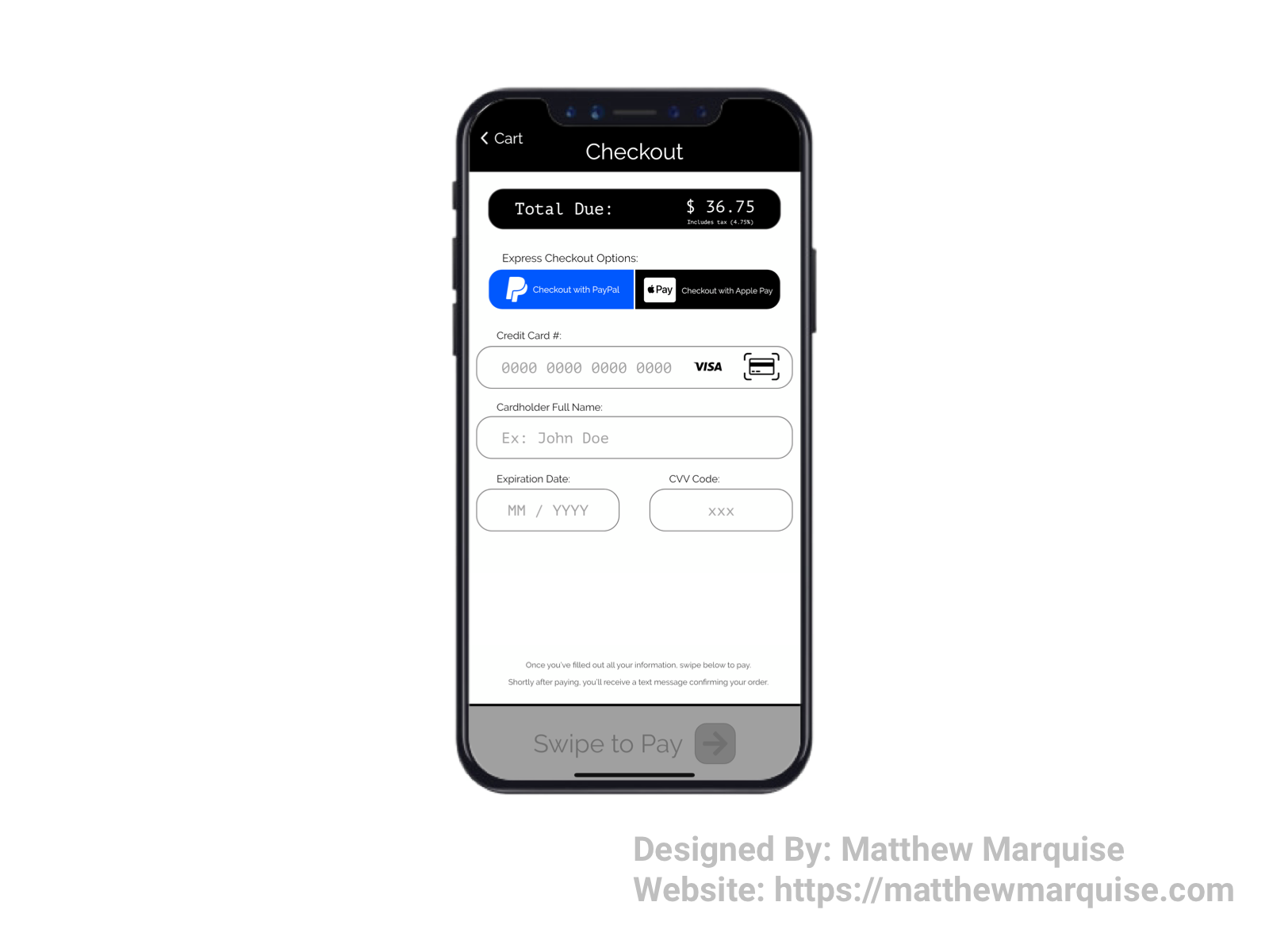
Day 002 :: Credit Card Checkout
Deisgn Notes:
For day two, the challenge was to create a credit card checkout page. I decided to go with a checkout page for a mobile app. It's honestly pretty straight forward and simple. Starting from the top, The total amount due is shown with the tax rate listed just below the price. Moving down the screen, we have the actual payment method options. While this challenge was mainly focused on use of a credit card, there are also two express checkout options (PayPal and Apple Pay) that could be used. After a user has populated each of the fields, the lower, "Swipe to Pay" area will lighten up and the arrow will begin sliding from left to right indicating that the user must then swipe to complete their purchase. Again, the design is very simple and quite modern but easy to navigate and understand.
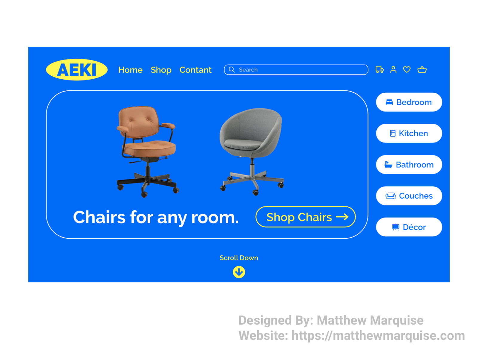
Day 003 :: Landing Page
Deisgn Notes:
This is the landing page I decided to build for day three. As many can likely guess, it's a mock of IKEA's landing page but with a change in bg color. This landing page features a main element ("Chairs for any room.") that users first see when entering the site. Within that same element is a button directing users to the entire chair collection in the shop. To the right of the main piece, there is a simple 5 button list that offers users easy access to any of the specific things they may be looking for that are listed. I may add more to this in the future, but we'll see. Thanks for checking this out!
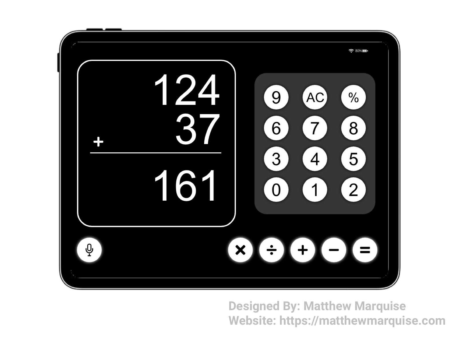
Day 004 :: Calculator
Deisgn Notes:
For day 4 the challenge was to design a calculator, and that I did. When it comes to designing a calculator it's pretty straight forward as to what components and features it needs. While this calculator is on the simpler end, as it doesn't allow for more advanced calculations as the proper buttons to do so aren't in the app, I think we all can agree that this simple calculator can still do a great job at solving random math equations quickly. This calculator also has my favorite feature, one I wish more calculator apps offered, a voice component. Tapping the icon would initiate the voice feature and simply telling it the equation you need to solve will output the answer even quicker.
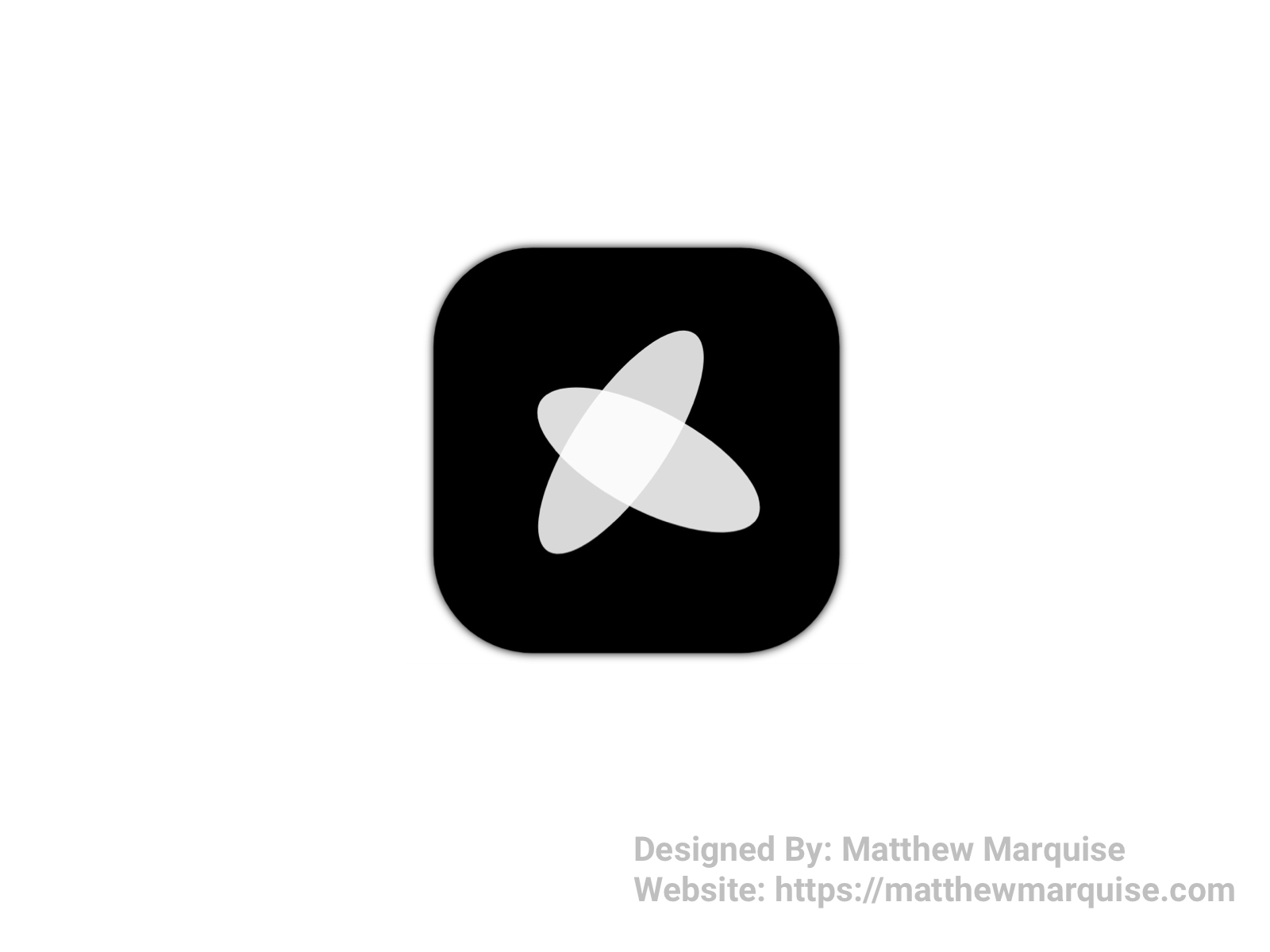
Day 005 :: App Icon
Deisgn Notes:
For day five, the challenge was to design an app icon. App icons are something I've never experimented with before. That changed today! The app icon I designed is very modern and while it isn't like most traditional app icons using a basic icon or lettering, mine features a modern logo that I created specifically for this challenge.
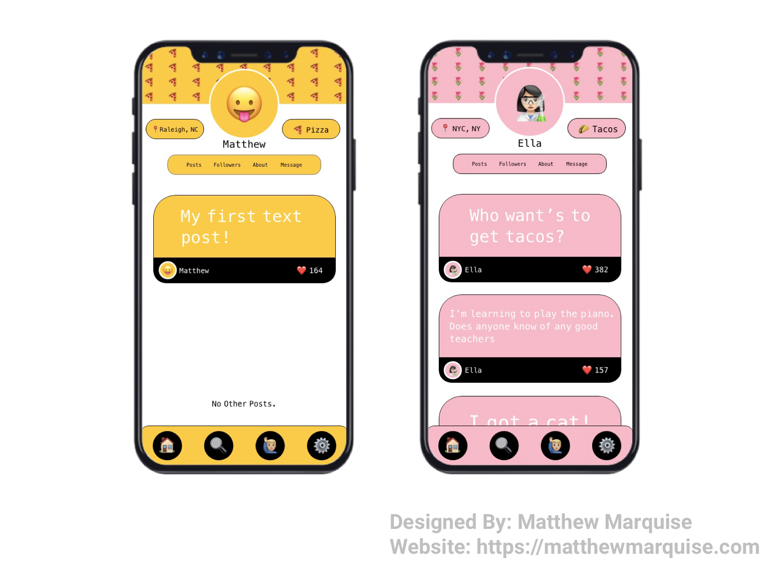
Day 006 :: User Profile
Deisgn Notes:
For day six the challenge was to create a user profile. So I did, and the design above is what I came up with! I thought it would be neat to have a social app that incorporates emojis in place of basic icons. In each user's profile the users will have the option to set the main colors, choose a background image that uses emojis, and choose their profile picture which also uses emojis. Only text posts would be allowed on this social app as adding pictures could take away from not having a real profile picture. Also, each post has a like feature just like any social app would. What do you think?
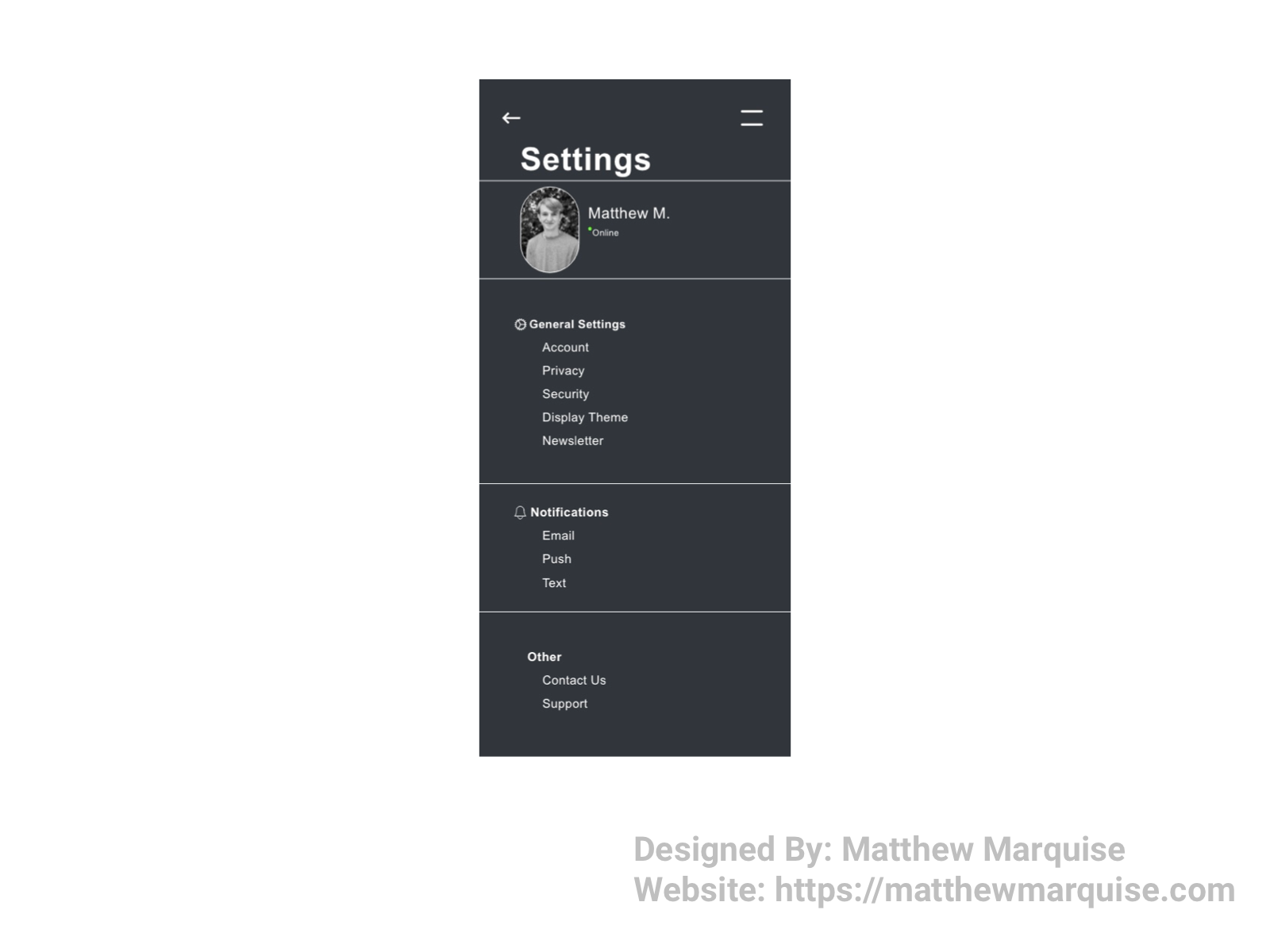
Day 007 :: Settings
Deisgn Notes:
In short, this is a minimal settings page with just about all the necessary settings options. The idea for the app was a mobile gaming platform. Below the username, and beside the user profile image is an "online" button. For the actual settings there's everything from typical Account settings to privacy/security, and even display theme options. Notifications are an important part of a gaming app because it allows each user to know when their friends are playing a video game therefore access to notification options are crucial. Besides those settings options, there's a contact us and support option.
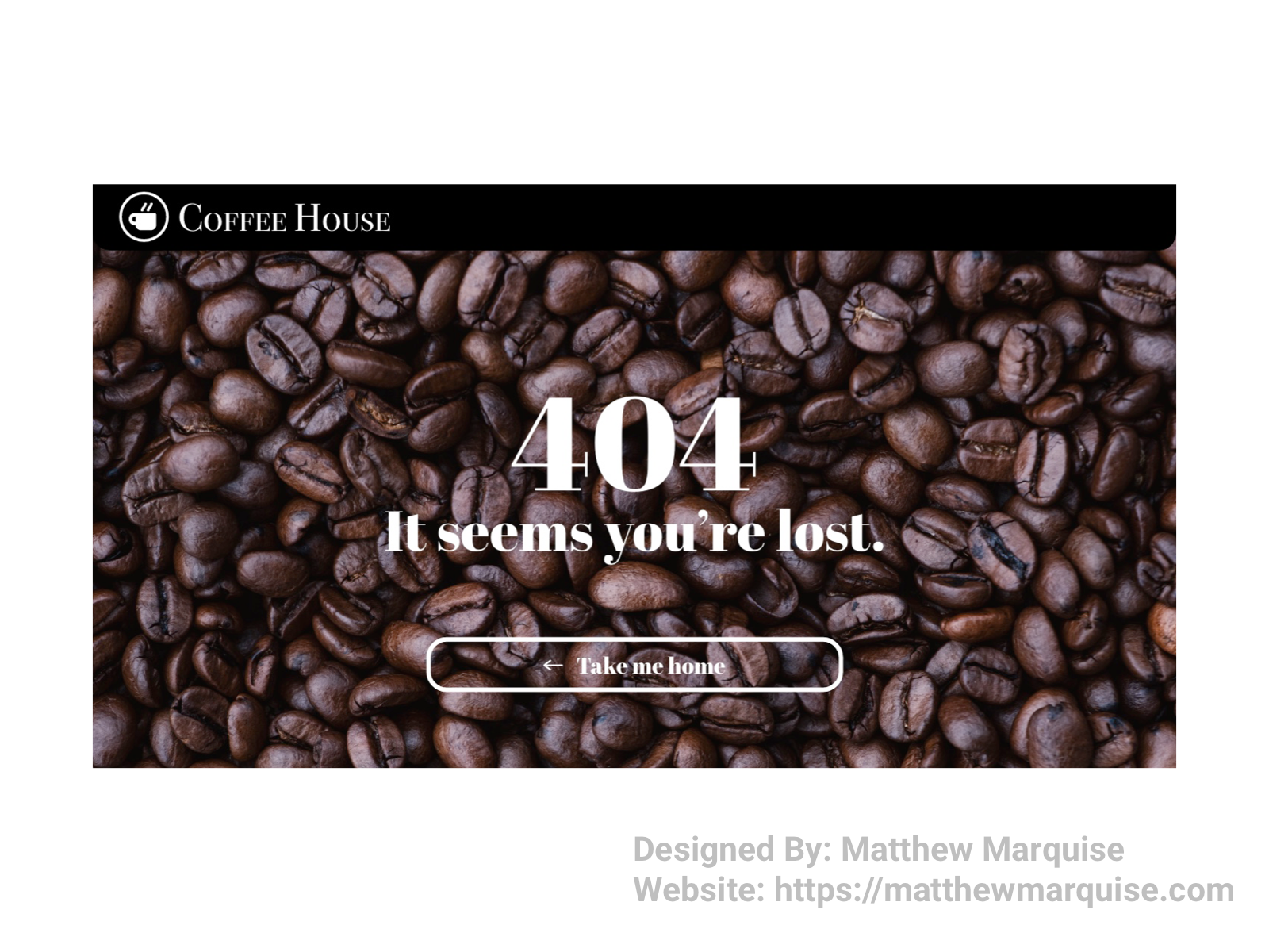
Day 008 :: 404 Page
Deisgn Notes:
For the 404 page I decided to go with a very minimal page for a cafe. A simple image related to the cafe acts a a great, minimalistic background to the page. Below the 404 error text, is a button directing lost users back home. Again, this page is very minimal however, easy to understand.
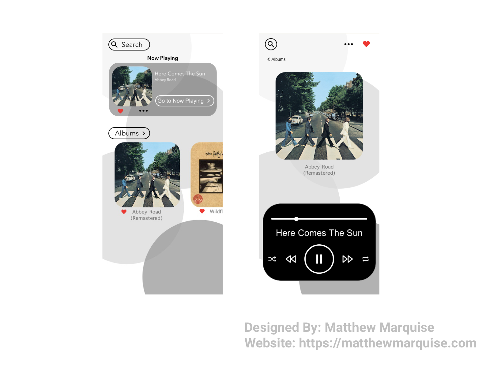
Day 009 :: Music Player
Deisgn Notes:
For day 9 I needed to design a music player. A simple, easy to navigate music player is what I like so that's exactly what I designed. On the first screen (left), users will see a search icon to search a their current songs and albums. Below that is a now playing area allowing users to move to the actual player screen (right) quickly. Below the now playing section is an area where all of a user's albums live. For quick access to the albums users can scroll till they find the perfect one, however as they get more albums, that'll be a nightmare. So there is a button to view all albums in a full list on a separate screen. Moving to the player screen we can see the search button still remains and just beside it are a more options icon, allowing users to view more info on the album or song they're listening to and a favorite/heart icon that allows users to easily save songs and albums to the favorites section. Further down the screen is the literal player where users control the part of the song they're listening to, loop or shuffle an album/playlist, and pause or play a song.
Day 010 :: Social Share
Deisgn Notes:
The tenth day asked for a social share component/feature to be designed. The feature itself is quite straightforward and easy to understand. The coloration with a black and white contrast is something I thought would be different and appealing. That it is.
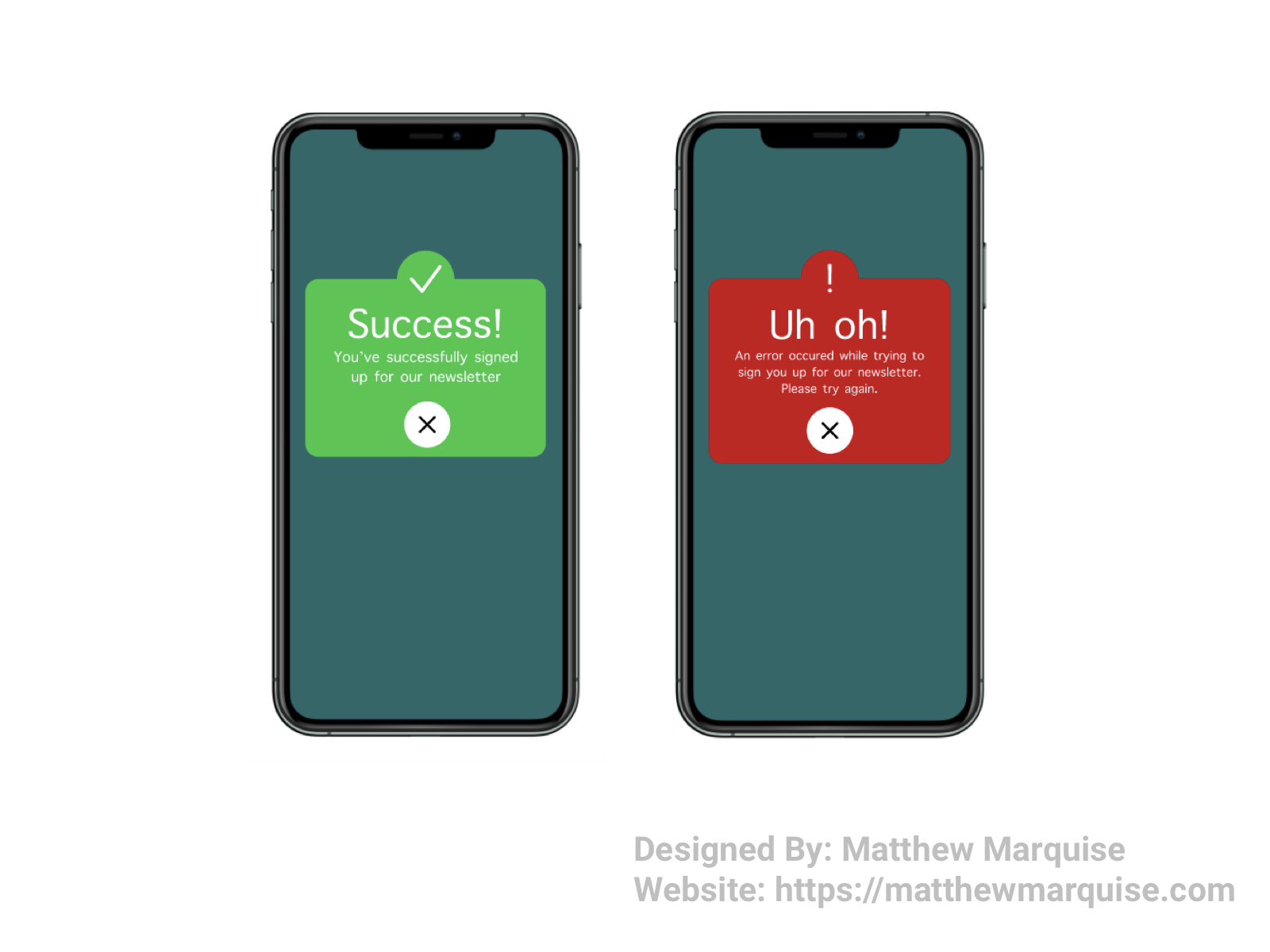
Day 011 :: Flash Message
Deisgn Notes:
For day 11 the challenge was to design a flash message for both a success and error. I decided to make my flash message for a newsletter sign up, informing the user wether or not they were successfully signed up or not. I honestly wasn't sure how my designs would look, but as you can see they turned out fairly decent.
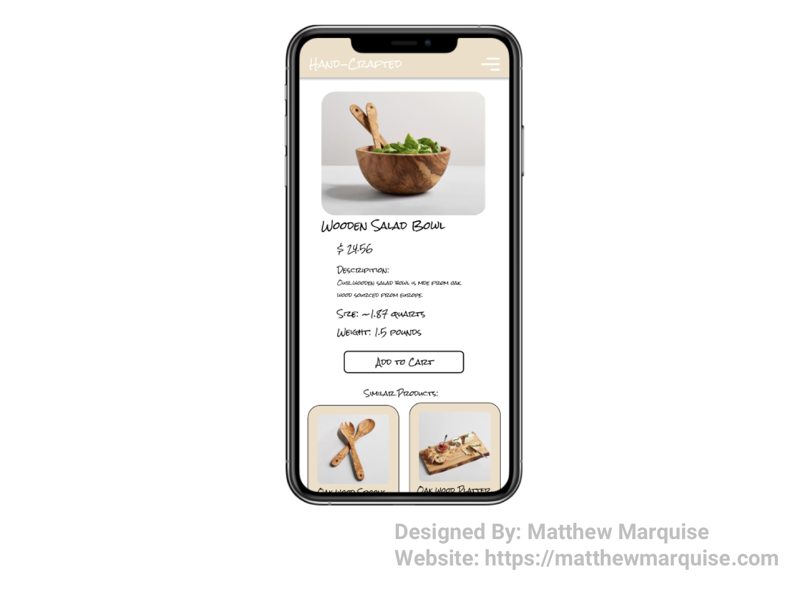
Day 012 :: E-Commerce Shop (Single Item)
Deisgn Notes:
For day twelve, the challenge was to create a single item in an e-commerce shop. I wanted the design to be simple as I personally hate e-commerce sites that are hard to navigate and give every user a headache. Color themes can be overwhelming at times on various shopping sites too, so the colors for mine are simple and provide a warm feeling to each users. Under the product image and description is an add to cart button. Below that, a row of similar products is shown. While this design is minimalistic, it's also very pleasing to users.
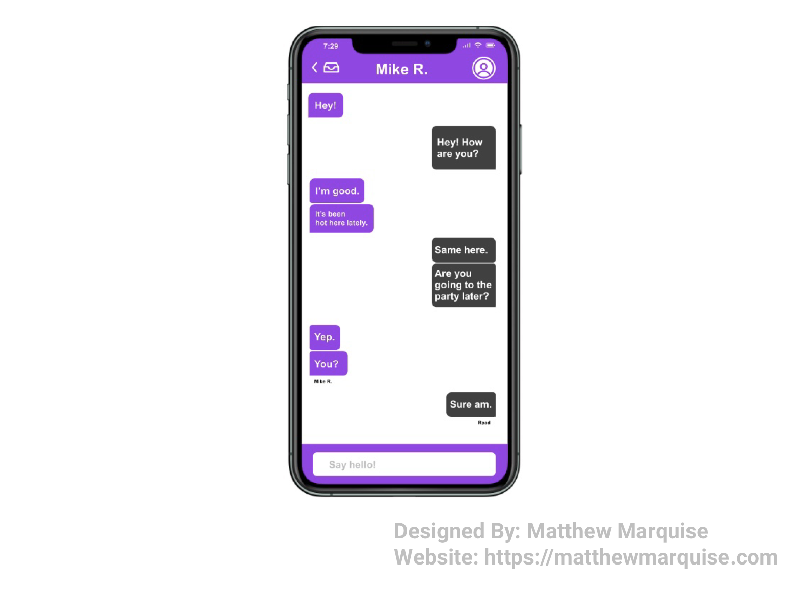
Day 013 :: Direct Messaging
Deisgn Notes:
For day 13 the challenge was to create a direct messaging application. I designed this messaging app with ease of use in mind. In this design, I made sure that a user could easily navigate in and out of messaging with friends using the return to inbox button in top left corner of the app. In the top right, a user can click on their friend's profile picture to view that user's full profile. It's minimal, the color theme isn't overwhelming and it achieves exactly what was challenged.
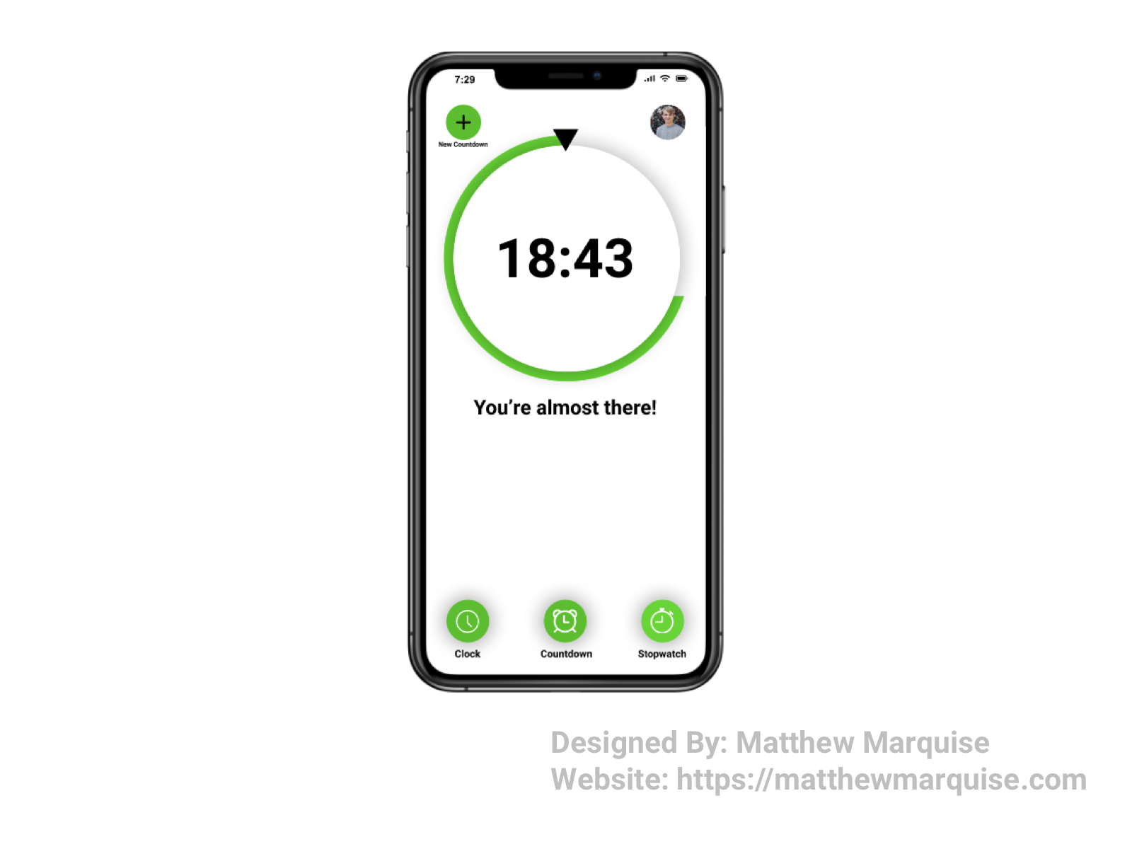
Day 014 :: Countdown Timer
Deisgn Notes:
Day 14 involved creating a countdown timer. I choose to design one for an app. Starting at the lower, navigation portion of UI, there are three options: a clock, a countdown and a stopwatch. Each of these options are all very standard on most time tracking apps and sites, however changing the layout and adding a fast way to navigate between each time tracking option is crucial. In the center of the screen, the physical countdown is located, encouraging the user as they near the end of the set time. Above the timer, in the top right is the user's icon, keeping track of their past countdowns and stopwatches, as well as their favorited world clocks. In the top left is a create new countdown icon allowing a user to create up to 4 countdowns at one time. Each being displayed in a two by two, stacked format.
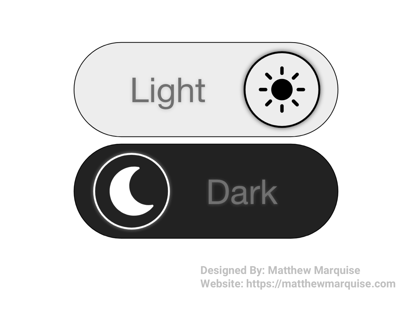
Daily UI 015 :: On/Off Switch
Deisgn Notes:
For these On/Off Switches I chose to design them as toggles between dark and light mode and they're fairly simplistic as most toggle switches are.
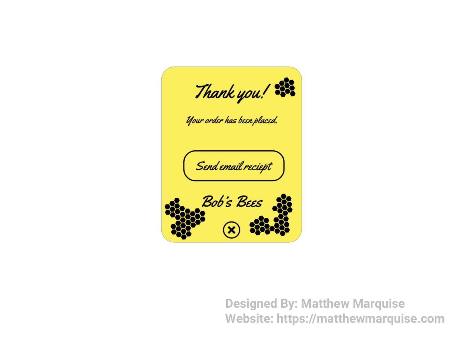
Daily UI :: 016 - Pop-Up / Overlay
Deisgn Notes:
Day 16 called for the design of a pop-up/overlay. This overlay is shown after a user purchases honey from this online shop. It informs the user that their order was successfully placed and allows them the option to get a receipt sent to their email inbox. Below the company name, is an x icon allowing users to close out of the overlay and return to the app or website. While this overlay is minimalistic, it achieves everything a user would need to know and do after making a purchase.
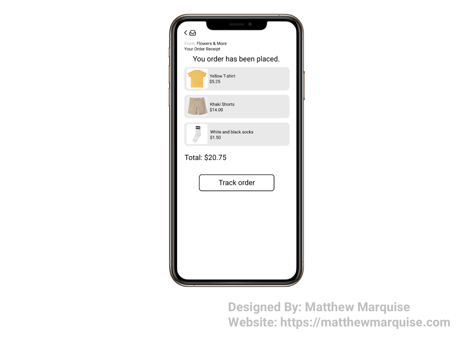
Daily UI 017 :: Email Receipt
Deisgn Notes:
Email receipts are typically overcomplicated and far from easy to understand. With that being said, the email receipt I've designed is one that any user can understand. This receipt reminds the user of what they ordered and the total cost, as well as allows them to track their order. This email receipt displays all the essentials that every customer would ever need to know.
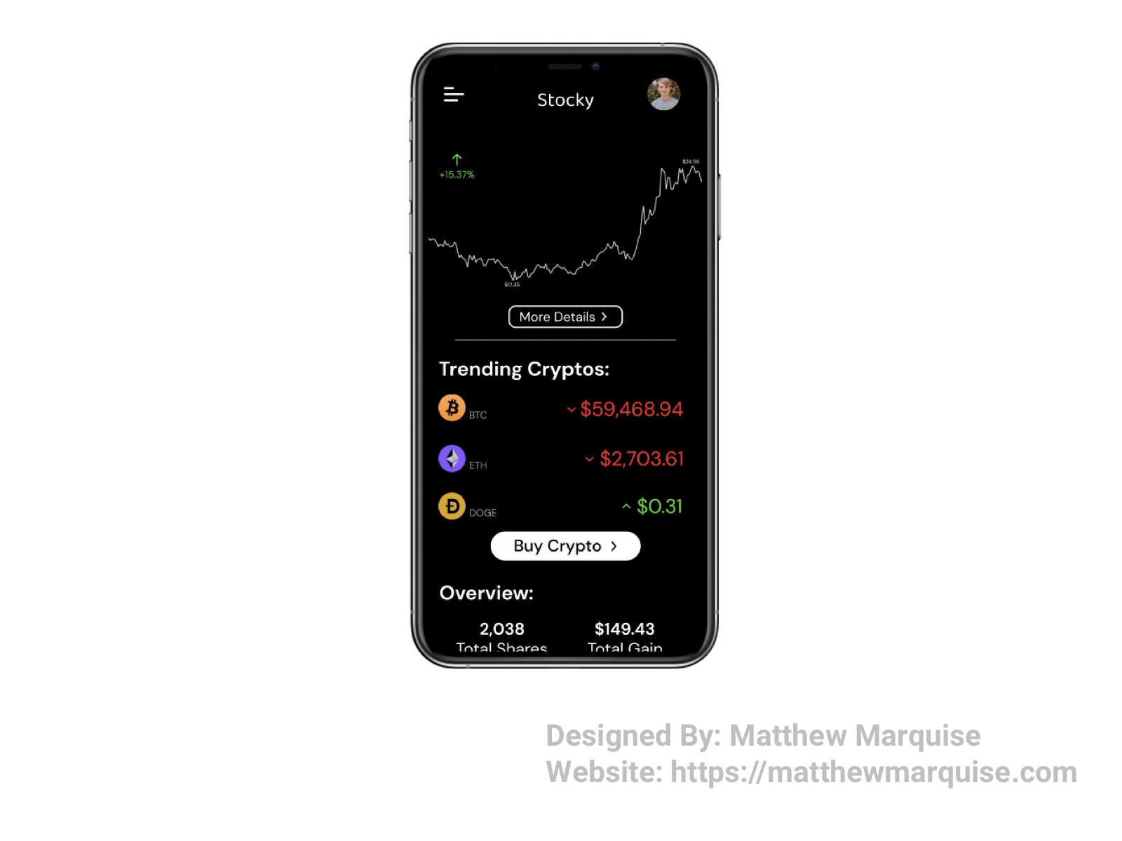
Daily UI 018 :: Analytics Chart
Deisgn Notes:
For the analytics chart challenge, I decided to design a crypto trading app. The main page of the app allows the user to see current prices, trends on the actual analytical graph and also view their wallet balance. While it's minimal, this app could be a great way for users to track their investments as well as decide on future investments.
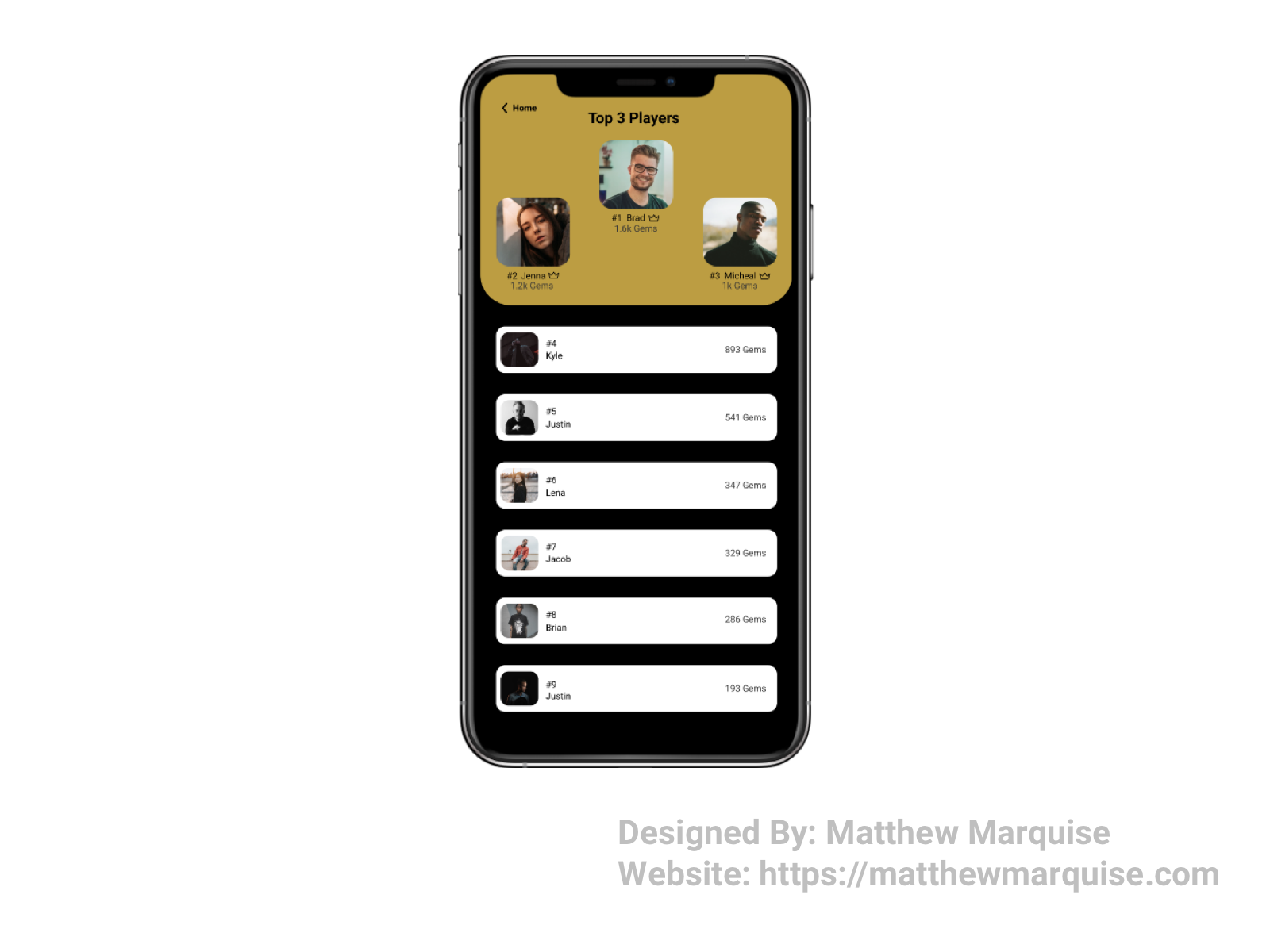
Daily UI 019 :: Leaderboard
Deisgn Notes:
This leaderboard is minimalistic, and informative for users. At the top of the leaderboard screen, the highest ranked players are listed. Players are given a crown beside their name if they rank within the top three and beside or below their name is the amount of gems they've acquired.
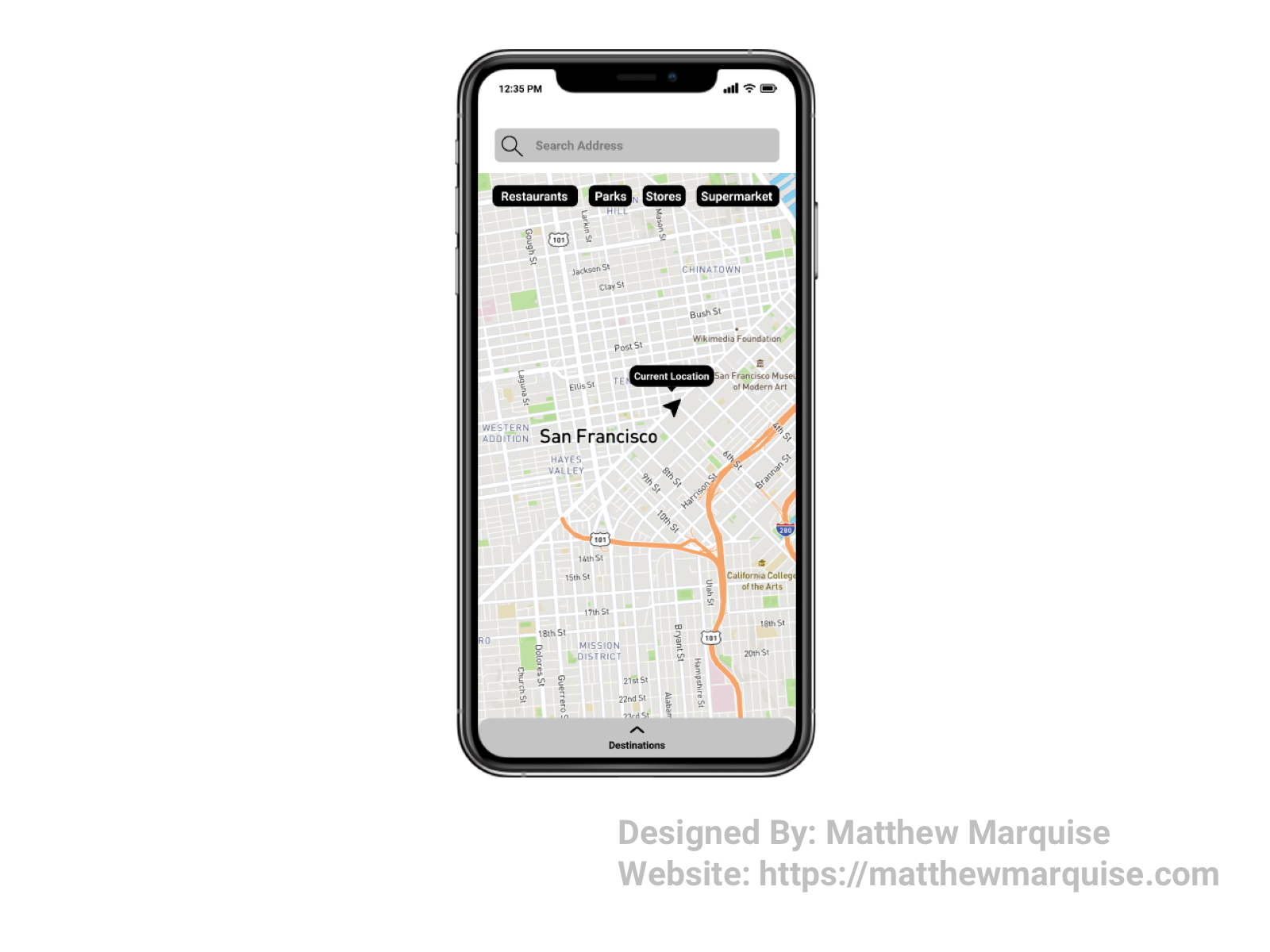
Daily UI 020 :: Location Tracker
Deisgn Notes:
For day 20, the challenge was to design a location tracker. Wether this app be used for setting destinations and choosing the fastest routes like most maps, or tracking you and your friends and family, it can do it all. The map is enlarged upon opening showing the user's current location. A quick search would allow the user to find places he/she would like to travel to. For quick searches, the app offers quick links to things such as restaurants, parks, stores, and supermarkets and others, based on the user's most frequented searches. While this design is quite minimalistic, it certainly offers the same features and more of most map apps.
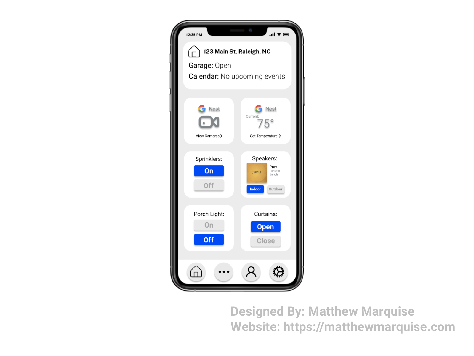
Daily UI 021 :: Home Monitoring Dashboard
Deisgn Notes:
On the main screen of the home monitoring dashboard, it allows the user to be informed of everything they need to know and more. Everything from the user's Nest cameras to their curtains, they can access every smart device in and around their home from this one app. They can control the sprinklers, the indoor and outdoor speakers, lights and temperature from the main screen. Other, not frequently used devices, can be accessed from the "more" screen of the app. It can be visited by selecting the three dots in the bottom navigation tab. The design is simple and easy to understand, allowing the user to quickly and efficiently control and check on all the smart devices within their home.
Daily UI 022 :: Search
Deisgn Notes:
Designing a search screen is fairly simple and making it user friendly is extremely important. Adding quick search options is also a great way to help users out when searching a site or app and making it minimalistic is key so that the users aren't overwhelmed.
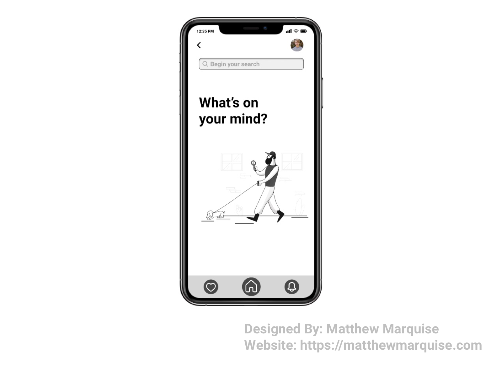
Daily UI 023 :: Onboarding
Deisgn Notes:
For this onboarding screen I wanted to incorporate the user and create hype around them joining. Though this screen is minimal, it welcomes then informs the user of the next necessary steps in this case checking email to verify account.
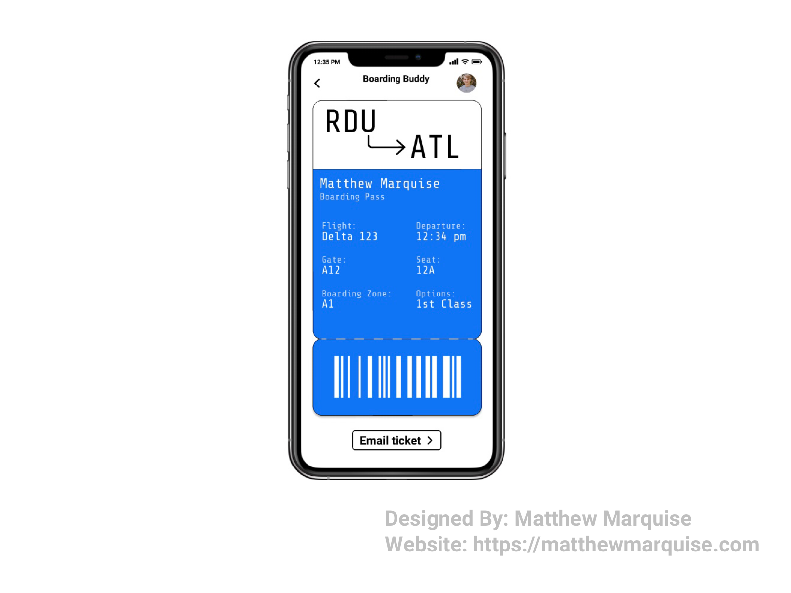
Daily UI 024 :: Boarding Pass
Deisgn Notes:
This boarding pass is minimalistic, modern, and digital which is something I find very unique. Simply arriving at an airport, train station, bus station, and any other transport facility and showing their ticket via their phone for a contactless, and headache free check in. They'll never forget their boarding pass again. A user can also email themself the boarding pass so they can share or print out.
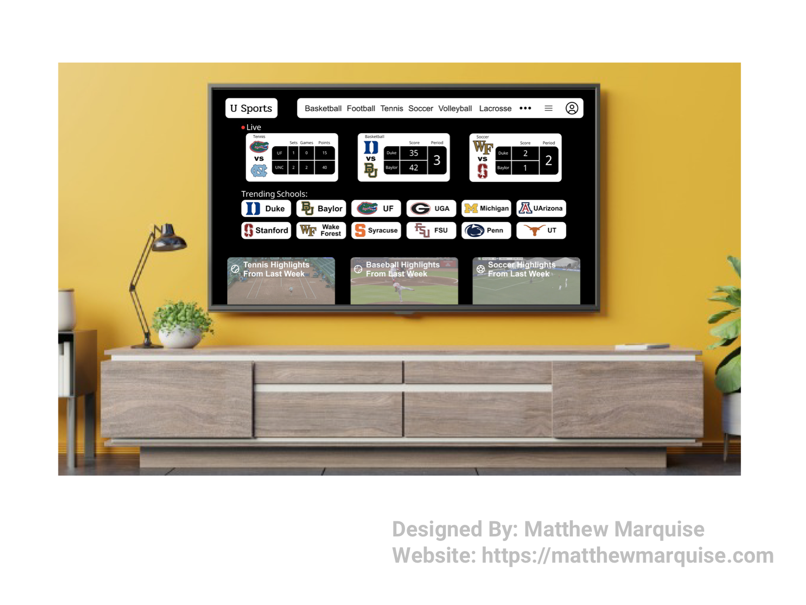
Daily UI 025 :: TV App
Deisgn Notes:
This tv app is specific to college sports. It offers users every sport, from every college in North America. The idea sprouted from the fact that it's hard to find where to watch a college sports game, that is if it's being streamed at all, but with U Sports, you'll never have to miss another game from your favorite college. This app was designed with quick access to specific games in mind. In the nav, various popular sports are listed, below that is a live section for every currently live game. Continuing down the screen, a list of popular universities, based on the user's watch history and favorited teams, allows for quick access to on-demand sports and live. U Sports the perfect streaming app for any college sports fan.

Daily UI 026 :: Subscribe
Deisgn Notes:
This subscribe button allows a user to be added to a mailing list that sends various recipes to their inbox each day. This form is minimalistic, yet informative as it explains to the user what they're signing up for.
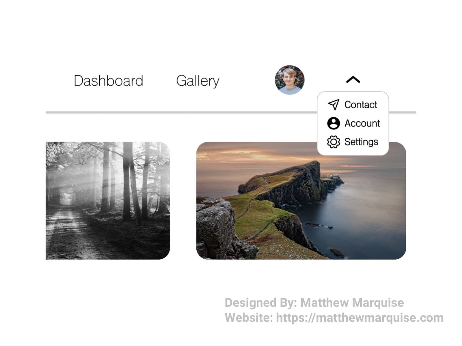
Daily UI 027 :: Dropdown
Deisgn Notes:
This dropdown allows a user to access other important info such as contact support, account info, and settings. It's simple and straightforward yet very functional.
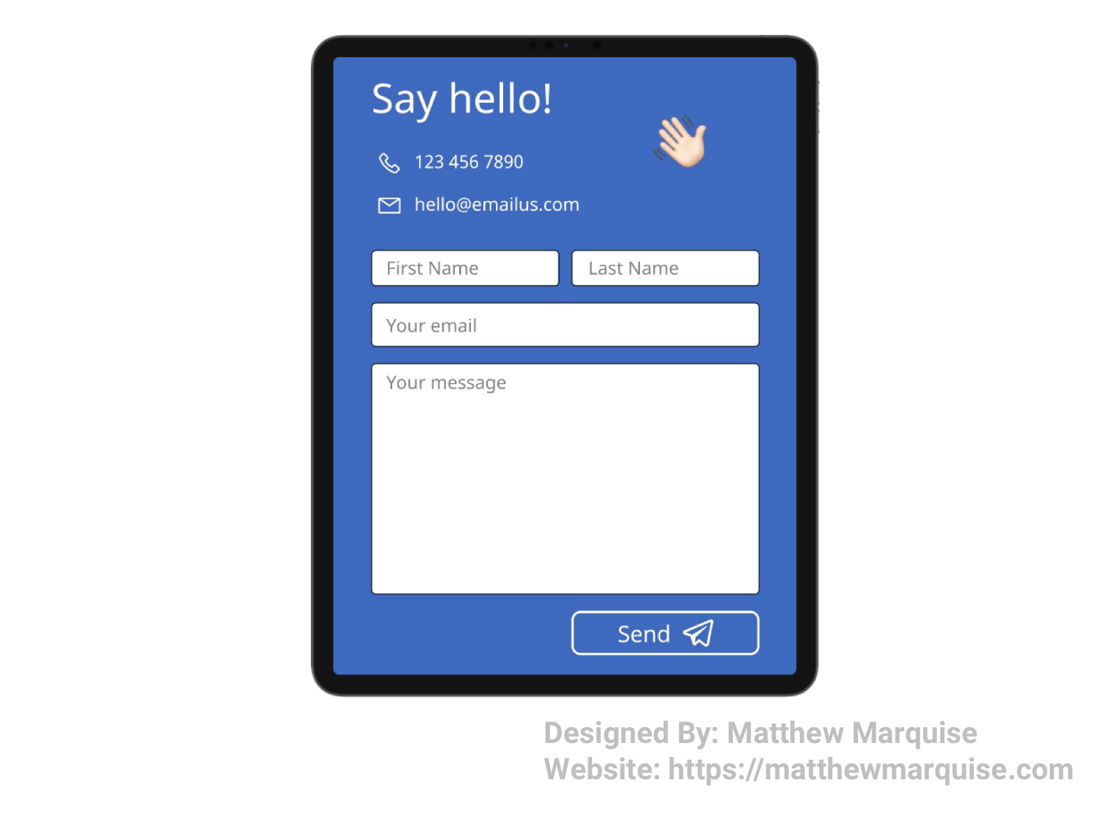
Daily UI 028 :: Contact Us
Deisgn Notes:
This contact form is concise and enables users to easily get in touch with the company. Regardless what a users prefers when it comes to contacting someone, this form offers two main options, email and phone. If a user doesn't want to submit a form right away they can save the company's email and reach out later. The design isn't overwhelming and the font and color is welcoming to every user.
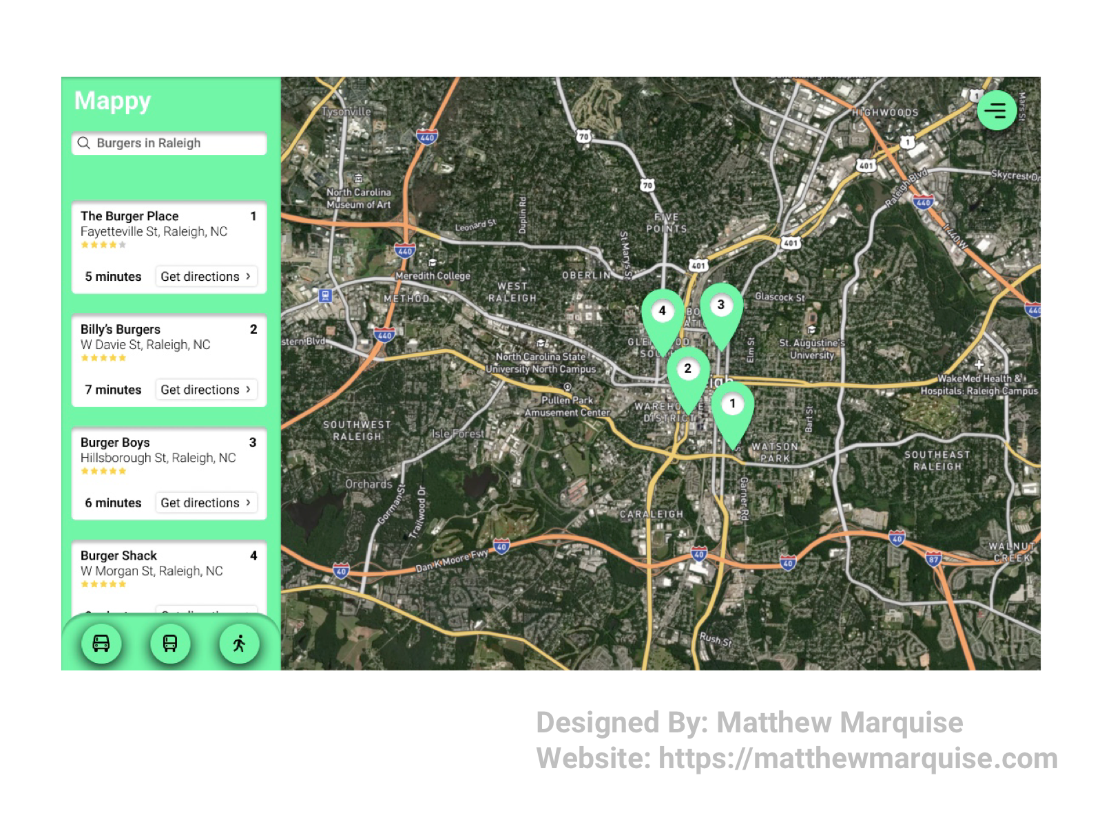
Daily UI 029 :: Map
Deisgn Notes:
This is Mappy. Mappy allows users to easily search for restaurants, parks, stores, and more. Users can choose between car, public transport or walking so however they prefer to travel, they can find the best routes. This map application is designed to be easily understandable and not overwhelming.
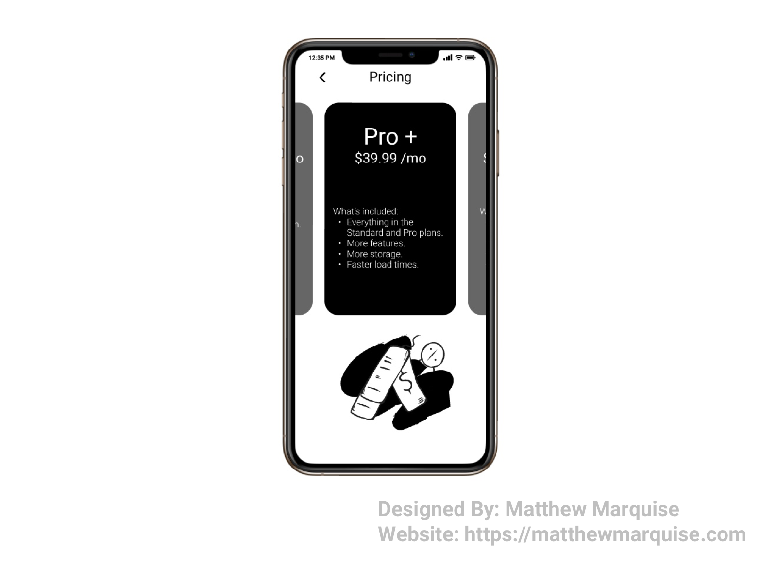
Daily UI 030 :: Pricing
Deisgn Notes:
A well designed pricing page should be concise so that a user understands what they're paying for. Offering various plans at different price points allows users to choose the most suitable plan as well as a plan that is within their budget.
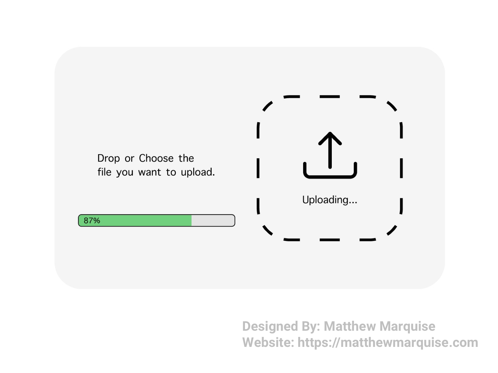
Daily UI 031 :: File Upload
Deisgn Notes:
This is designed to be a popup window for an app, website, and or software allowing users to easily upload necessary files. After selecting the file/s, the uploading process begins automatically and a progress bar appears informing the user the completed percentage.
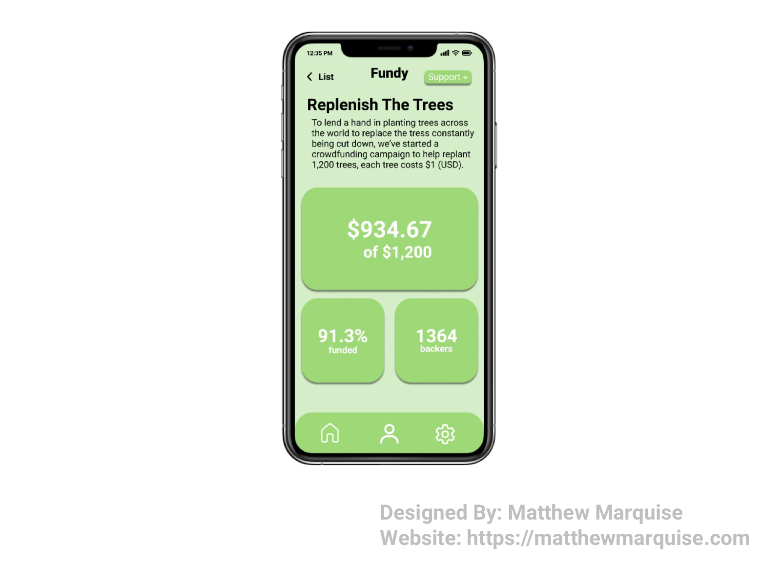
Daily UI 032 :: Crowdfunding Campaign
Deisgn Notes:
Fundy is a great way to support organizations, charities, events, projects, and so much more. Each individual Fundy campaign page gives lengthy info about what you and other are helping support, as well as statistics on total money raised, the percentage of the set goal that's been funded, and how many backers have chosen to support the campaign. Supporting campaigns with Fundy is easy and allows a user to feel good knowing they are lending a hand to whatever cause they choose.
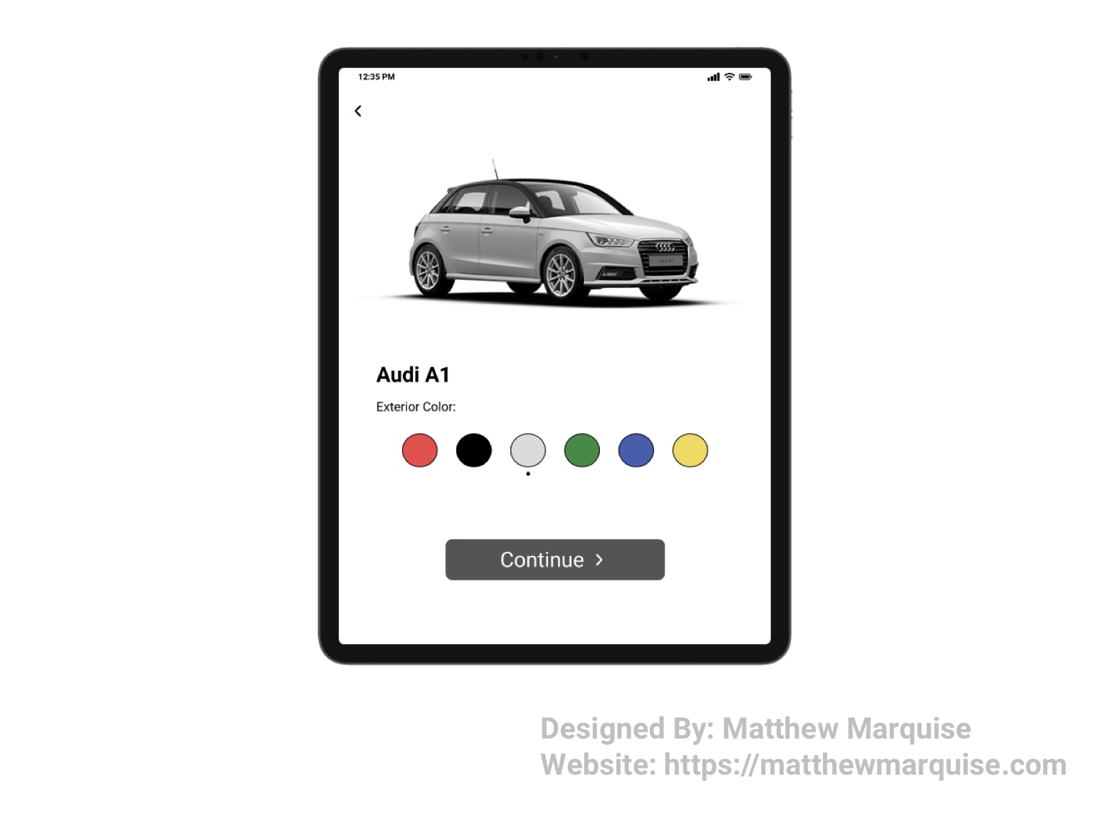
Daily UI 033 :: Customize Product
Deisgn Notes:
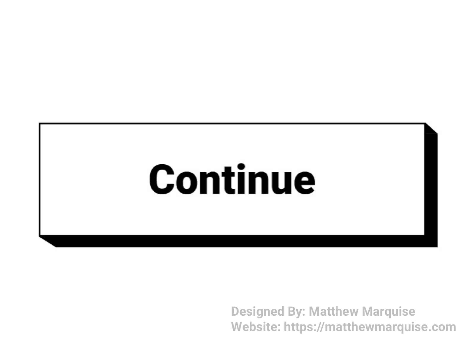
For this product configuration/customization page, users are able to choose the color of their new car. As a user switches between available color options, the digital version of the car updates to display the corresponding body color. a back arrow in the top left returns to product page, and a lower continue button brings the user to the next configuration options. This product customization page is concise and minimalistic.
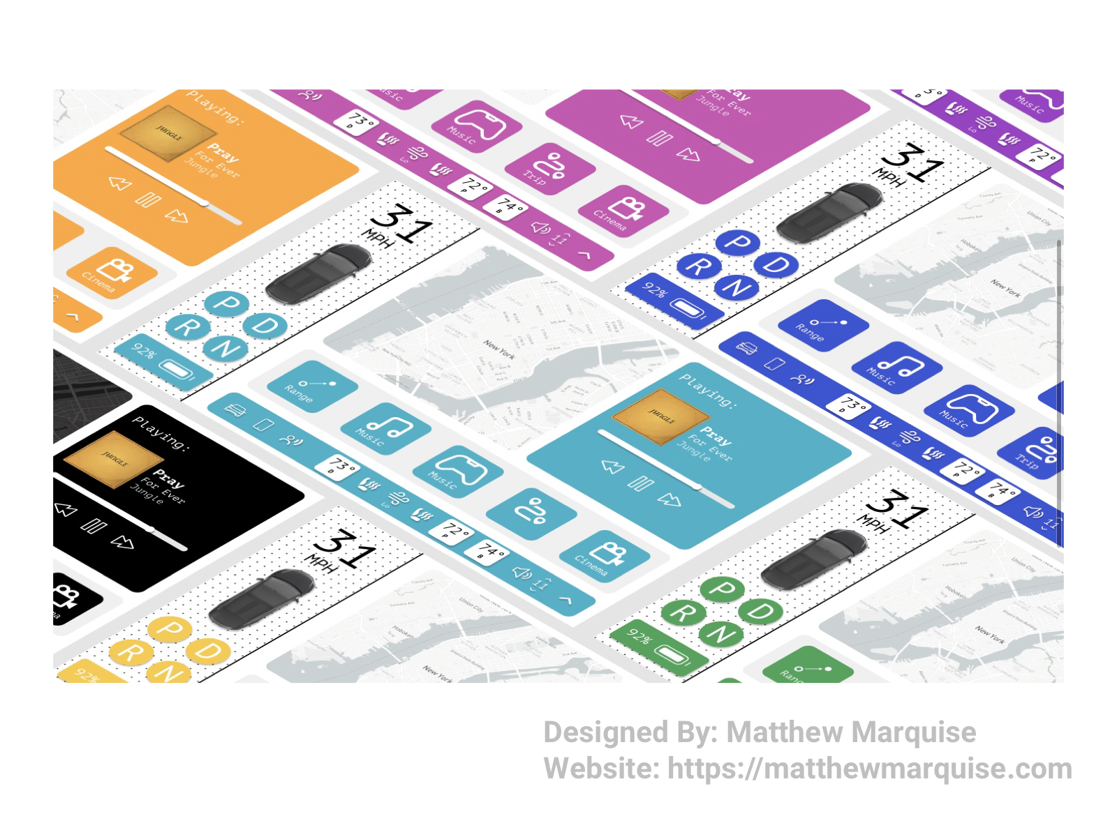
Daily UI 034 :: Car Interface
Deisgn Notes:
For this challenge I wanted to make a minimalistic interface that any user could easily navigate. Simple buttons and icons achieve just that. Each UI has a customizable rgb background color. The digital speedometer is located in the top left of the interface. To toggle between park, drive, reverse, and neutral. The main portion of the interface features a map, access to music, games, range and trip info, and streaming services. There's also toggles for AC, heated seats, and audio volume.
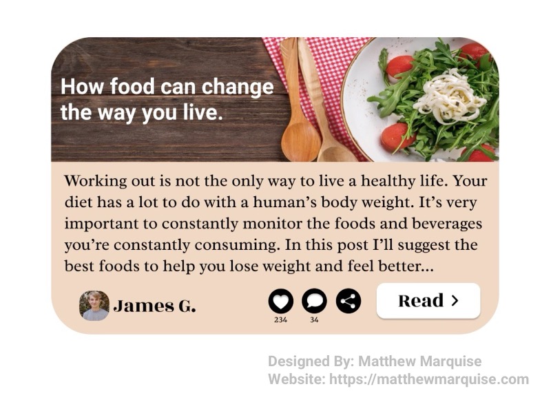
Daily UI 035 :: Blog Post
Deisgn Notes:
This blog post preview is concise and stylish. This preview includes the post title, a header image, preview text from the post's body, the author, number of likes, number of comments, a share button, and a read button to open the full article. This blog post preview is exactly what a writer would want as it allows for readers to get a glimpse at what the post discusses.
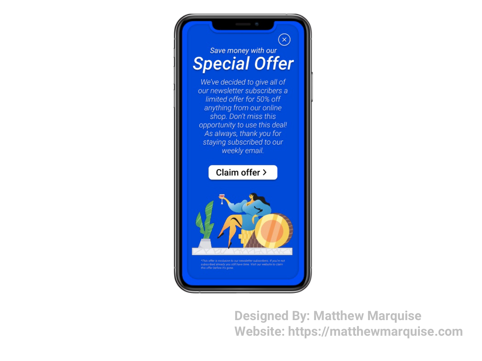
Daily UI 036 :: Special Offer
Deisgn Notes:
This special offer pops up when a user enter the app. The offer screen incorporates two main shades of blue (#0C24FF & #092CE1), each of which are warm feeling, drawing the user to read what is on the screen. Below the description of the offer is a claim offer button that's concise, and because of the proportion of button it would be difficult for a user to miss it.
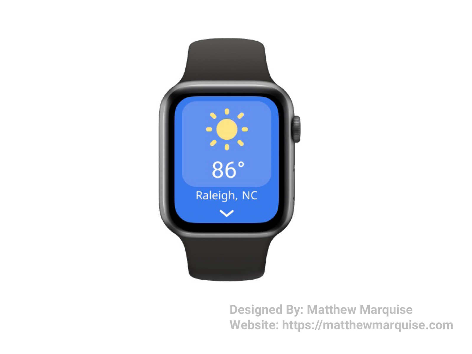
Daily UI 037 :: Weather
Deisgn Notes:
This weather app is extremely concise because it's for a smart watch. A simple icon immediately informs the user of the current weather outside such as sunny, rainy, cloudy, windy, etc. Below the weather icon is the current temperature. Further down is the user's current location, followed by an arrow leading to other weather data and saved locations.
Daily UI 038 :: Calendar
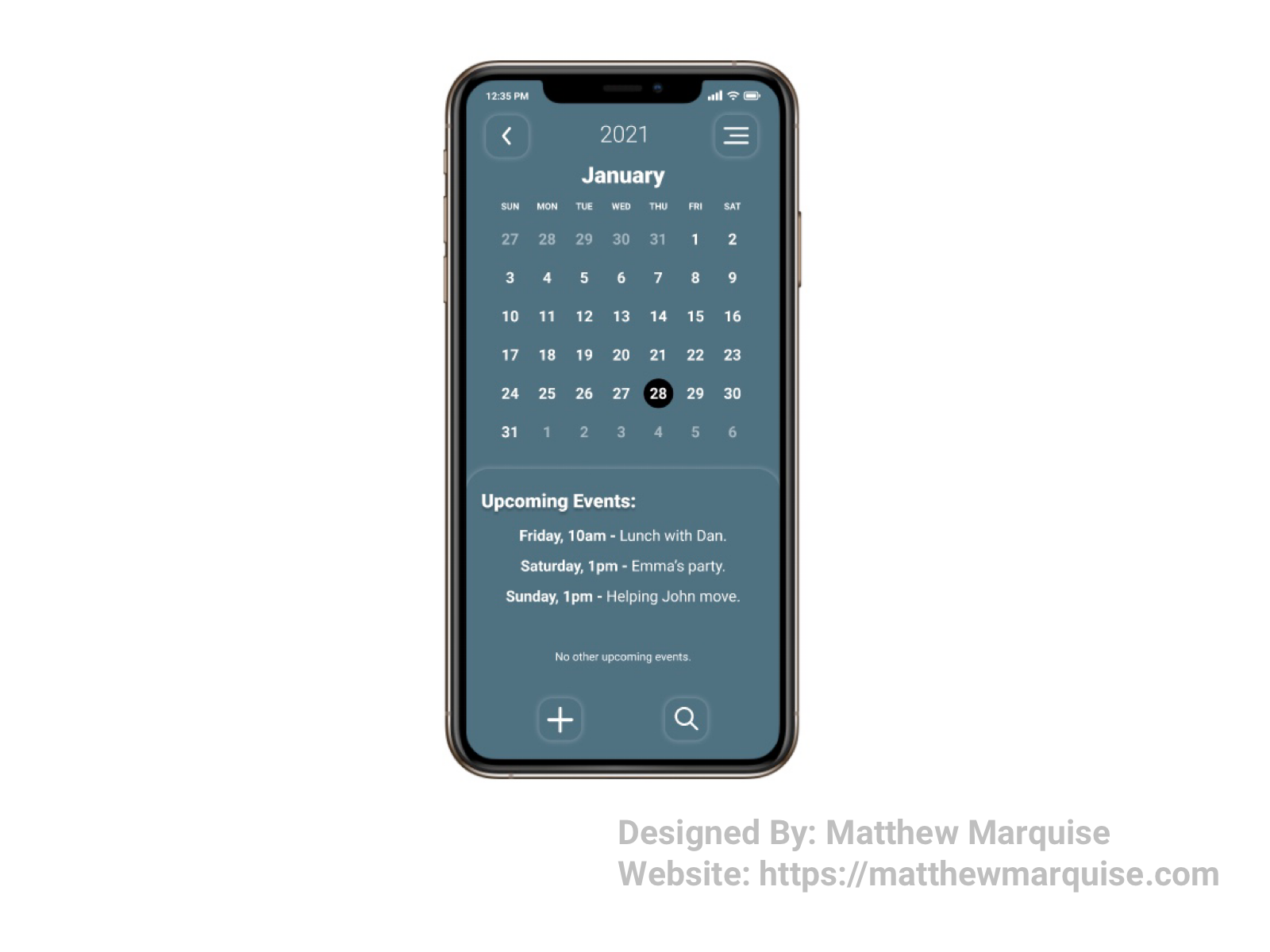
Deisgn Notes:
This calendar is very minimal, although very informative. The general content of a calendar app is pretty straight forward, therefore it comes down to designing a stunning theme and fully accessible features. In the top left is an arrow that expands the view of the calendar from a singular month to multiple. Below is the calendar itself followed by a scrollable list of all upcoming events. To add an event, a user would press the plus icon in the bottom left. By pressing the search icon in the bottom right, a user can search all previous and current events.

Daily UI 039 :: Testimonial
Deisgn Notes:
This testimonial is very concise, but also eye catching to users who want to read them before purchasing a product. The purple background, met with the white color used for the testimonial card, compliment each other very well.
Daily UI 040 :: Recipe
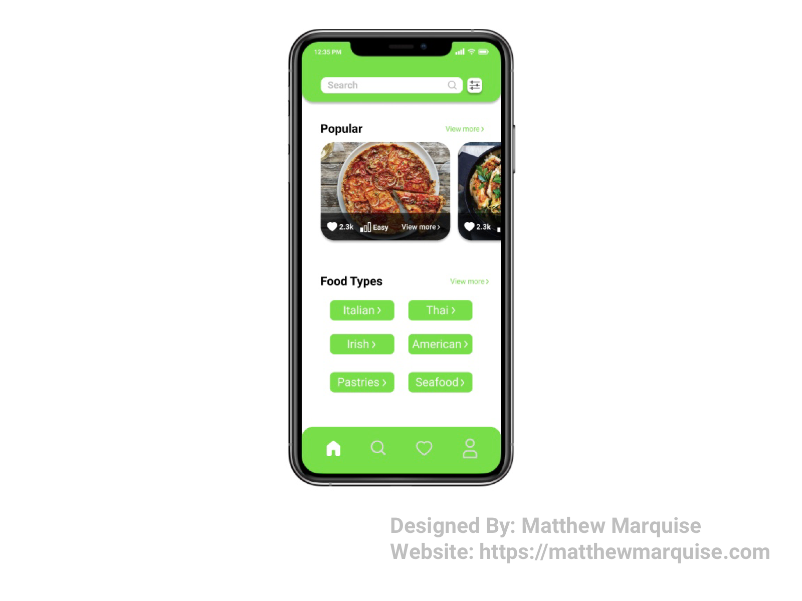
Deisgn Notes:
This recipe app allows users find recipes for their favorite meals, explore new ones, and save time. The home page of this app includes a search bar with customizable filters, popular recipes, and popular food types. Quick access to recipes based on food types makes search for a new recipe fast and enjoyable.
Daily UI 041 :: Workout Tracker
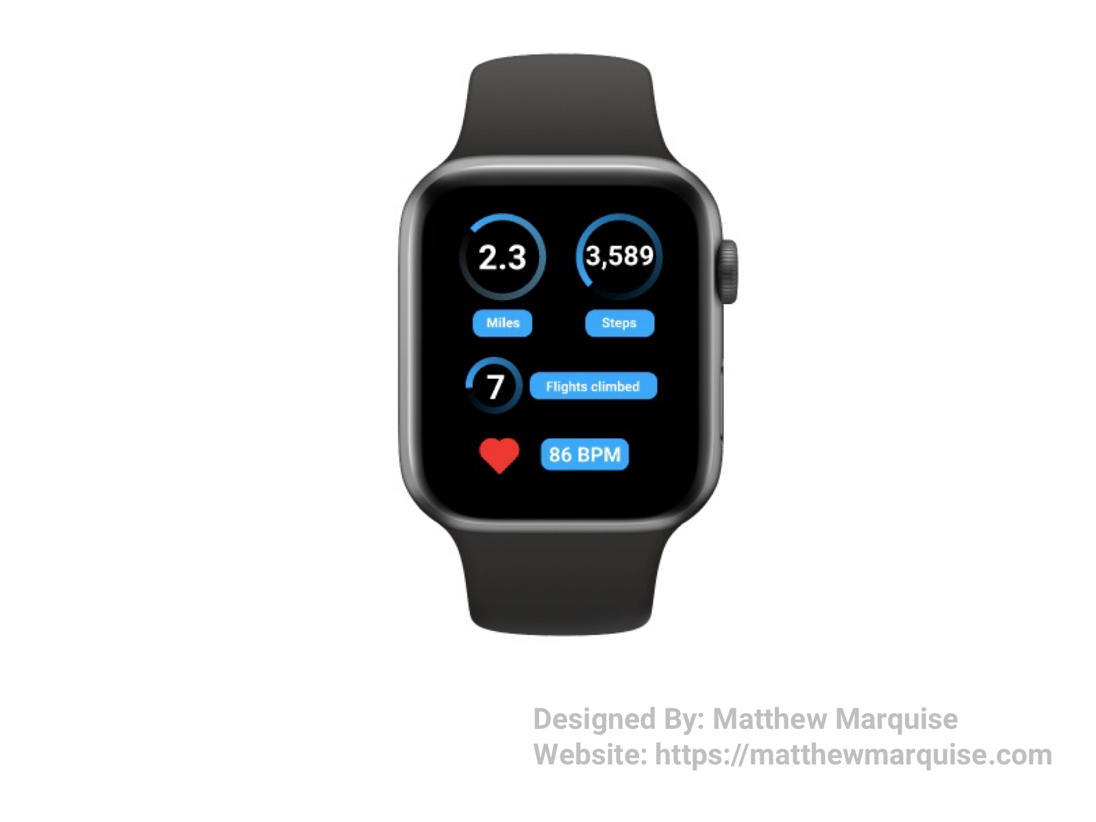
Deisgn Notes:
This smart watch app tracks a user's distance in both miles and steps, as well as the total flights they've climbed. Below the distance stats is the heart rate display. For the main UI colors I chose blue and black because they compliment each other very well and the neon blue inspires energetic users to stay active.
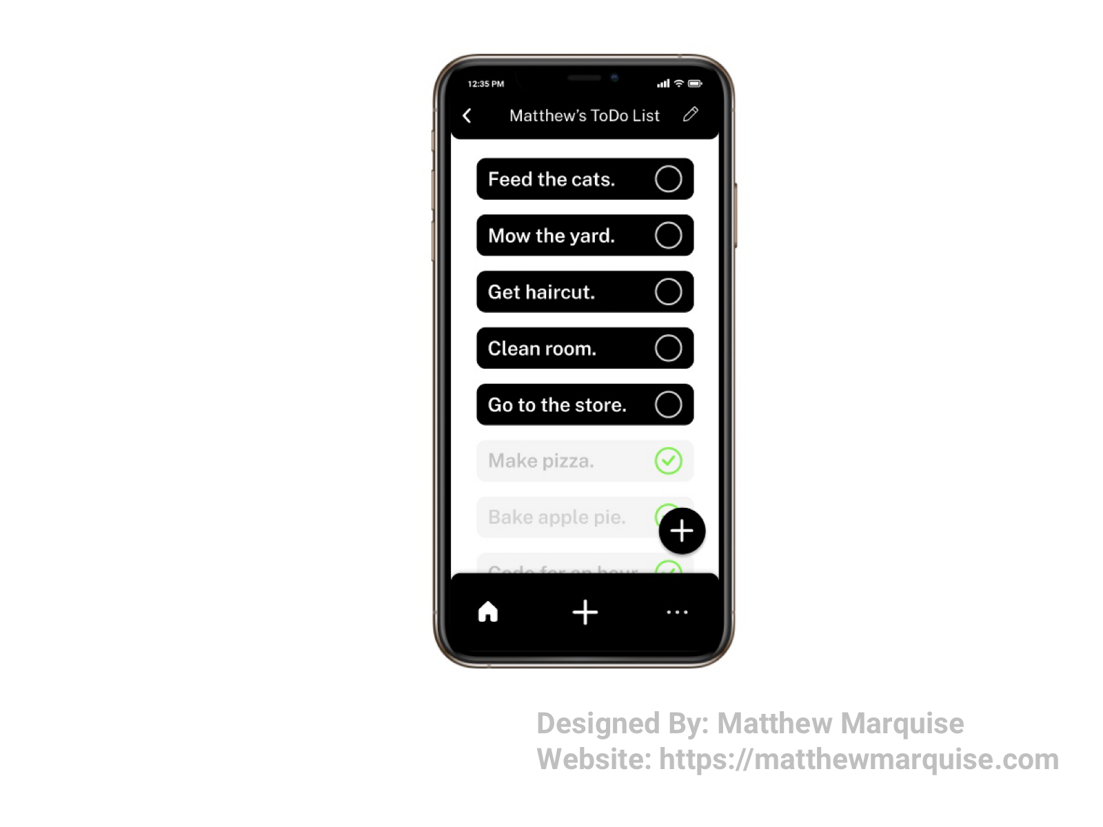
Daily UI 042 :: ToDo List
Deisgn Notes:
This mobile app allows users to easily manage every task they need to achieve. Using simple buttons a user can mark tasks as completed and add new tasks to the list. The use of black and white for the UI allows the design to be both modern and minimal.
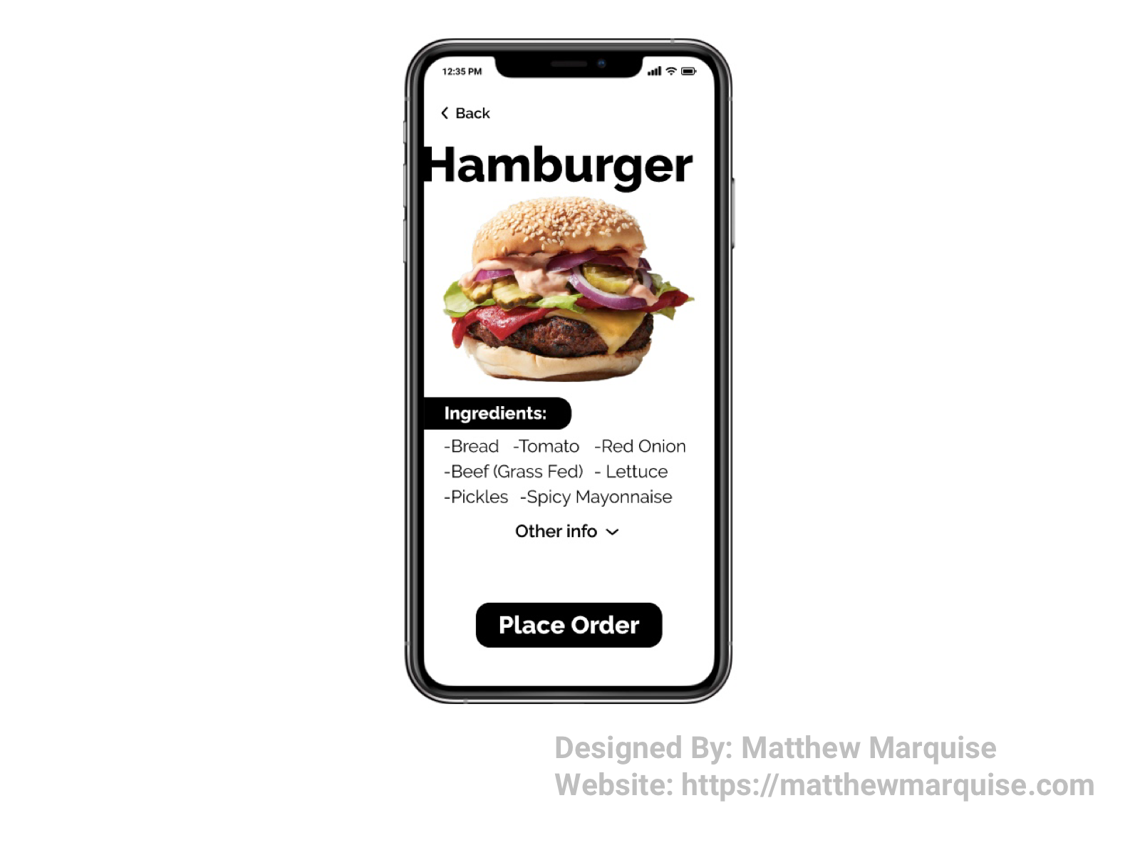
Daily UI 043 :: Food/Drink Menu
Deisgn Notes:
Digital menus are a great way for users to save time when ordering from a restaurant. A user can choose their desired meal before even arriving at a restaurant, therefore a digital menu should be concise. A digital menu that's overcrowded can cause a user to feel overwhelmed and not important. A complex UI could ultimately change the users mind on where to order from based on how easy it is to a restaurants digital menu. This menu is modern and concise, keeping the user in mind.
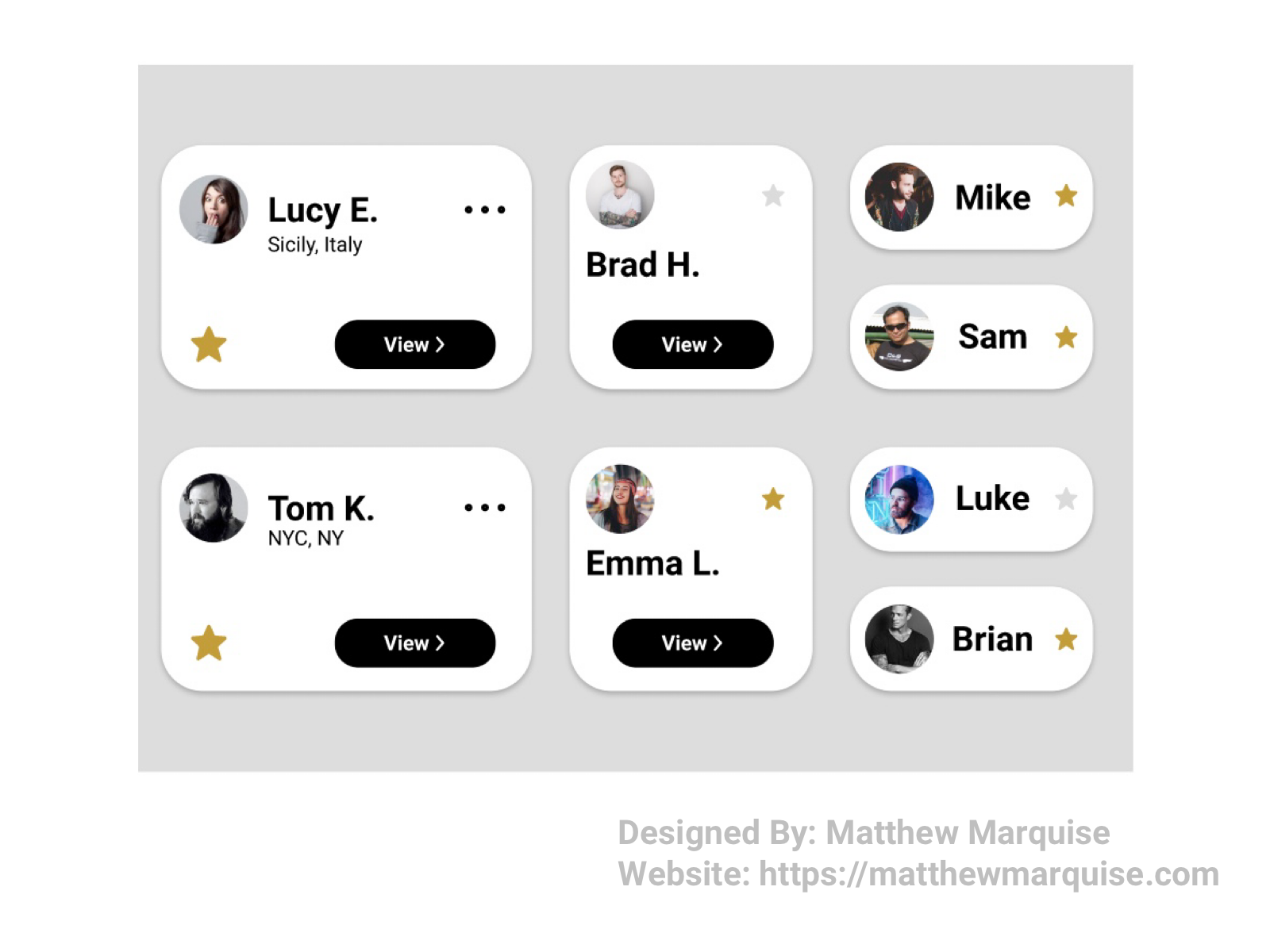
Daily UI 044 :: Favorites
Deisgn Notes:
These profile cards feature a favorites icon for users to mark their friends, family, etc. as favorites, an alternative to follows. A user can mark a profile as a favorite by pressing the greyed out star. After a profile has been added to a user's favorites, the grey star will become gold. This design is simple, different, and effective.

Daily UI 045 :: Info Card
Deisgn Notes:
This business card is modern and minimal, yet concise. Info cards should only offer the most important information, so those who have it know who you are and how to reach you.
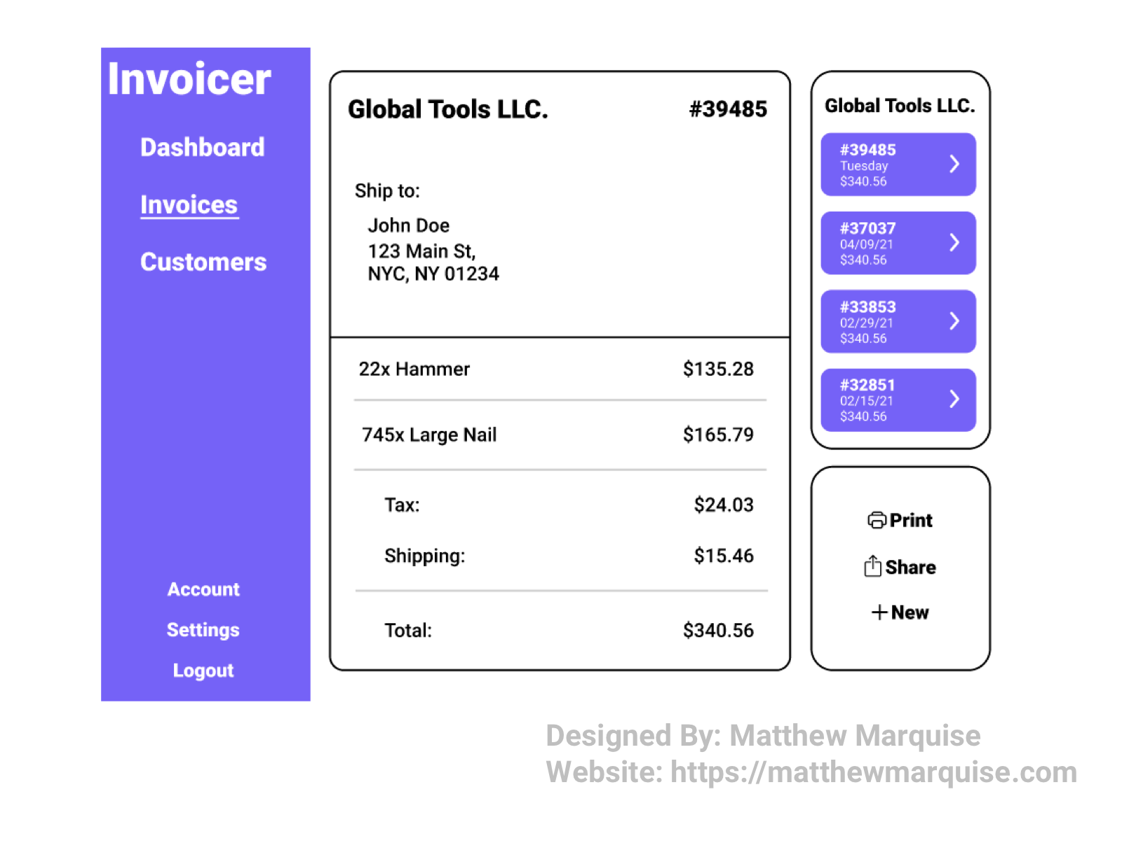
Daily UI 046 :: Invoice
Deisgn Notes:
This invoice software allows users to efficiently manage orders and bill customers. Simply selecting the customer and choosing an invoice from their list allows the user to print, share, or create a new invoice for that customer. The display is minimal and functional saving the user time.
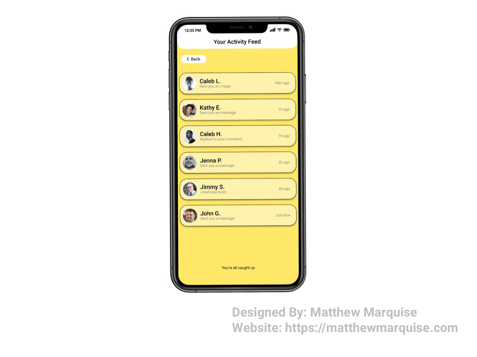
Daily UI 047 :: Daily UI 047 :: Activity Feed
Deisgn Notes:
This is an activity feed screen that informs a user of all their follower's activity relating to their account. Simply pressing the activity notification a user wants to view, will open it. This design is minimal, modern, and unique. I chose the yellow, white, and black color theme as the colors complement each other pretty well and each are subtle.
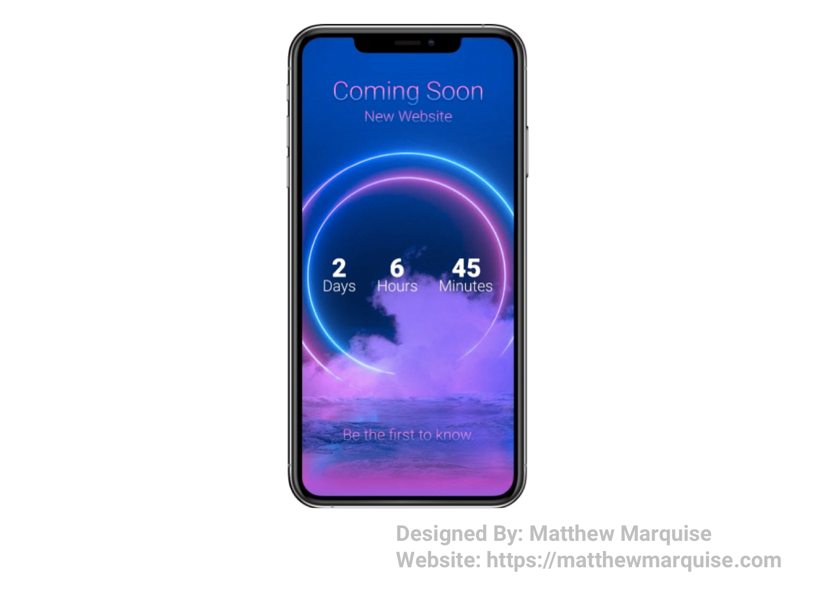
Daily UI 048 :: Coming Soon
Deisgn Notes:
This screen informs the user of an app that it's coming soon, along with a countdown. Though this screen is minimal, it is very concise.
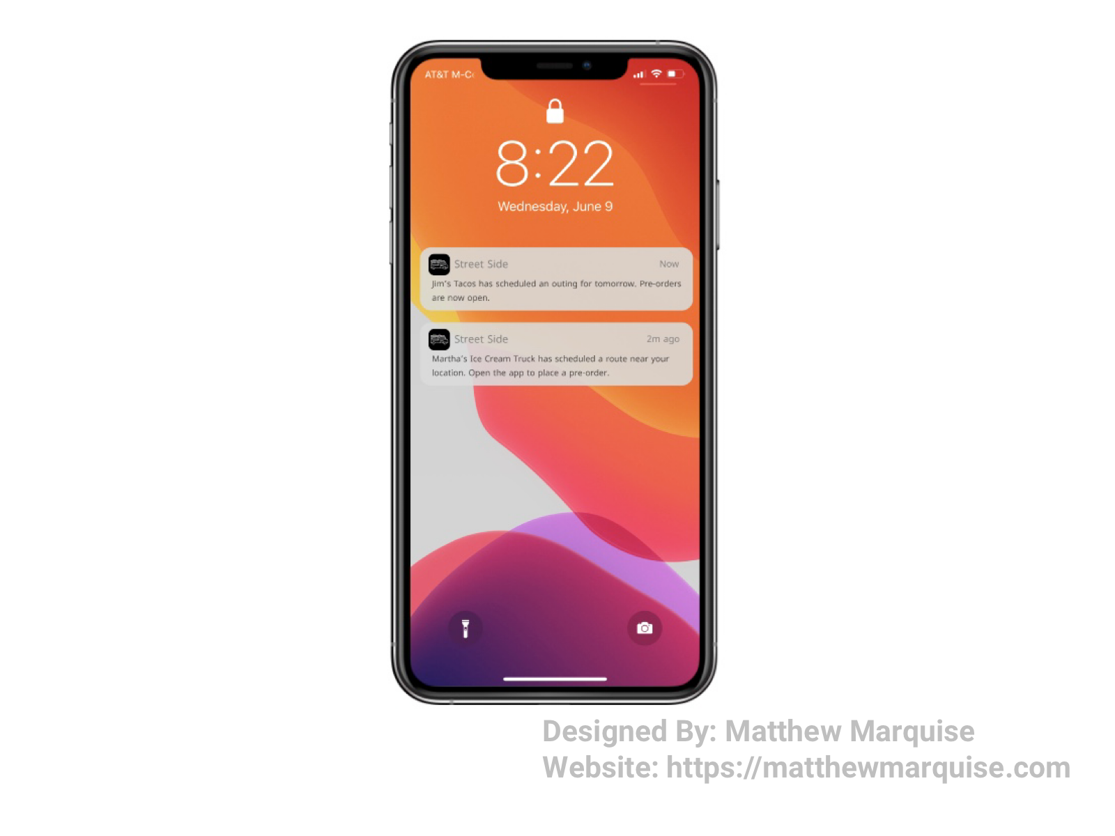
Daily UI 049 :: Notifications
Deisgn Notes:
On the lock screen, a user can view their recent notifications. These particular notifications are for an app I've been working on recently that allows users to pre-order food from food trucks. Alerts like these inform users of when and where a food truck will be. Notifications must be concise to overwhelm the user. An alert that's too wordy can cause a user to simply erase it without ever opening.
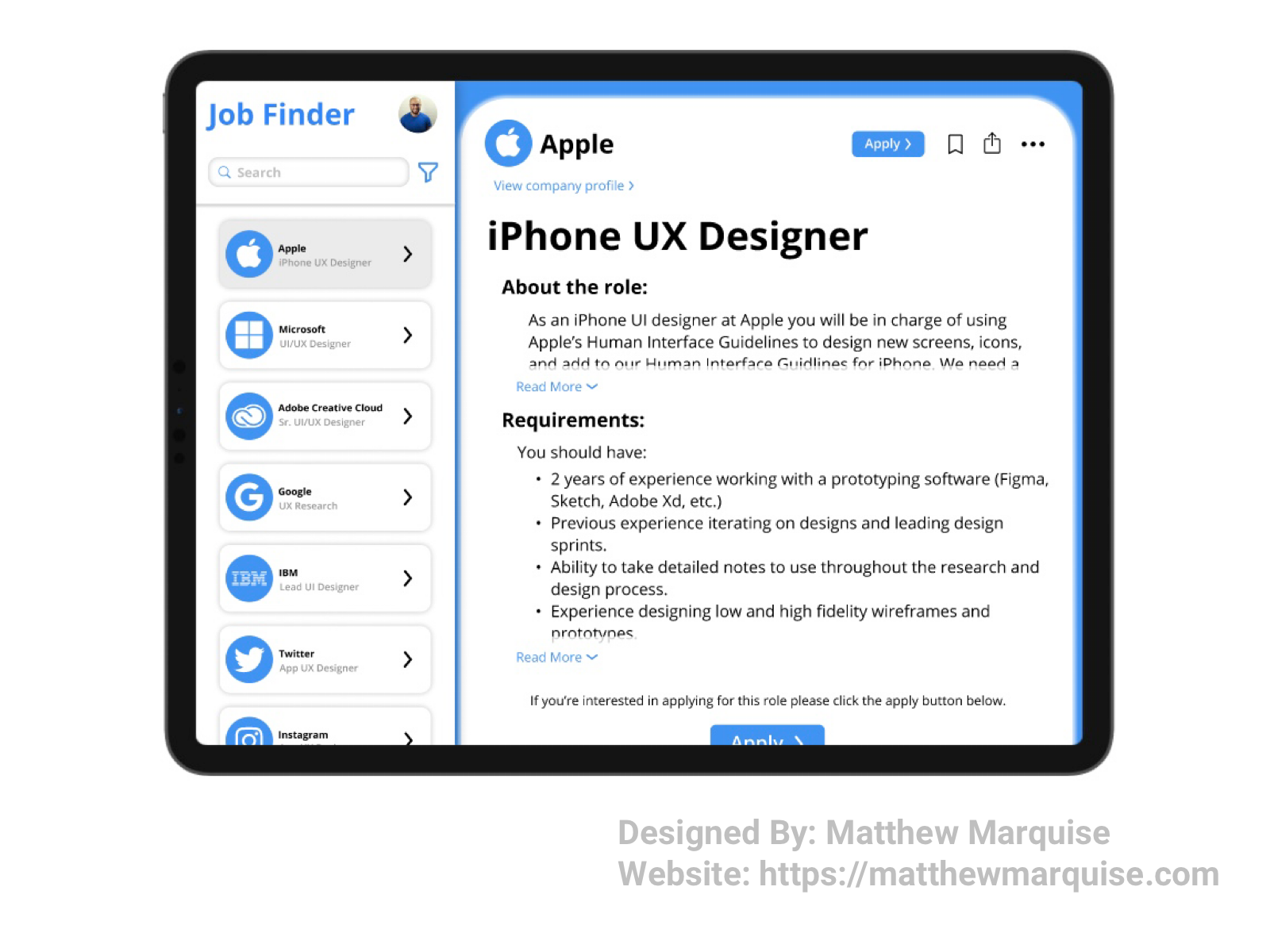
Daily UI 050 :: Job Listing
Deisgn Notes:
Firstly, I must say that I am now halfway through Daily UI's 100 day challenge and I cannot express how excited I am to have reached this major checkpoint. These 50 challenges have gone by quick, but I've truly enjoyed each one so far. It's important that job listings are not cluttered, but instead concise. Companies may have low response ratings to a job listing if users of a job search platform can't understand the job requirements or submit an application. This job search app has a layout that makes it easy for the user to learn about a company, read job requirements, and apply to jobs because the app uses clearly labeled buttons, simple icons, accessible colors, and concise labels.
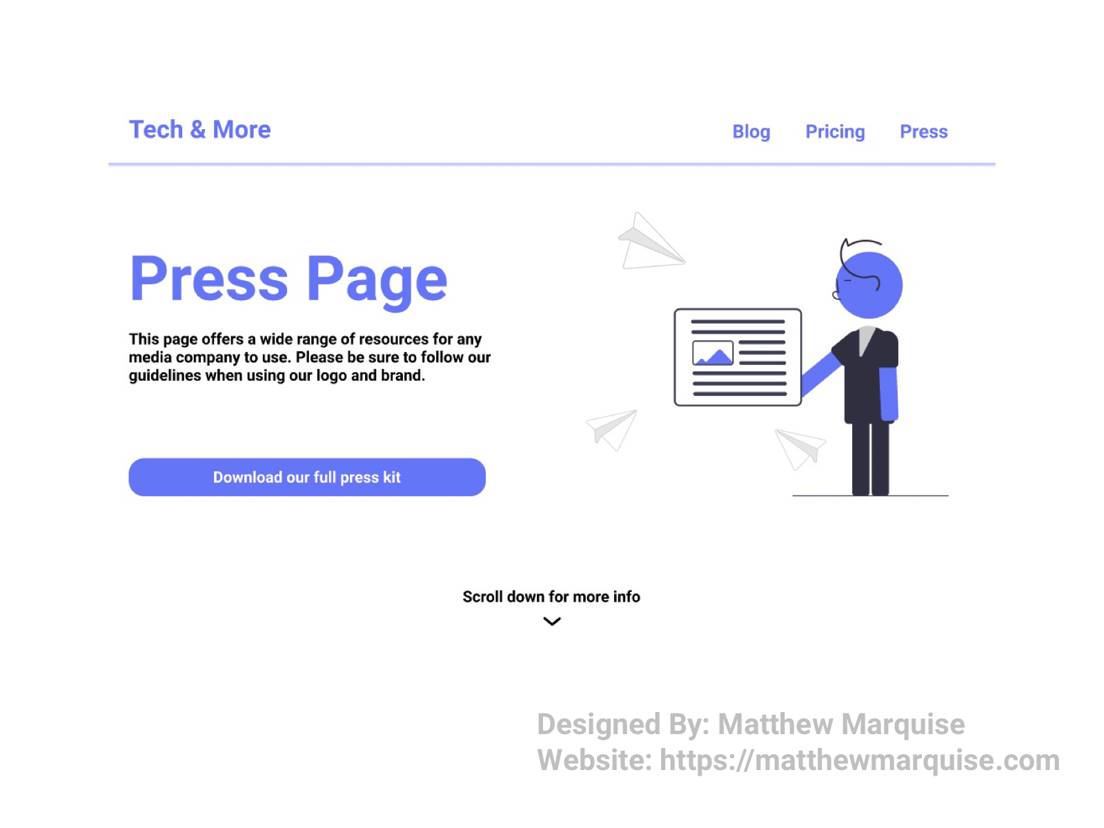
Daily UI 051 :: Press Page
Deisgn Notes:
This press page informs media outlets of their brand's style guidelines such as logo and font usage. A press page must be concise and minimal, giving publications all necessary resources while saving them time.
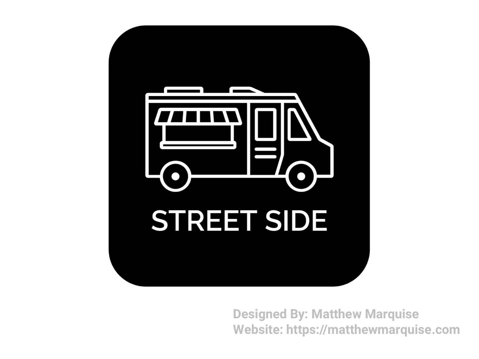
Daily UI 052 :: Logo Design
Deisgn Notes:
This logo is for an app I've been designing for Google's UX design certification course. The app will allow users to order from food trucks, therefore a food truck icon is used in the logo along with the app name "street side" below it making this logo is modern, simple, and easily recognizable. The color theme for the logo is black and white as the app I'm designing also uses this theme.
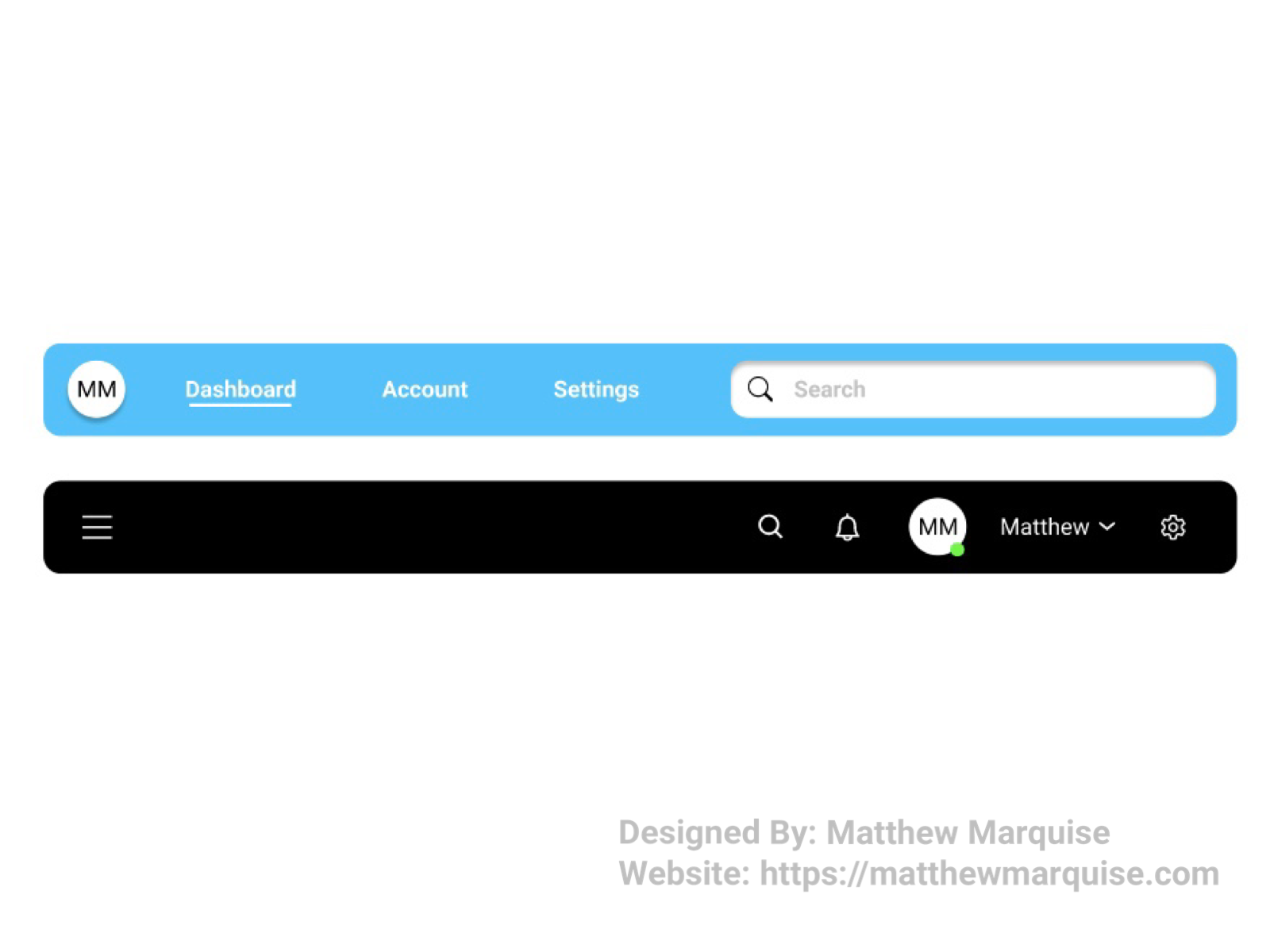
Daily UI 053 :: Header Navigation
Deisgn Notes:
These are two minimal headers that feature navigation links using text and icons. Both headers are concise and allow a user easy access to the most important links. The first header could be used in a software as it includes links to a user's dashboard, account, and settings. The second header could be used for a social app as it allows a user to directly access their profile, settings, notifications, search, and menu.
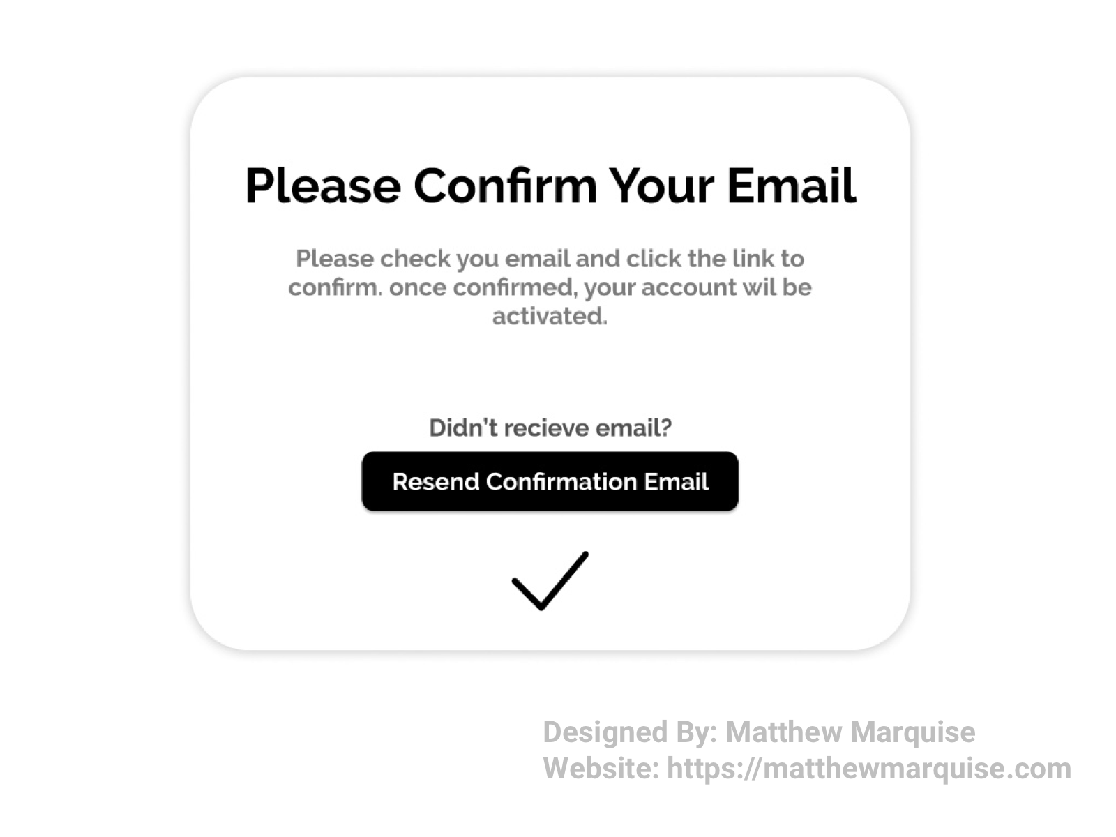
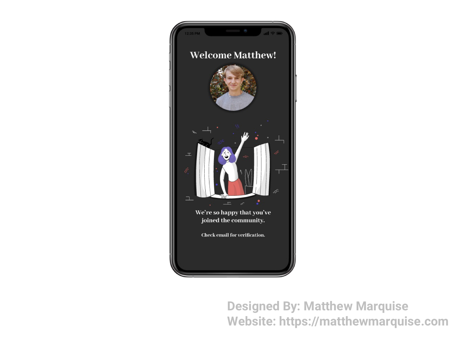
Daily UI 054 :: Confirmation
Deisgn Notes:
This confirmation notification is simple and concise, informing the user of the next steps in their account set up process. The notification tells a user to check their email to confirm their new account.
Daily UI 055 :: Icon Set
Deisgn Notes:
Icon sets are extremely helpful to both designers and developers as they provide a consistent collection of icons to use for an app, website, or software. Icons are great to use for navigation when text isn't a good fit, therefore the icon must be easily recognizable and concise.
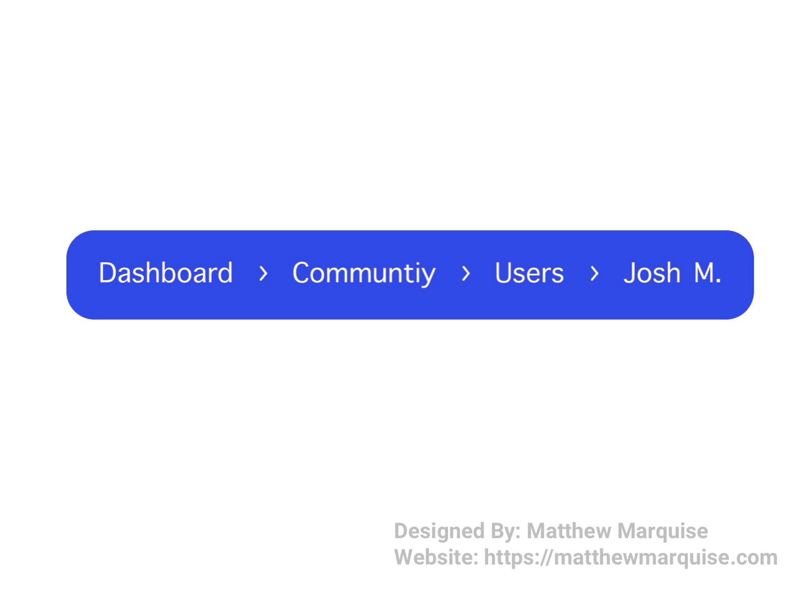
Daily UI 056 :: Breadcrumbs
Deisgn Notes:
Breadcrumbs aren't a feature that gets a lot of credit however they can be very helpful in an application, website, or software. Breadcrumbs allow a user to view the directory to where they are in the directory. If the breadcrumbs are links, then a user can easily return to a previous screen. I feel breadcrumbs are underrated and are always worth putting into any project.
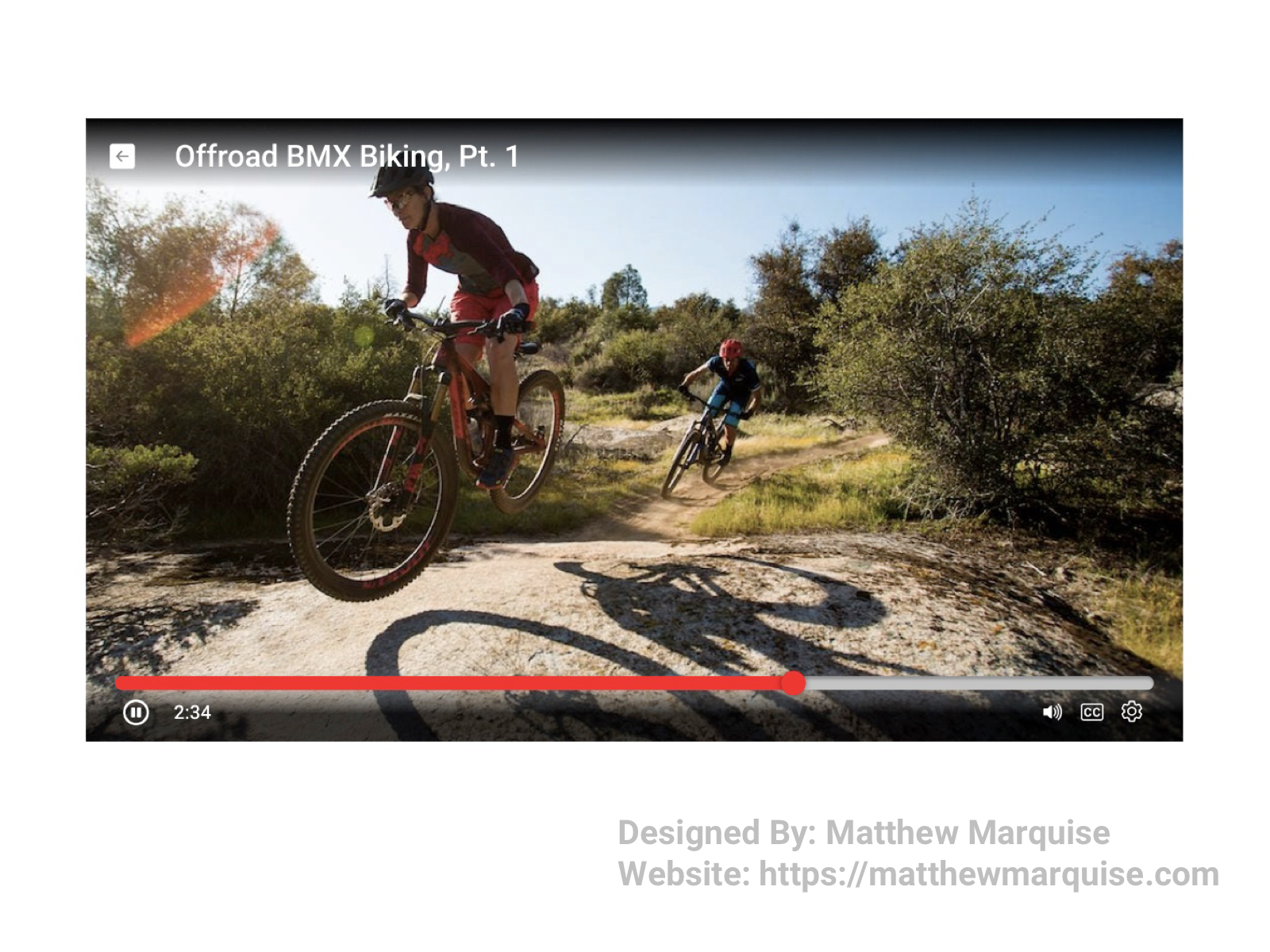
Daily UI 057 :: Video Player
Deisgn Notes:
This video player is minimal and easy to navigate as it uses icons that are easy to comprehend. A back button and the video title are located in the top left corner of the player. Across the bottom of the player, the player's timeline is located above the play/pause button, timestamp, volume, closed captions, and settings icons.
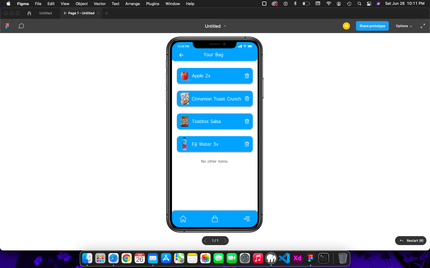
Daily UI 058 :: Shopping Cart
Deisgn Notes:
Shopping carts or shopping bags are common in digital shopping apps and websites. A shopping cart must be concise so a user knows exactly what they're ordering. Using light colors, such as the blue used in this design, is better than using dark, vibrant colors that can cause a user to feel uncomfortable and overwhelmed.
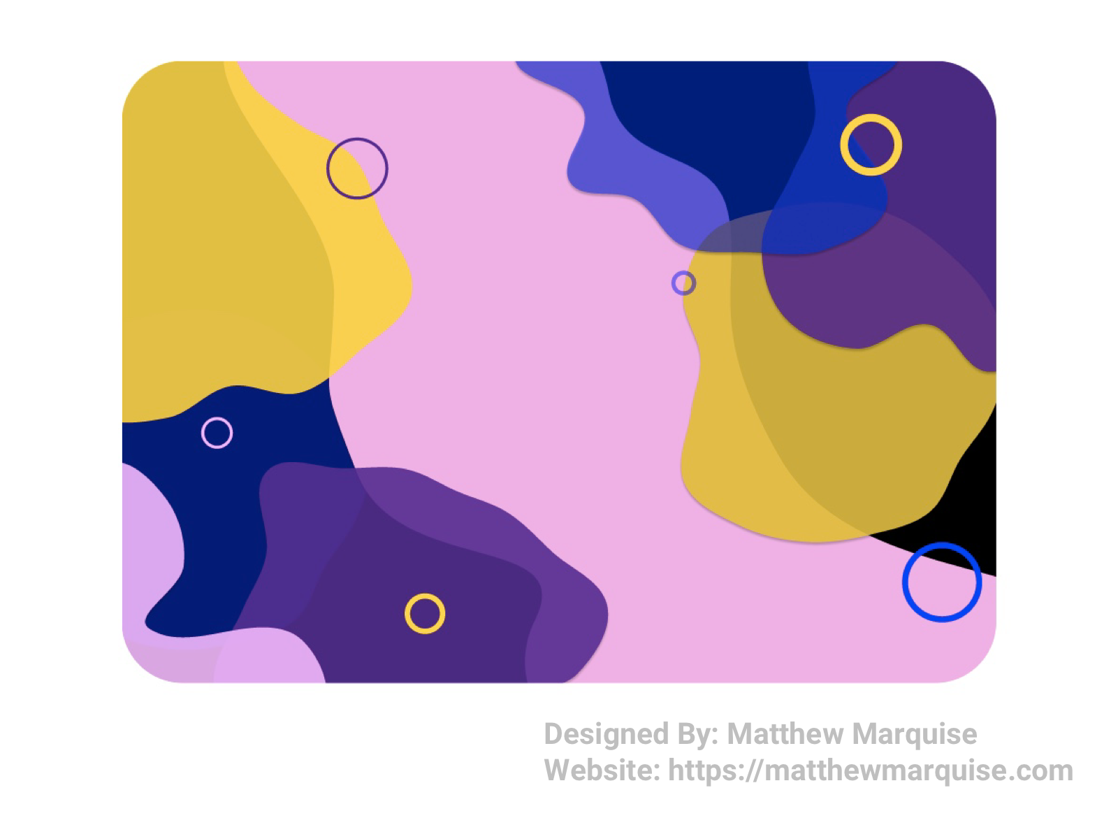
Daily UI 059 :: Background Pattern
Deisgn Notes:
The various liquid abstract shapes in this design make for a stunning background for any website or app, even a desktop wallpaper. Each shape is designed with fluidity in mind, allowing the background pattern to be less formal and more playful.
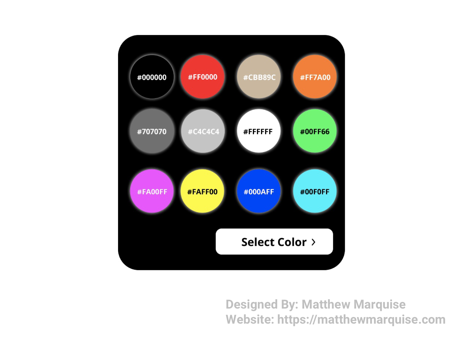
Daily UI 060 :: Color Picker
Deisgn Notes:
This color picker is very minimal yet straight forward. Each color shown has its hex value with it. A user would select one of these colors, and then press/click the "select color" button.
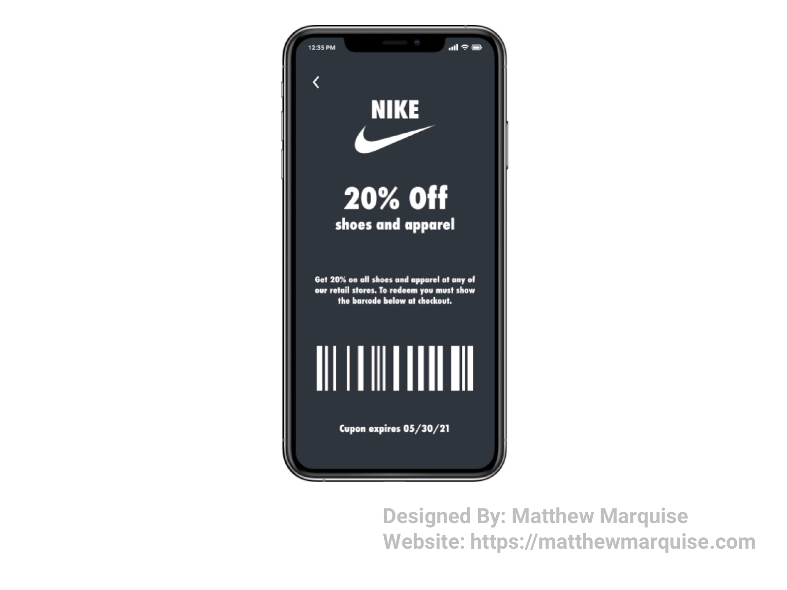
Daily UI 061 :: Redeem Coupon
Deisgn Notes:
This coupon app allows users to redeem their earned coupons from their virtual wallet. Users simply choose the coupon and show the barcode at checkout to redeem. The design is very minimal yet concise as it's only necessary for the coupon's code, details, and expiration date to be displayed.
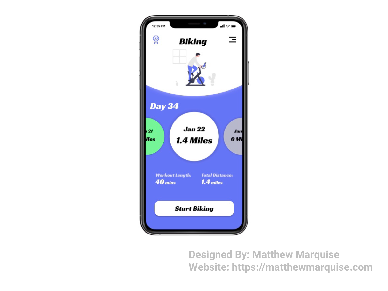
Daily UI 062 :: Workout Tracker
Deisgn Notes:
This workout tracker allows users to view their current and previous workout data and encourages the user to complete each day's activity using a ranking system. For example, this user has already completed 33 days of their daily biking activity. In the top left corner you'll notice a small badge with the number 33 inside, representing the total completed days of biking.
Daily UI 063 :: Best Of My Designs
Deisgn Notes:
This is a collection of my best Daily UI designs so far. Each of these designs are similar in that they all are modern, minimal, and concise. My favorite designs so far are the coupon app, the crypto trader app, the calendar, and the airfare app. Explore the rest on my projects on Bēhance and Dribbble, as well as on my website.
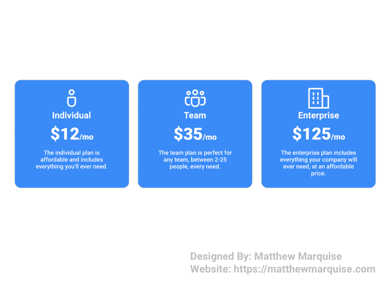
Daily UI 064 :: Select User Type
Deisgn Notes:
Offering different tiers or user types at sign up is a great way to include all of the various user types. Offering different user types is also a great way to garner data. In my design I have three different user types: individual, team, and enterprise. Each type has different offerings based on the amount of total users per account.
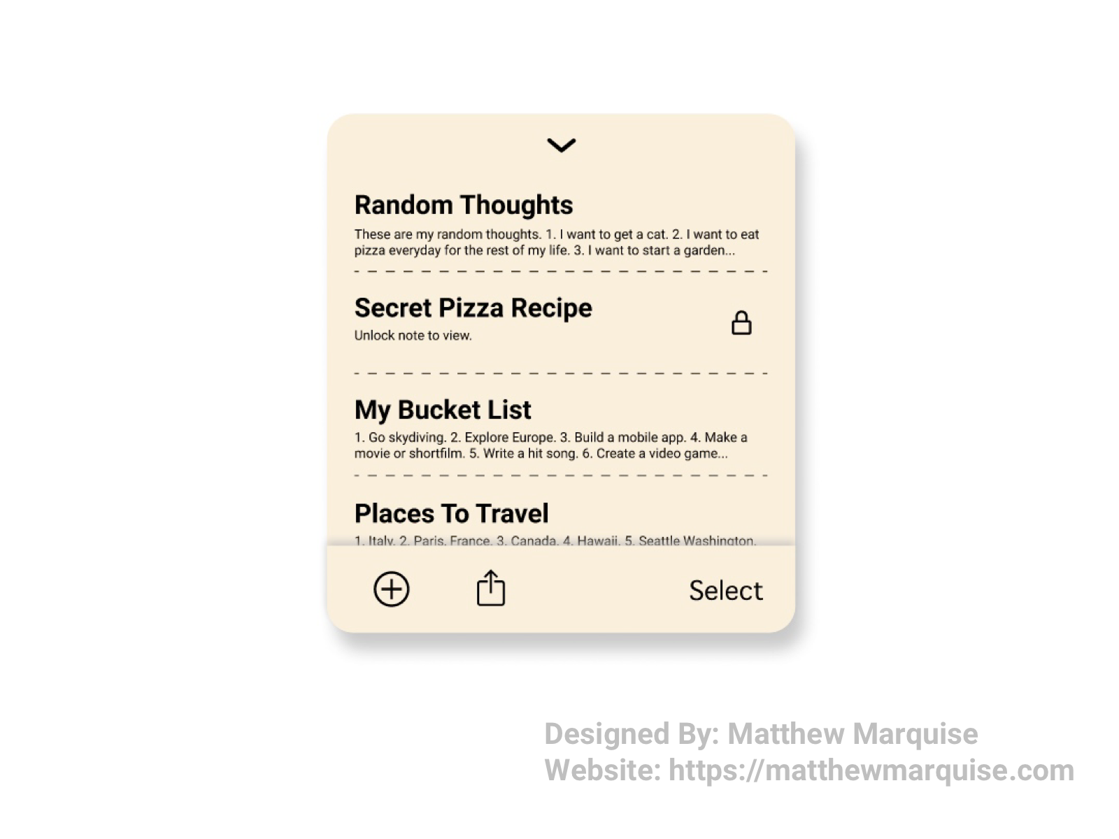
Daily UI 065 :: Notes Widget
Deisgn Notes:
This notes widget is very minimal but also very useful. A user can easily view and edit previously created notes, create new notes, share the notes, and select notes to delete. A user also has the ability to password protect their notes for their private notes.
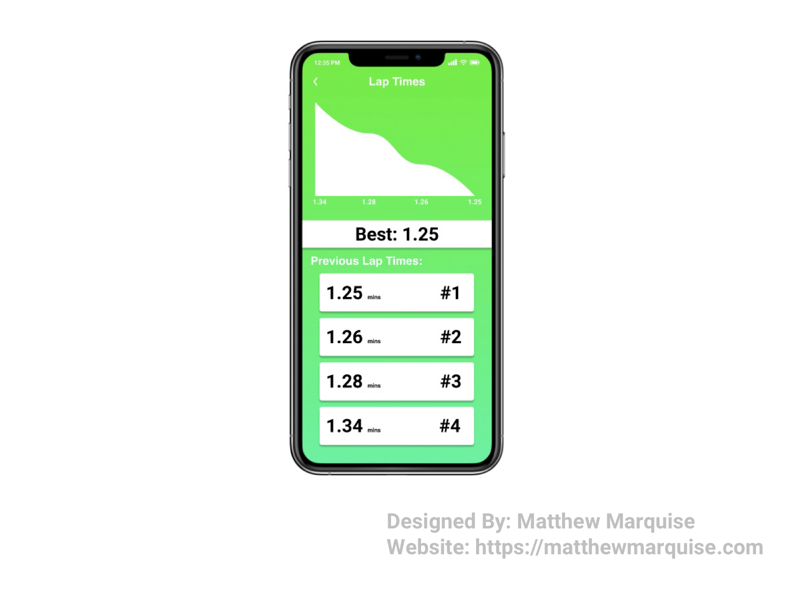
Daily UI 066 :: Statistics
Deisgn Notes:
This run lap tracking app allows a user to view all previously recorded laps they've run. Using the lap time data, the app creates a statistical graph offering a great way to show trends in a user's lap times. Understanding the trends and recorded times can help a user adjust their run speed to decrease their lap time.
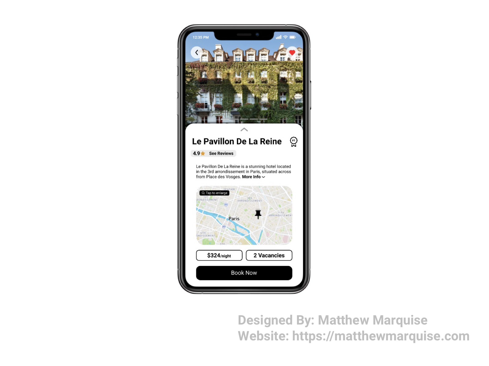
Daily UI 067 :: Hotel Booking
Deisgn Notes:
This app allows users to easily book a hotel room. Each hotel has a profile featuring their rates, reviews, vacancies, location, photos, and other important information. A user can also favorite a hotel. Once the user has chosen a hotel to stay at, they can been the booking process by simply tapping the "book now" button.
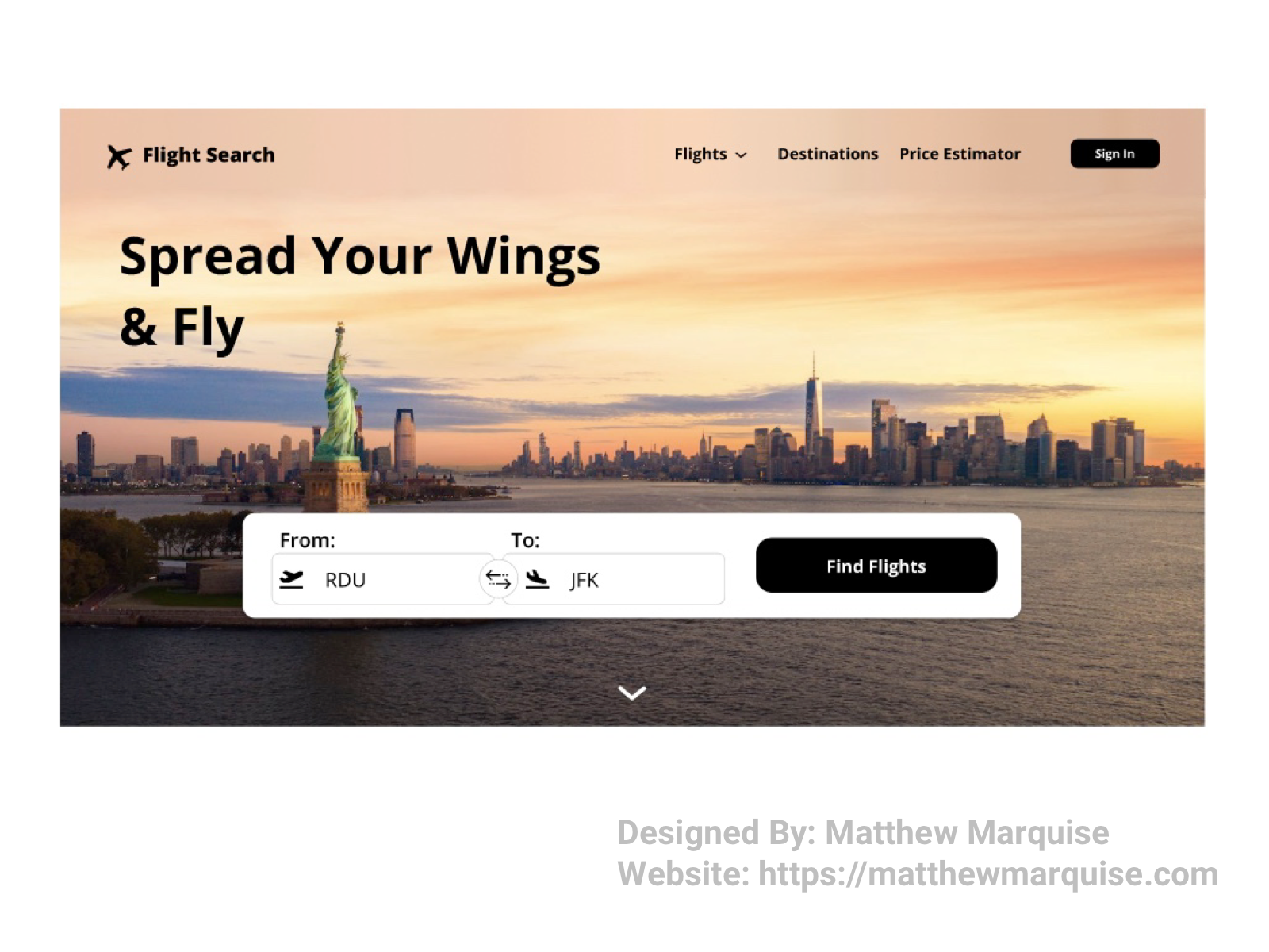
Daily UI 068 :: Flight Search
Deisgn Notes:
This website design gives users the ability to search for flights to their desired destination. From the home screen, users simply choose their departure (from) and destination (to) locations. Afterwards, users then select the "find flights" button and they are met with every flight between the selected locations. The design is minimal and labels are concise so users can easily move through the flow and find the perfect flight.
Daily UI 069 :: Trending
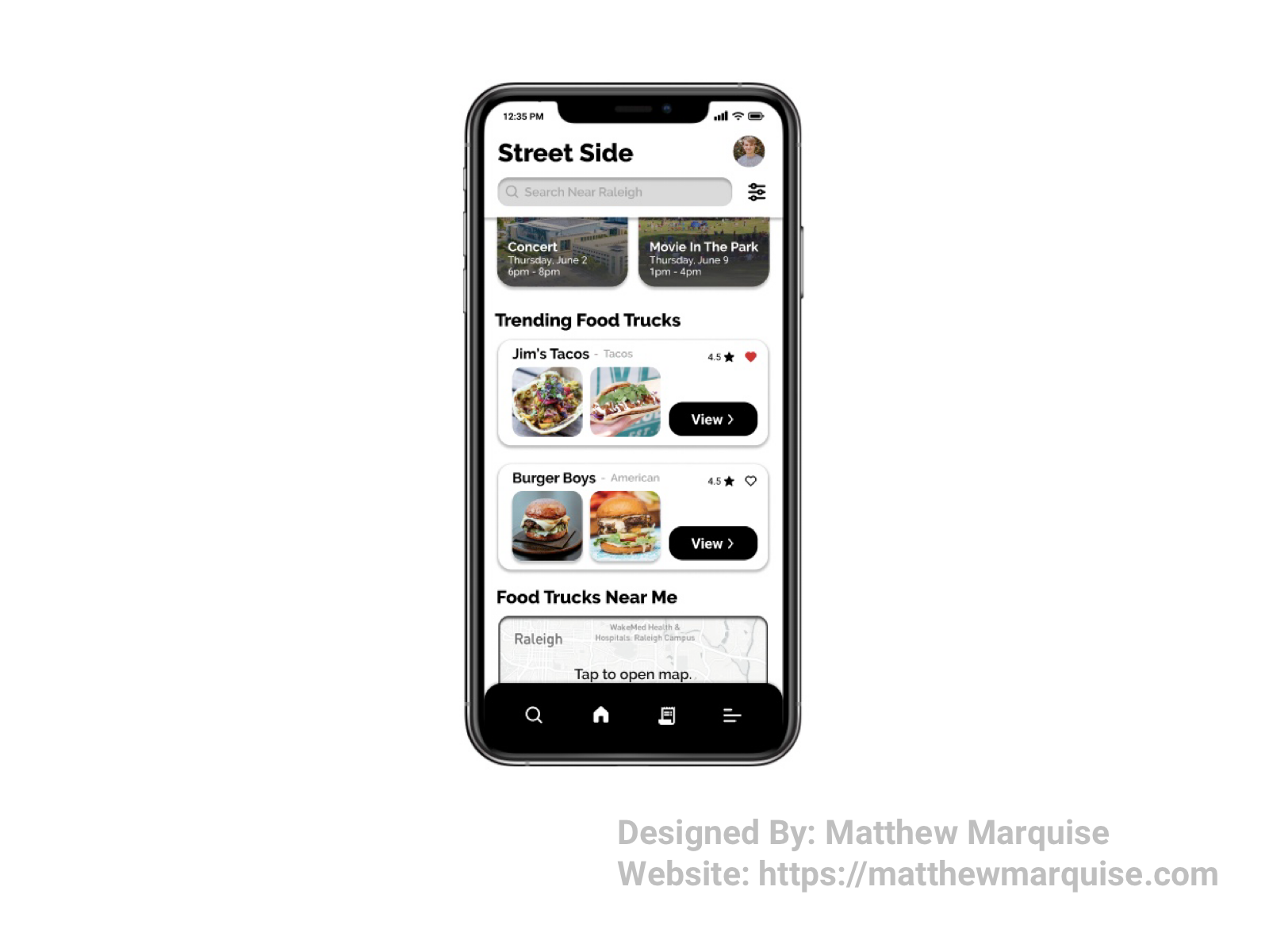
Deisgn Notes:
This is a portion of the home screen of a concept app I've been designing called Street Side. The section is labeled trending food trucks and features various popular trucks in the user's local area. As shown in the design, a user can easily view a food truck's profile using the "view" button on the card from the trending list. Each card also features great photos of the food served and the current overall rating of the featured trucks. The design is minimal and concise allowing the user to not become confused and enjoy the experience.
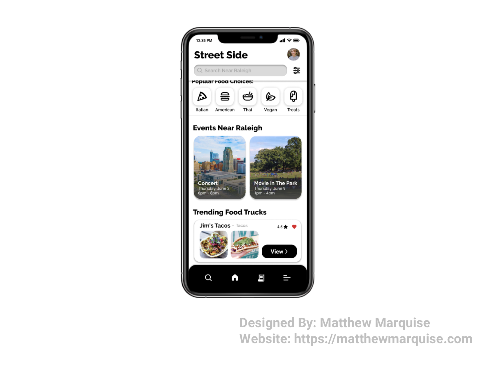
Daily UI 070 :: Event Listing
Deisgn Notes:
A key feature of a concept app I've been working on called Street Side is event listings. As seen on the design's home screen above, a user can easily see the upcoming events in their local area. If a user taps on an event they're interested in attending, they'll be guided to a screen specifically for that event. That page would have information on everything that's happening as well as what food trucks will be attending the event.
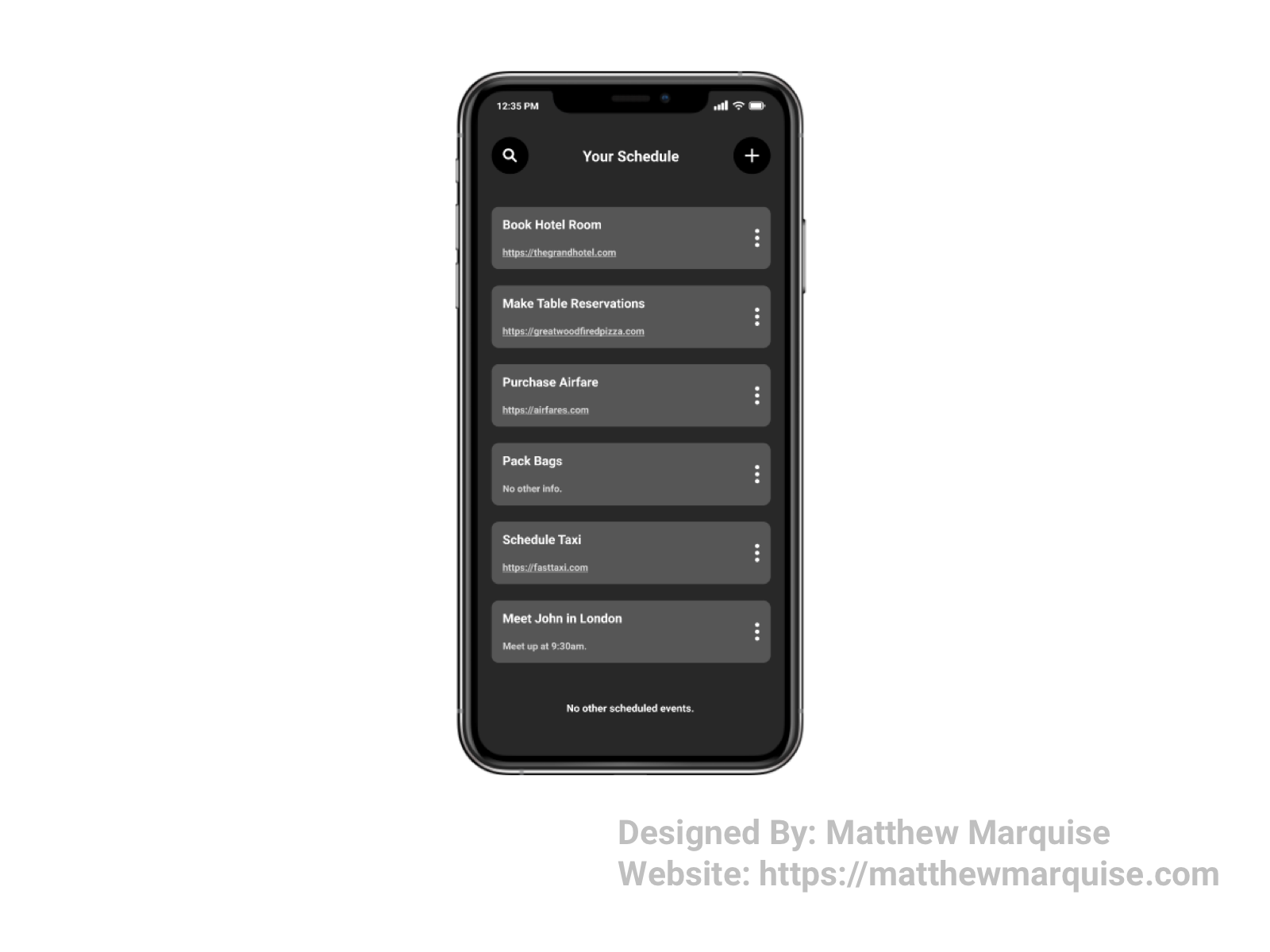
Daily UI 071 :: Schedule
Deisgn Notes:
This scheduling app offers a minimal, and modern, dark mode themed, design that allows users to focus on viewing, making changes to, and achieving their tasks as the app's visual design isn't overwhelming. Using the search, a user can quickly find a scheduled task. With the add button, a user can easily schedule a new task. A more icon is located on the right side of each scheduled event allowing a user to edit and delete a task.
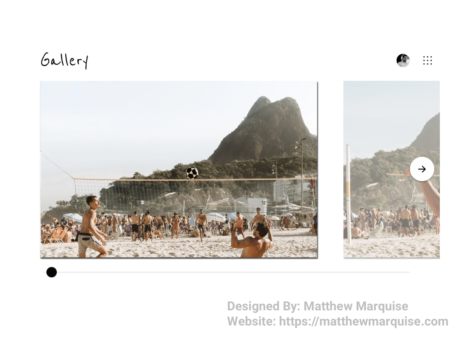
Daily UI 072 :: Image Slider
Deisgn Notes:
This photo gallery web is very modern and perfect for showing off a user's best pictures. A simple slider and next arrow button allows users to effortlessly move through their collection. A user's profile image in the top right offers quick access their account info and galleries profile. Beside that, a simple menu button enables users to quickly rearrange and delete images in their gallery. This design is all about being concise and allowing users to focus on their images rather than the gallery's design.
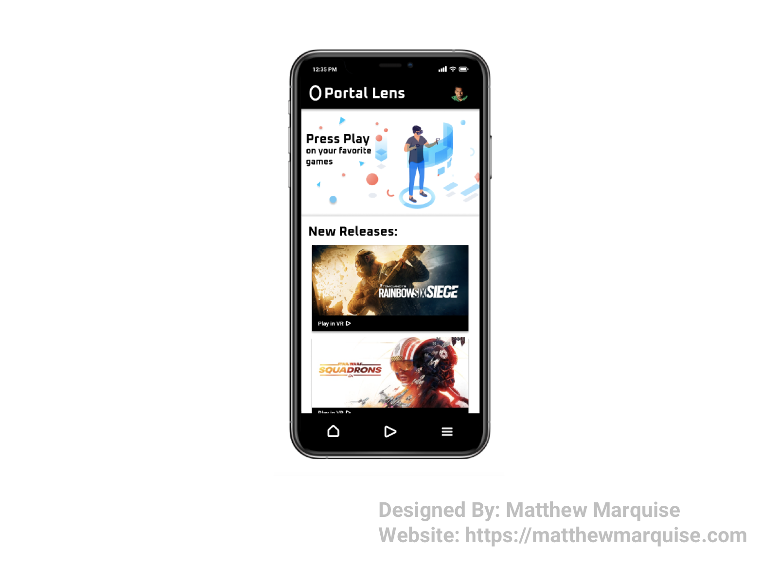
Daily UI 073 :: Virtual Reality
Deisgn Notes:
This mobile app design is centered around virtual reality gaming. It allows users to explore new games, and complete ones they've already started. The minimal black and white color theme is perfect to not distract users. Simplistic icons allow users to quickly navigate between the home, play, and menu screens of the app.
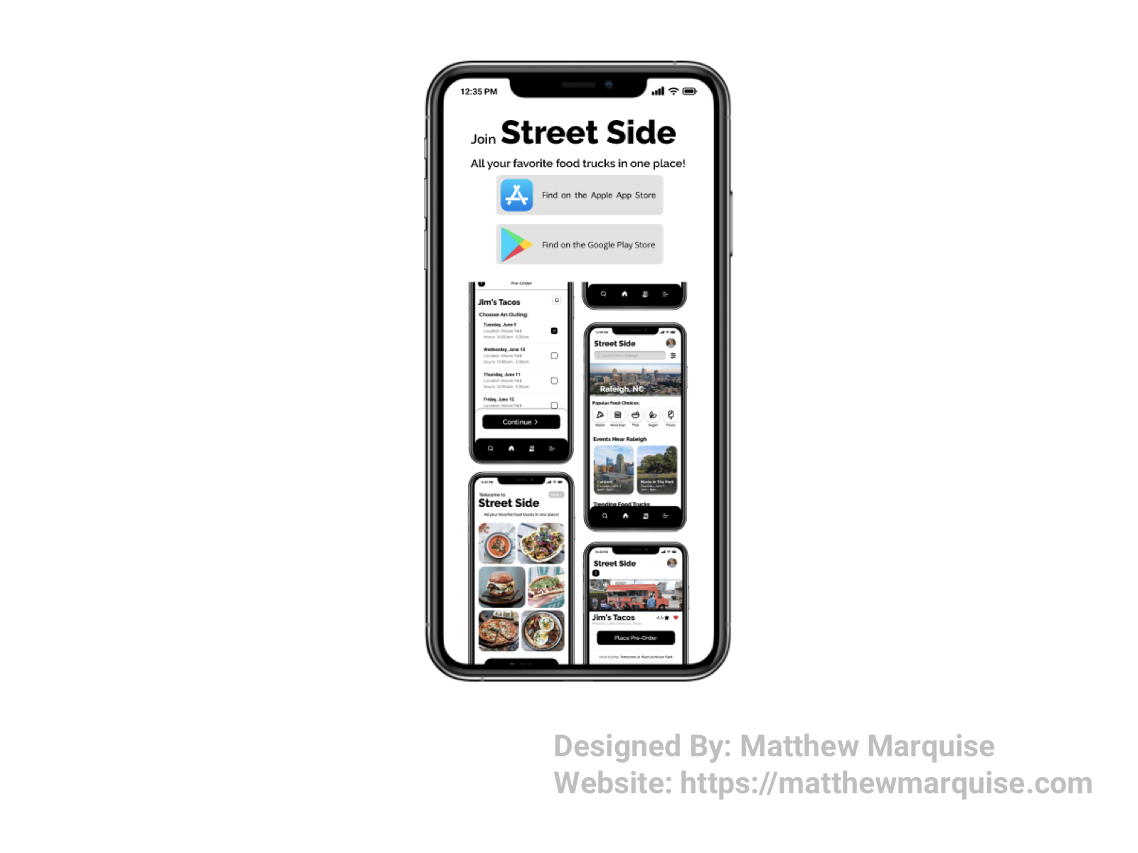
Daily UI 074 :: Download App
Deisgn Notes:
This design is from an app concept I recently designed called Street Side. To onboard new users, it's necessary to have a screen on the website to encourage users to download and use the app. It's a simplistic and modern design with two buttons allowing both Apple and Android users to easily download the app.
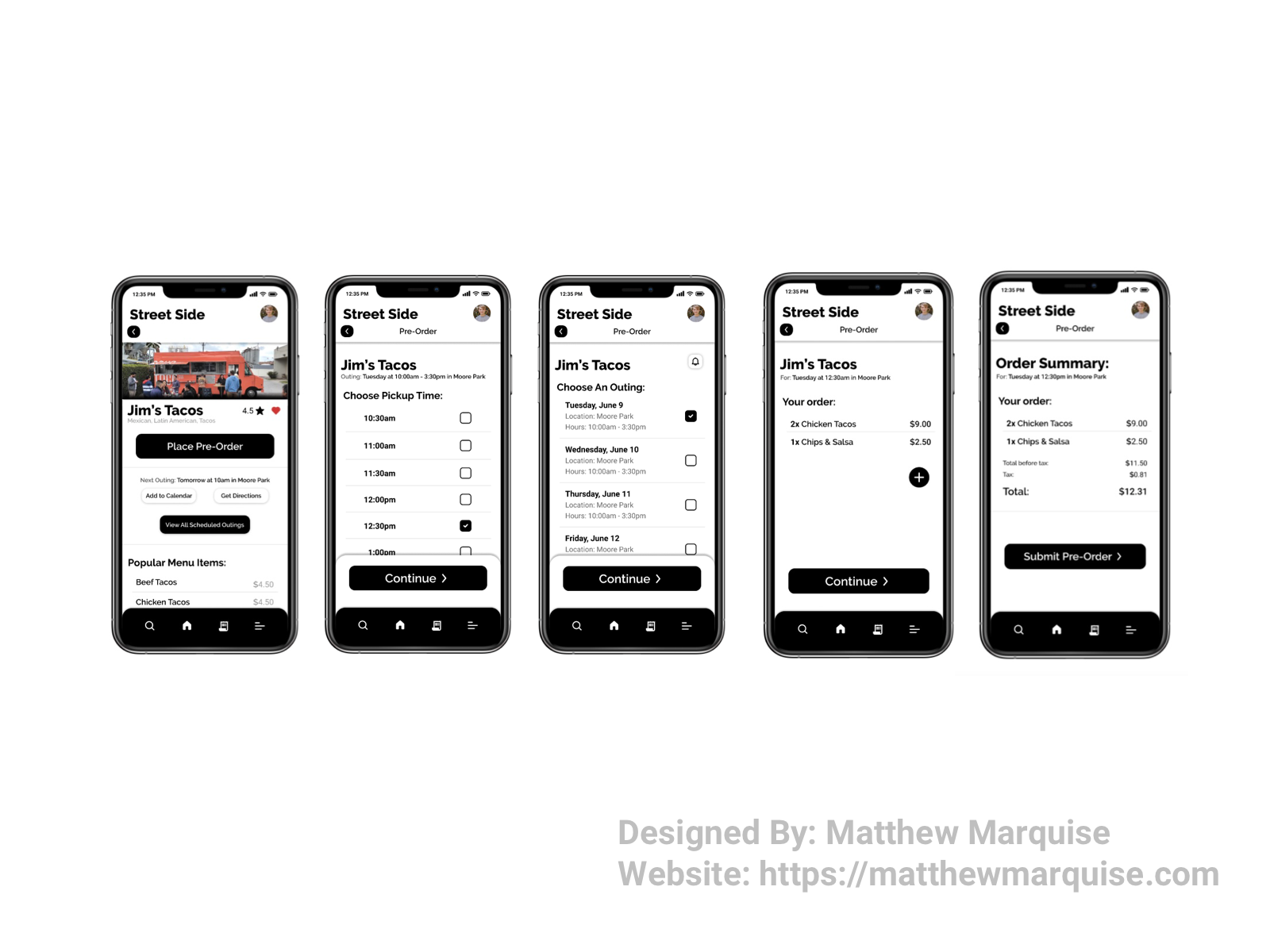
Daily UI 075 :: Pre-Order
Deisgn Notes:
This is a user flow for the pre-ordering portion of a concept app I did called Street Side. A user begins by selecting the "place pre-order" button on the vendor's profile. They are then directed to choose a scheduled out and time to pick up. Once they've selected these options, the user chooses creates their order by choosing menu items, then checking out on the final screen. This user journey is simple and headache free as users can easily achieve their goal of placing a pre-order.
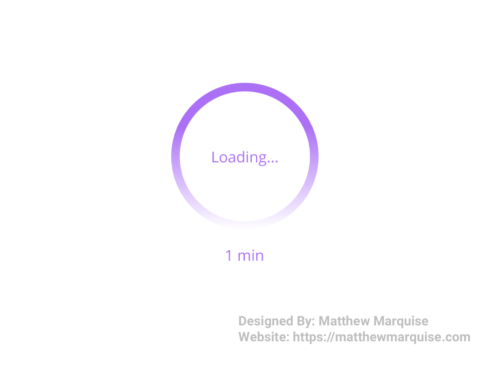
Daily UI 076 :: Loading...
Deisgn Notes:
Loading bars or spinners are very simplistic, and typically only inform users of when their download, upload, or whatever other process their device is trying to achieve, will be complete. As seen in this loading spinner, a light purple color is used as it's a color encouraging calmness and patience.
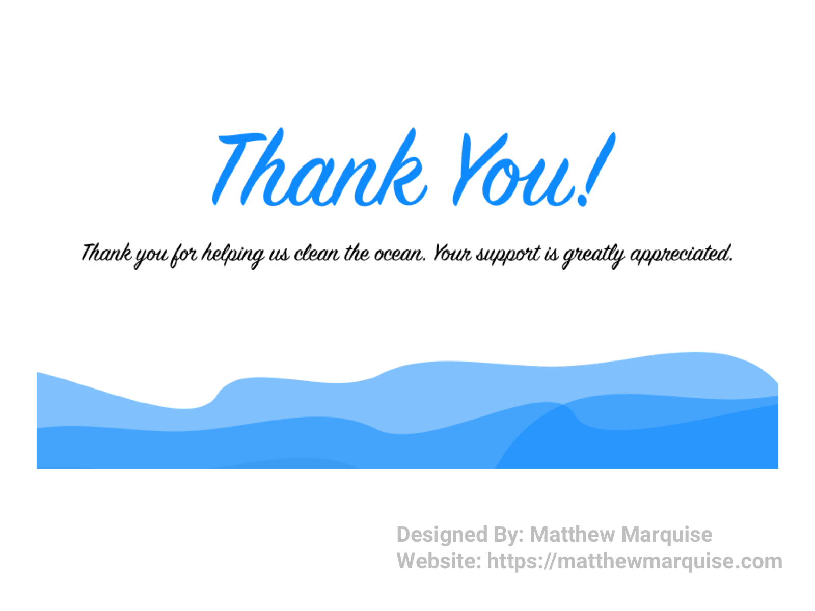
Daily UI 077 :: Thank You
Deisgn Notes:
This thank you screen is very simplistic but offers a warm feeling to users that see it. A thank you screen reminds users that they are appreciated and their purchase, donation, etc. is going to a good cause.
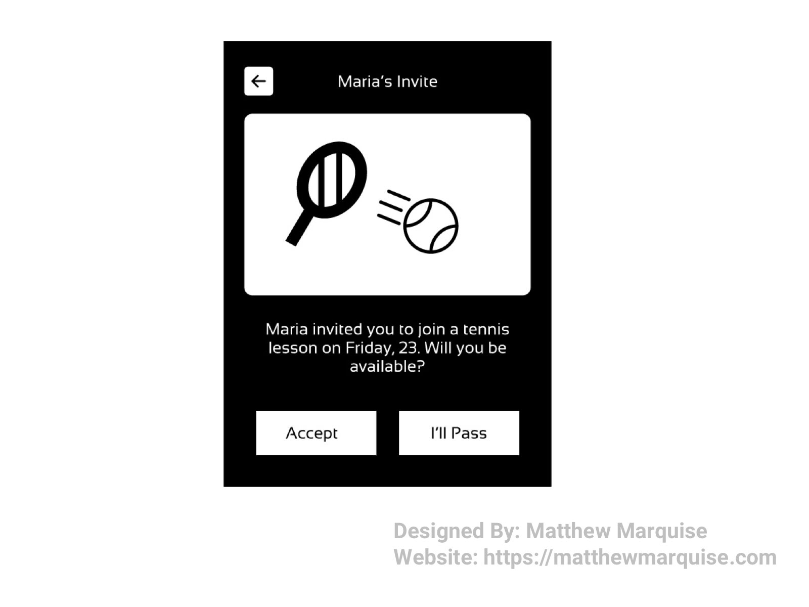
Daily UI 078 :: Pending Invitation
Deisgn Notes:
This invitation design is concise and super cute, informing a recipient they've been invited to play tennis with their friend Maria. If they can make it, they'll accept the invite, otherwise the user will politely decline. The use of black and white really works well for this design as it offers a modern and eye catching, but not overwhelming, user interface.
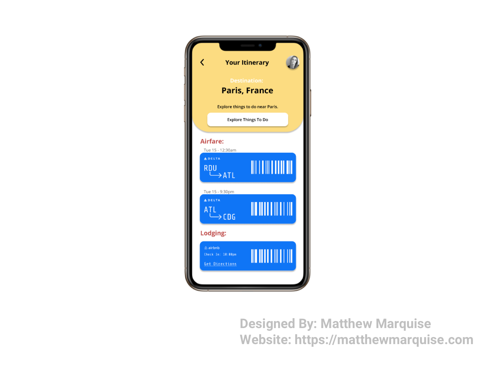
Daily UI 079 :: Itinerary
Deisgn Notes:
This mobile app design allows users to easily view their pre-filled itinerary. It lists destination, offers to allow users to explore recommended things to do at their destination, airfare tickets, and lodging reservations all from one screen. With a simplistic and modern design, this app is great for keeping track of all your travel plans.
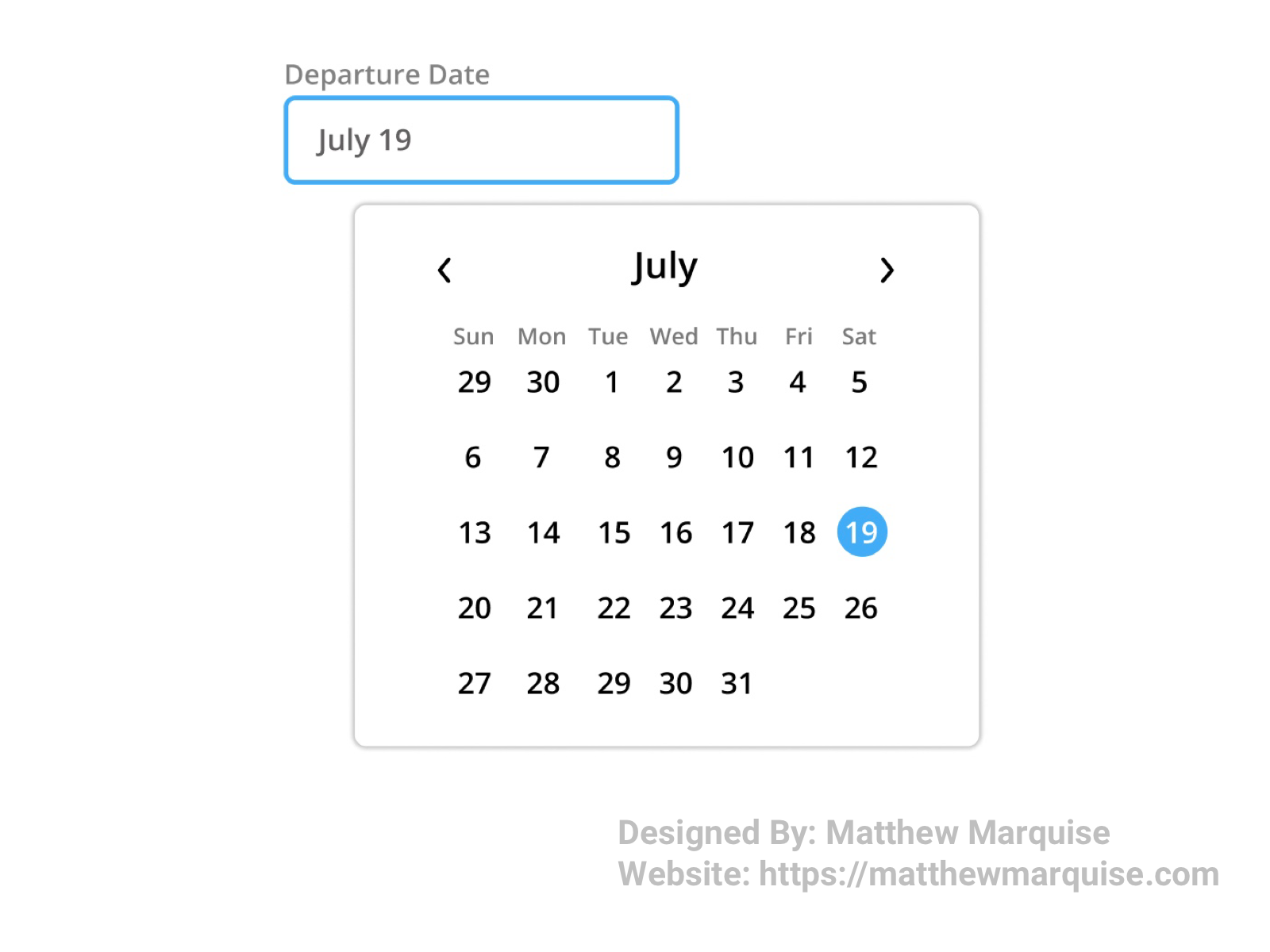
Daily UI 080 :: Date Picker
Deisgn Notes:
This date picker is very simplistic but gets the job done. With it a user can choose their departure date by selecting the desired date from the calendar list. Arrows at the top allow users to move through the months to select a date in the future.
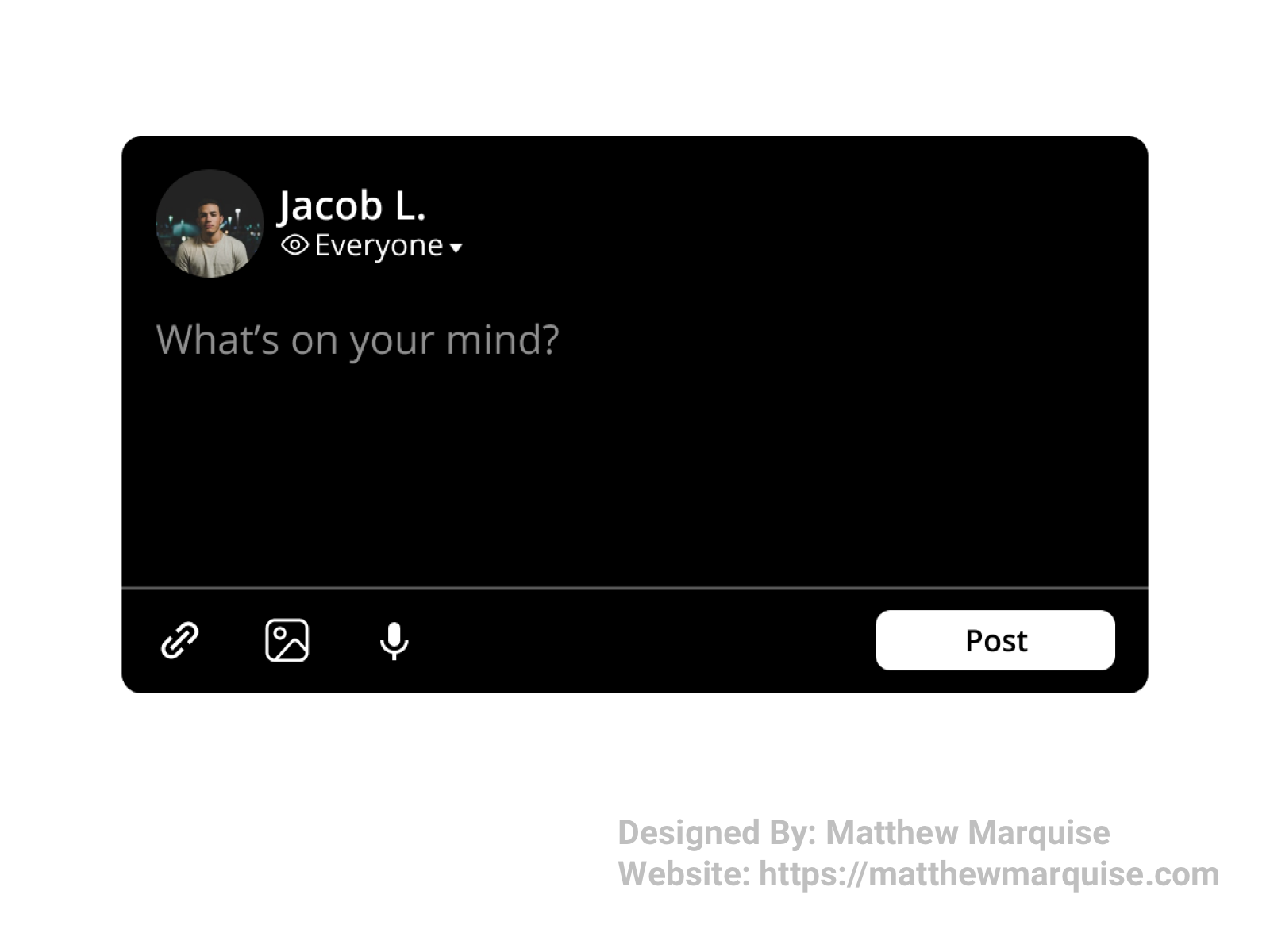
Daily UI 081 :: Status Update
Deisgn Notes:
This status update allows users to inform their friends/followers of what they're doing or what they've done recently. A user can choose the visibility of their update, add links, images or videos, and even use voice to text.
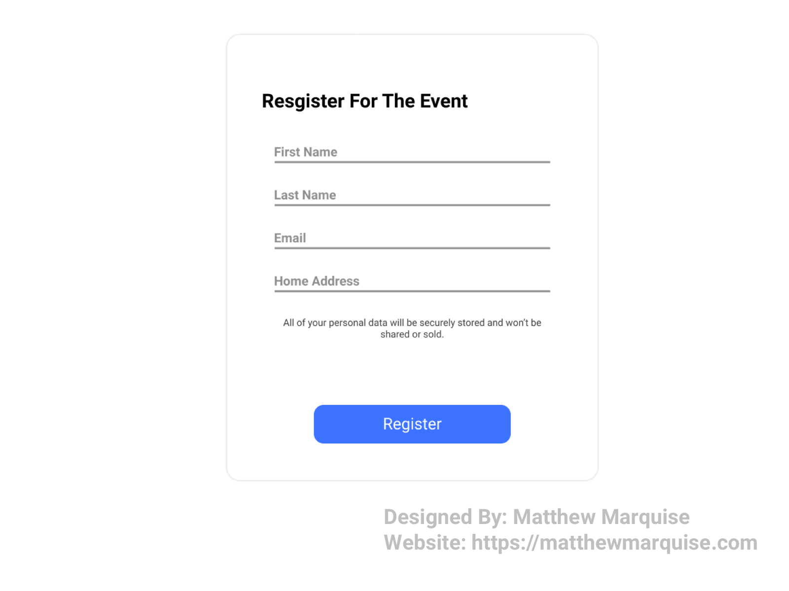
Daily UI 082 :: Form
Deisgn Notes:
This form enables users to register for an event. A user simply fills in their information like their name, email, and home address. After filling the necessary fields, tapping register submits the form data and registers the user for the event. The design is simple and not overwhelming, allowing the user to stay focused and achieve their goal.
Daily UI 083 :: Button
Deisgn Notes:
This black and white button is very minimalistic and modern. The design includes a shadow box effect that collapses upon hover.
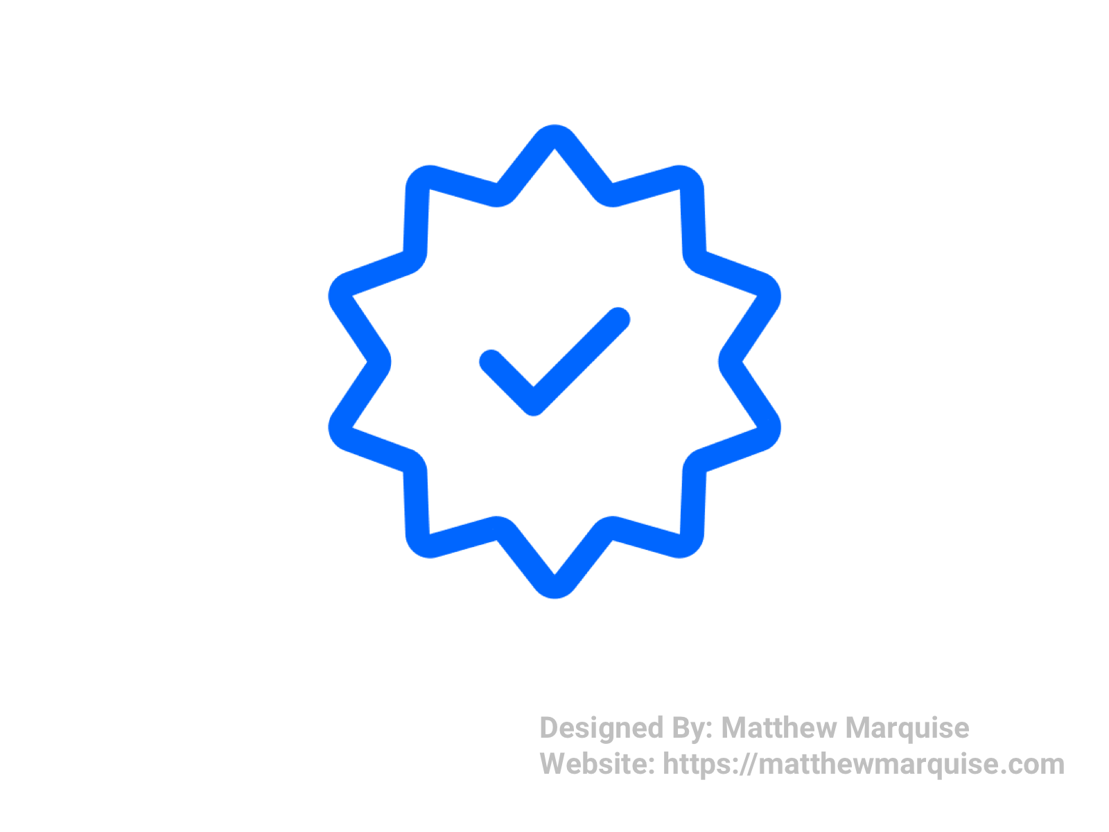
Daily UI 084 :: Badge
Deisgn Notes:
This verification badge is very minimal and has a bright blue color. On every social media platform, once a user has been verified, they are given recognition for being verified in the form of a badge. Typically, these badges are somewhat of a star shape with check marks nested inside . Though very simple, verification badges are widely used.
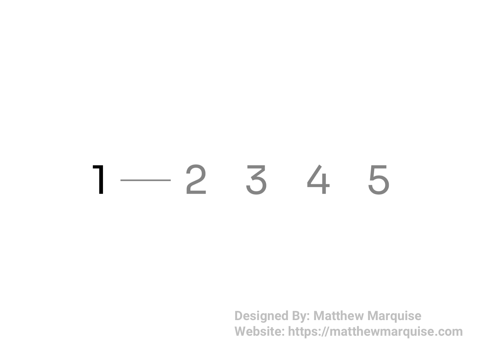
Daily UI 085 :: Pagination
Deisgn Notes:
This pagination feature is simple, modern, and eye catching. The numbers use the Sora regular font, these numbers stand out along with a simple line between the clicked number and the following number. It's a simple design but one that all users can admire.
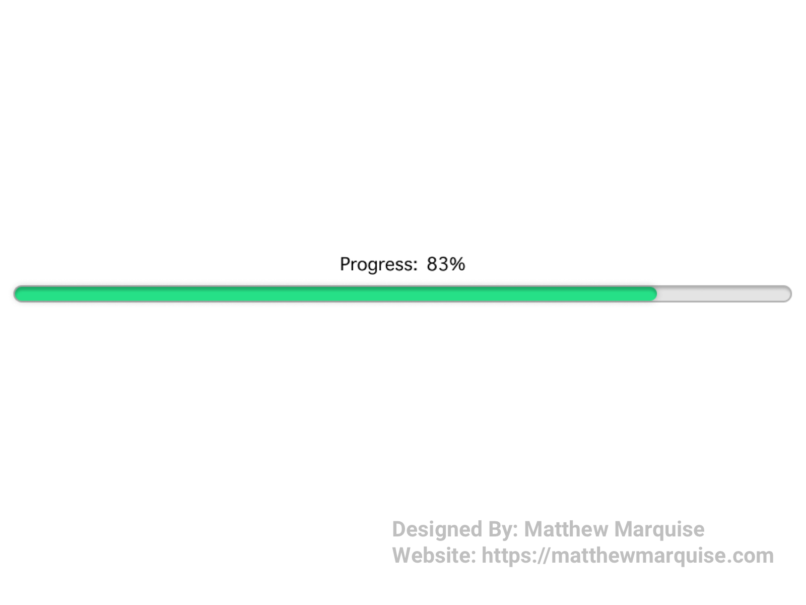
Daily UI 086 :: Progress Bar
Deisgn Notes:
This progress bar minimal and very appealing, while achieving its task perfectly. The progress bar is a way to inform users of how long their download or upload is taking. Sometimes words or phrases are used instead to represent the progress of their task. As their task gets closer to being completed, the green bar will draw closer to the end, and the progress percentage will also count up till it reaches one hundred percent.
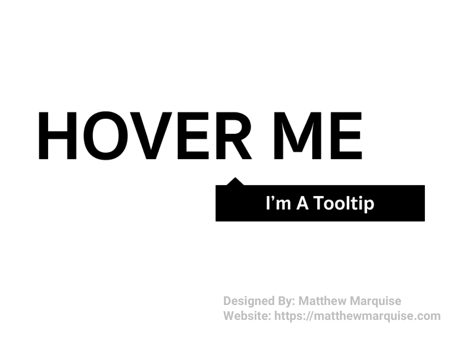
Daily UI 087 :: Tooltip
Deisgn Notes:
This tooltip is extremely simplistic but achieves everything it needs to. If and when a user hovers over the text "Hover Me", the tooltip will then appear with text below the text. Using easy-to-read fonts and a simple color scheme, tooltips should be easy to view and clearly defined as to not confuse users.
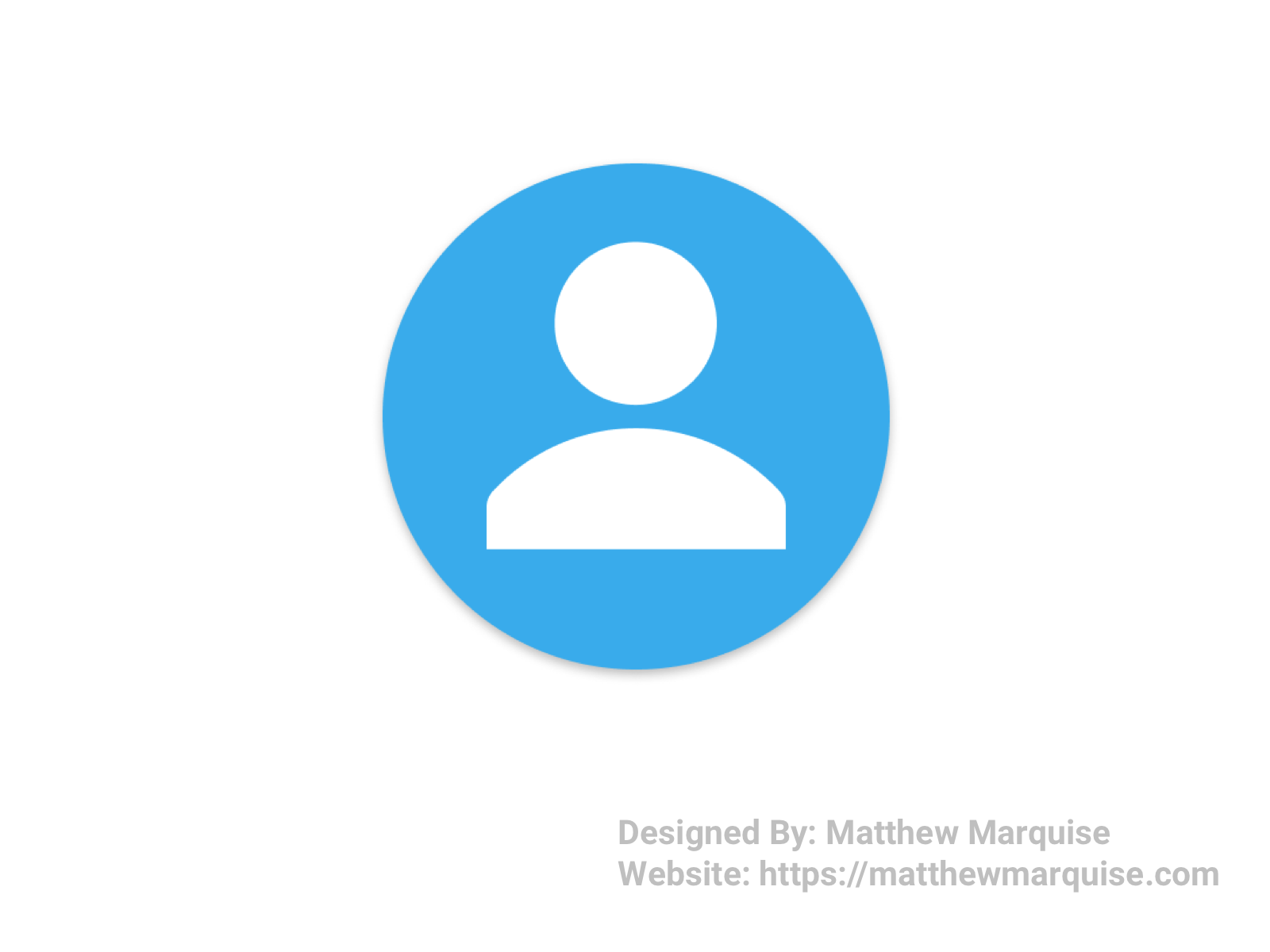
Daily UI 088 :: Avatar
Deisgn Notes:
This default avatar is perfect for any social account. The avatar uses a light blue and white color scheme.
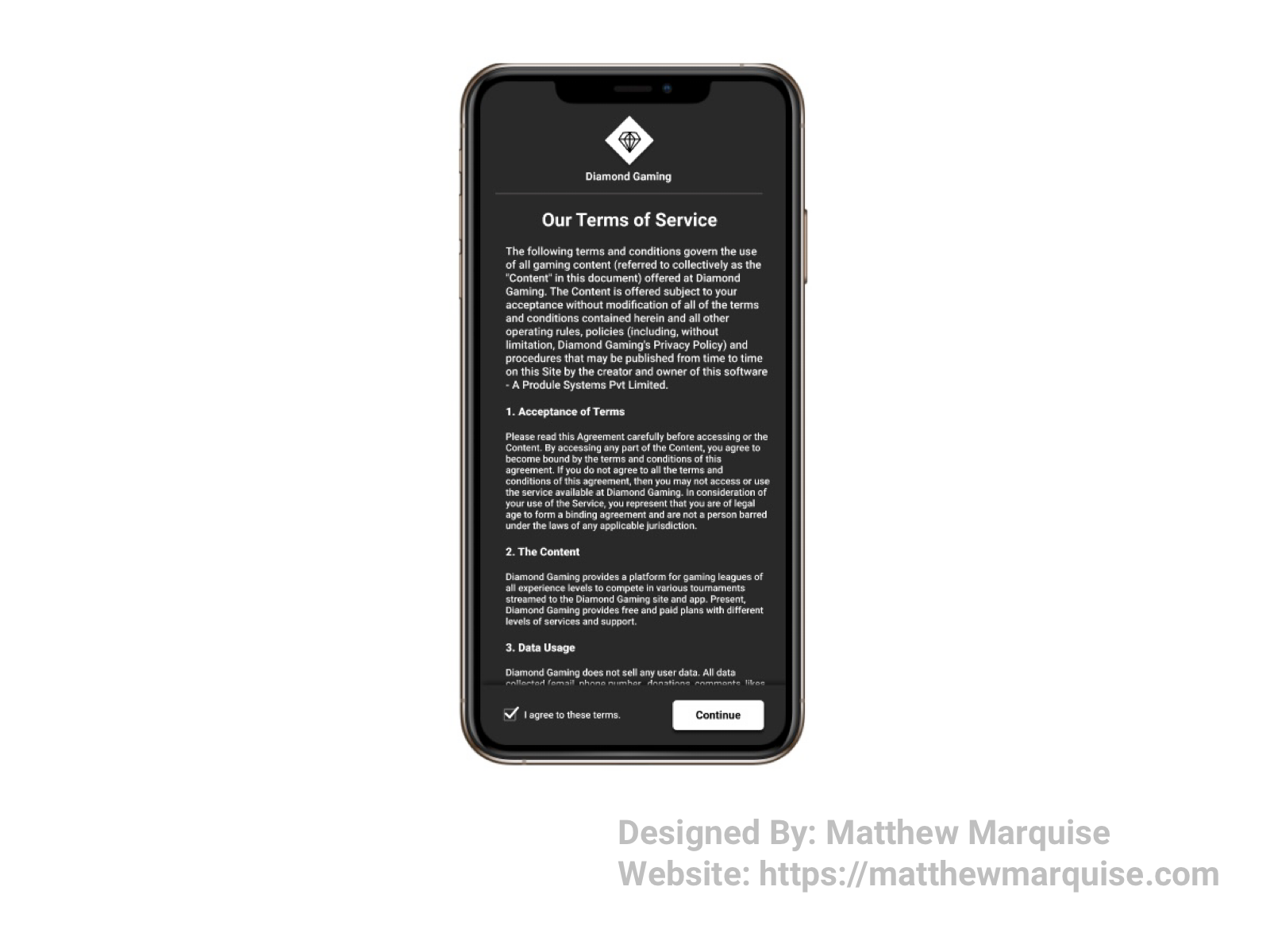
Daily UI 089 :: Terms of Service
Deisgn Notes:
Terms of Service (TOS) screens are commonly seen during the process of a user creating an account for pretty much anything they sign up for. The content of a TOS screen is never minimal, as whatever a user is signing up for must indicate how the user can use their platform, product, or service. However, the design of a TOS screen should be minimal and only include what is necessary as to not confuse or overwhelm the user. A scrollable list, displaying all of the terms and conditions allows a user to effortlessly read all of the given information. After a user has read the terms, they must agree to continue. Once checking the agree to these terms box, the continue button brightens and a user is on their way to complete the account creation process.
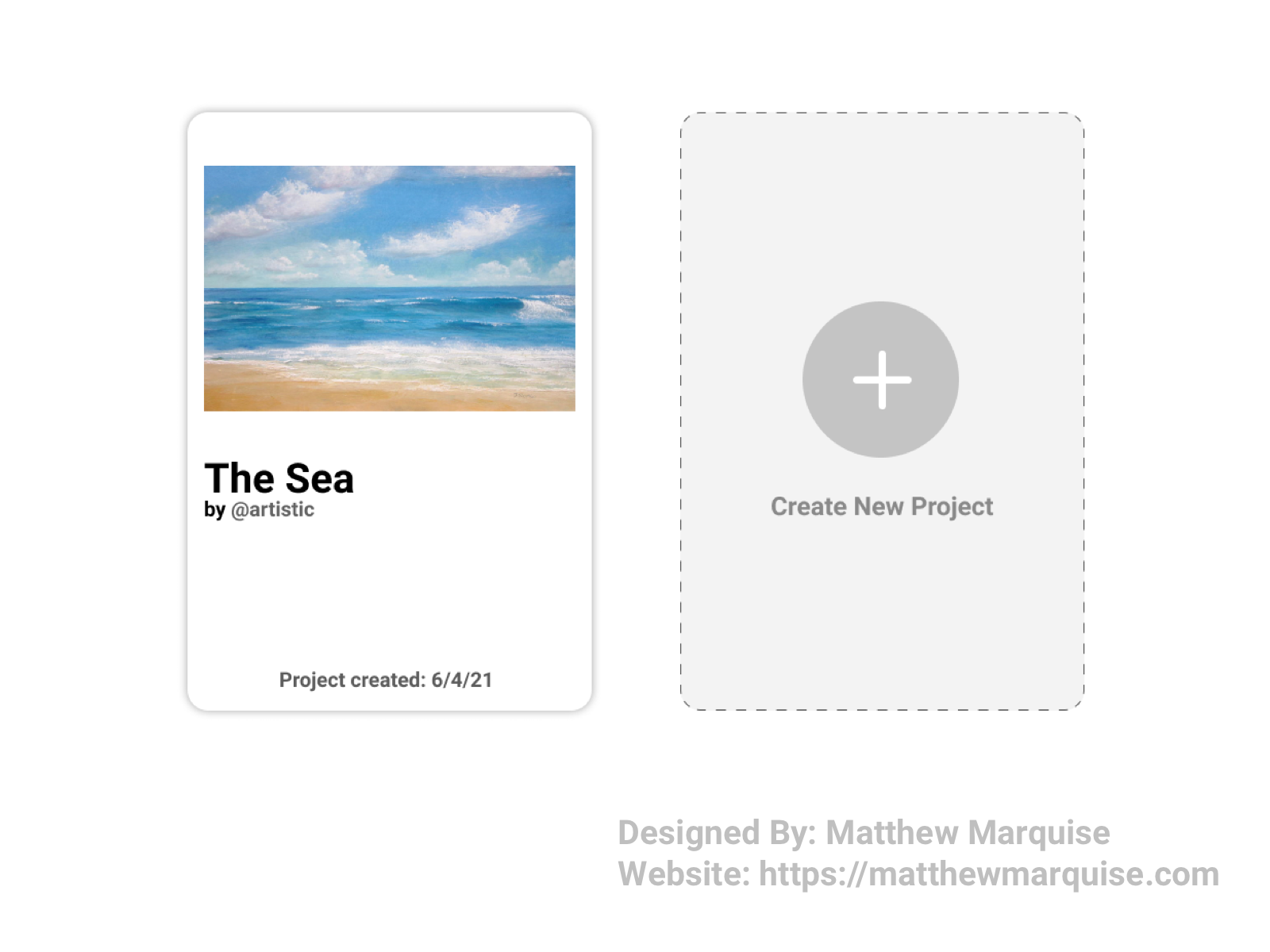
Daily UI 090 :: Create New
Deisgn Notes:
With this 'Create New' feature a user can add a new project to their portfolio. Uploading their photo, giving their project a name and hitting publish quickly adds their new project to the portfolio. Will clear labels and icons, this create feature isn't confusing.
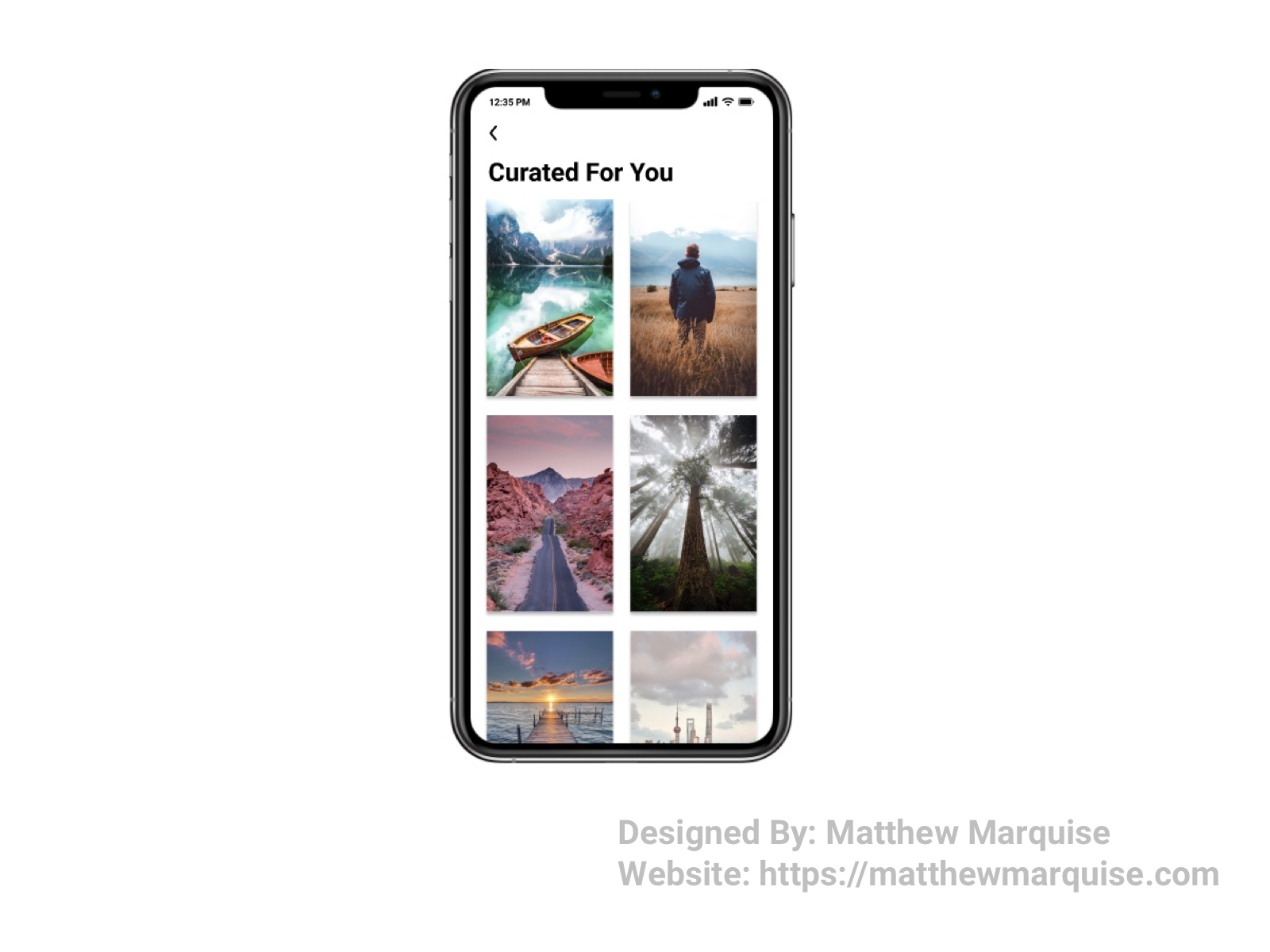
Daily UI 091 :: Curated For You
Deisgn Notes:
This screen displays various mobile wallpaper images with a simplistic and straightforward layout. Each image is curated for the user based on their previously downloaded and or favorited images.
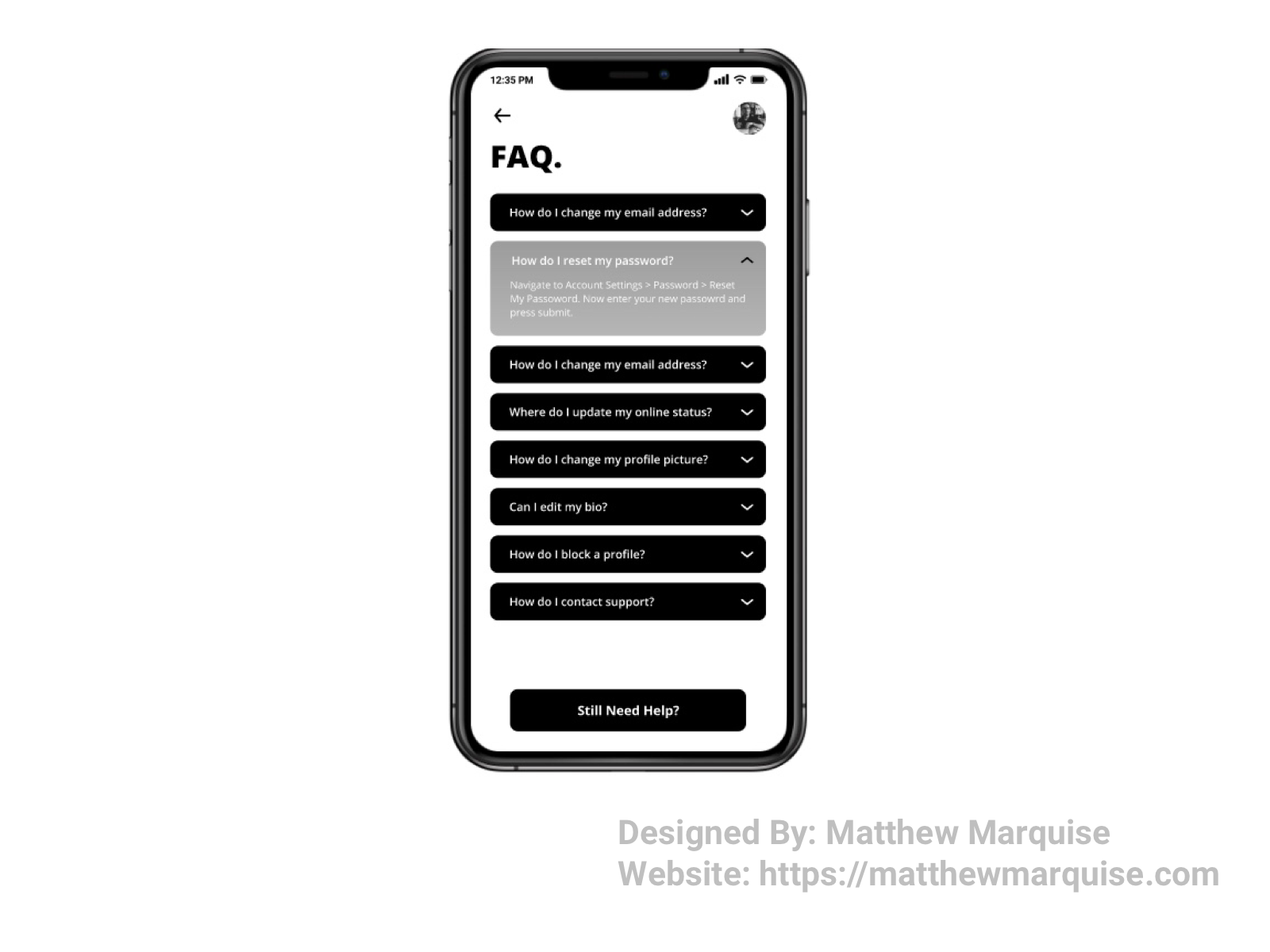
Daily UI 092 :: F.A.Q.
Deisgn Notes:
This frequently asked questions screen uses a very minimal and modern design, with a simplistic color scheme of black and white so users can focus on getting answers to their question. If a user does not find answers to their questions in any of the various drop downs, they're able to connect with a support agent by pressing the "Still Need Help" button.
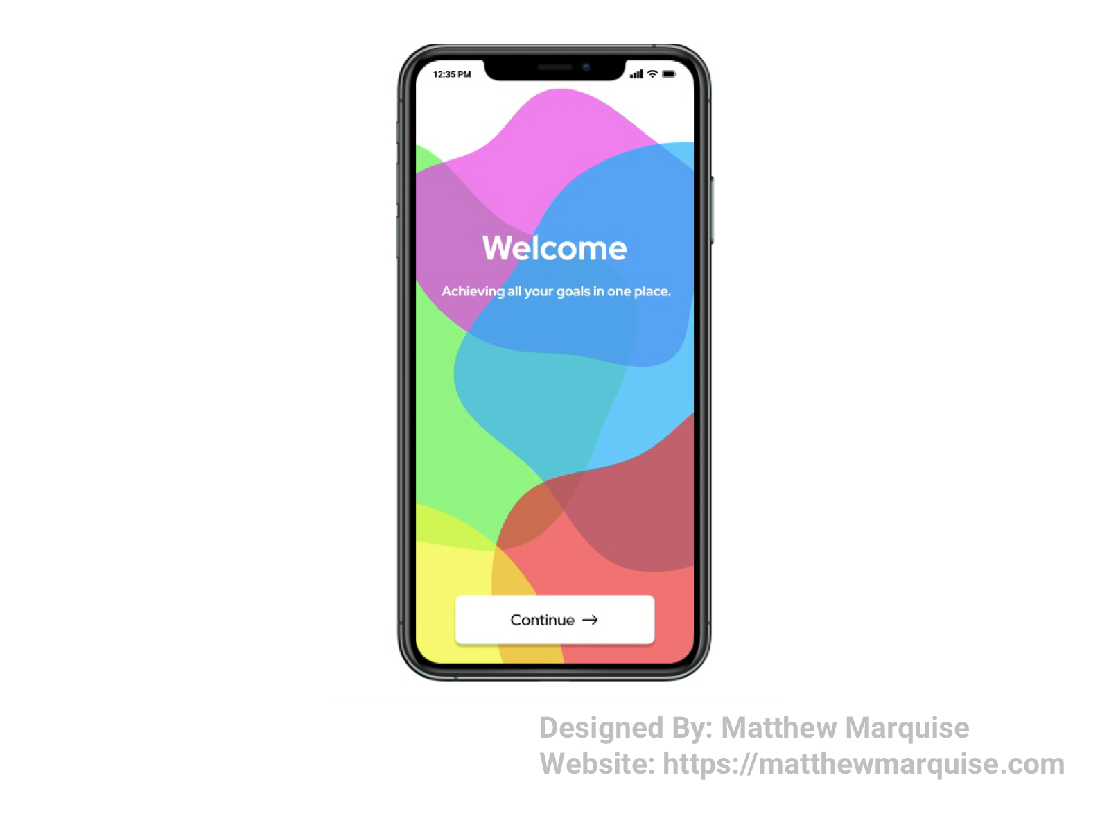
Daily UI 093 :: Splash Screen
Deisgn Notes:
This splash screen is filled with various colorful shapes welcoming the user into the experience. With a concise tagline that represents the mobile app's purpose, allows a user to feel excited about using the app.
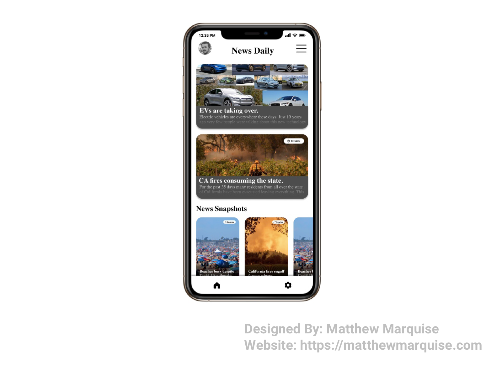
Daily UI 094 :: News
Deisgn Notes:
This mobile news app is very minimal and user focused, giving users immediate access to all the news the desire to read. With a simple white and black color scheme, each news story and snapshot is clearly defined and stands out, grabbing a users attention.
Daily UI 095 :: Product Tour
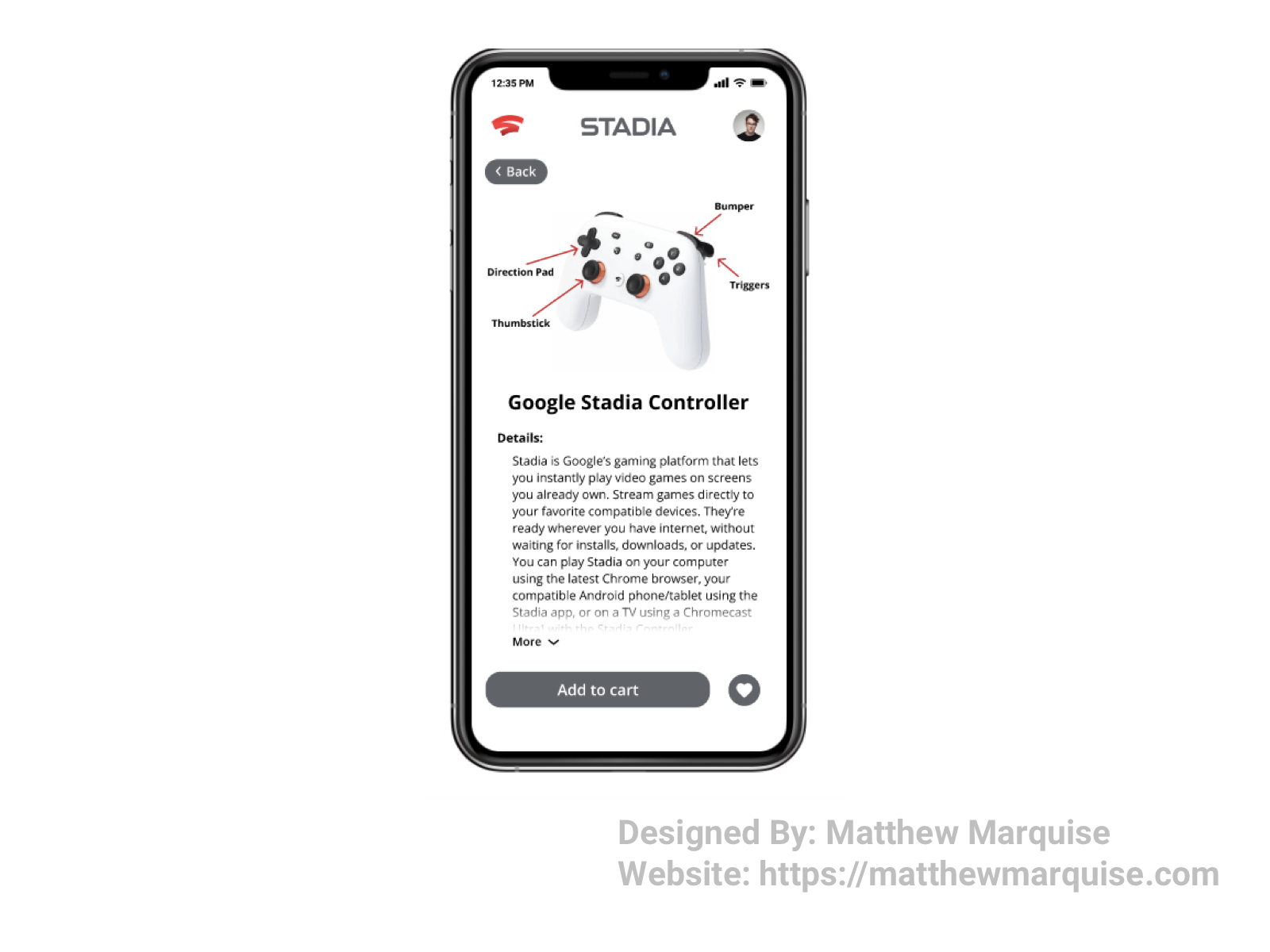
Deisgn Notes:
This product tour is for Google's Stadia controller, describing the most important components, their use cases, and other details about the gaming platform. This screen's design is minimal and uses a white, gray, black, and red color scheme along with straightforward icons and buttons.
Daily UI 096 :: Currently In-Stock
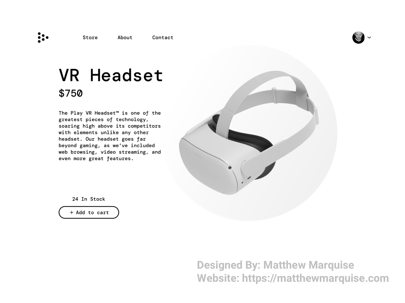
Deisgn Notes:
This product page not only details the selected product to the user, but it also informs them wether the item is in stock and the quantity available, if any, to purchase . Using text hierarchy, a minimal white, gray, and black color scheme, and modern, stylish buttons, a user is sure to enjoy the visual design of this screen and obtain all the information they need to know about the selected product.
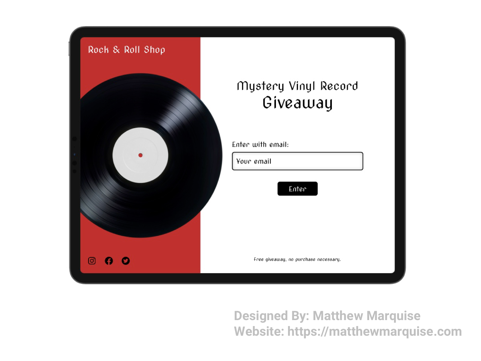
Daily UI 097 :: Giveaway
Deisgn Notes:
This giveaway screen on a website enables users to effortlessly enter a giveaway by inputing their email address and entering. Telling the user what they'll win, clearly showing them how to enter, and explaining any other important information in a concise way is very important.
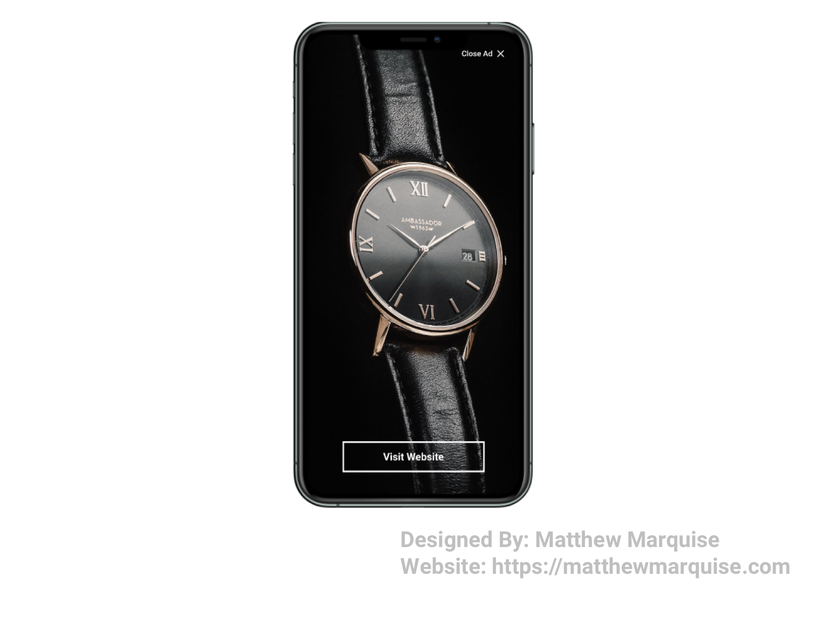
Daily UI 098 :: Advertisement
Deisgn Notes:
This advertisement is very modern and minimal. with an image that clearly shows the advertised product. At the bottom of the screen is a button with concise text explaining the link destination.
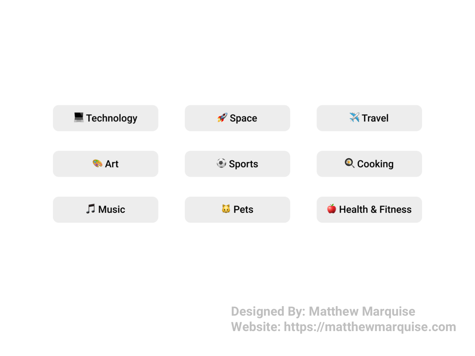
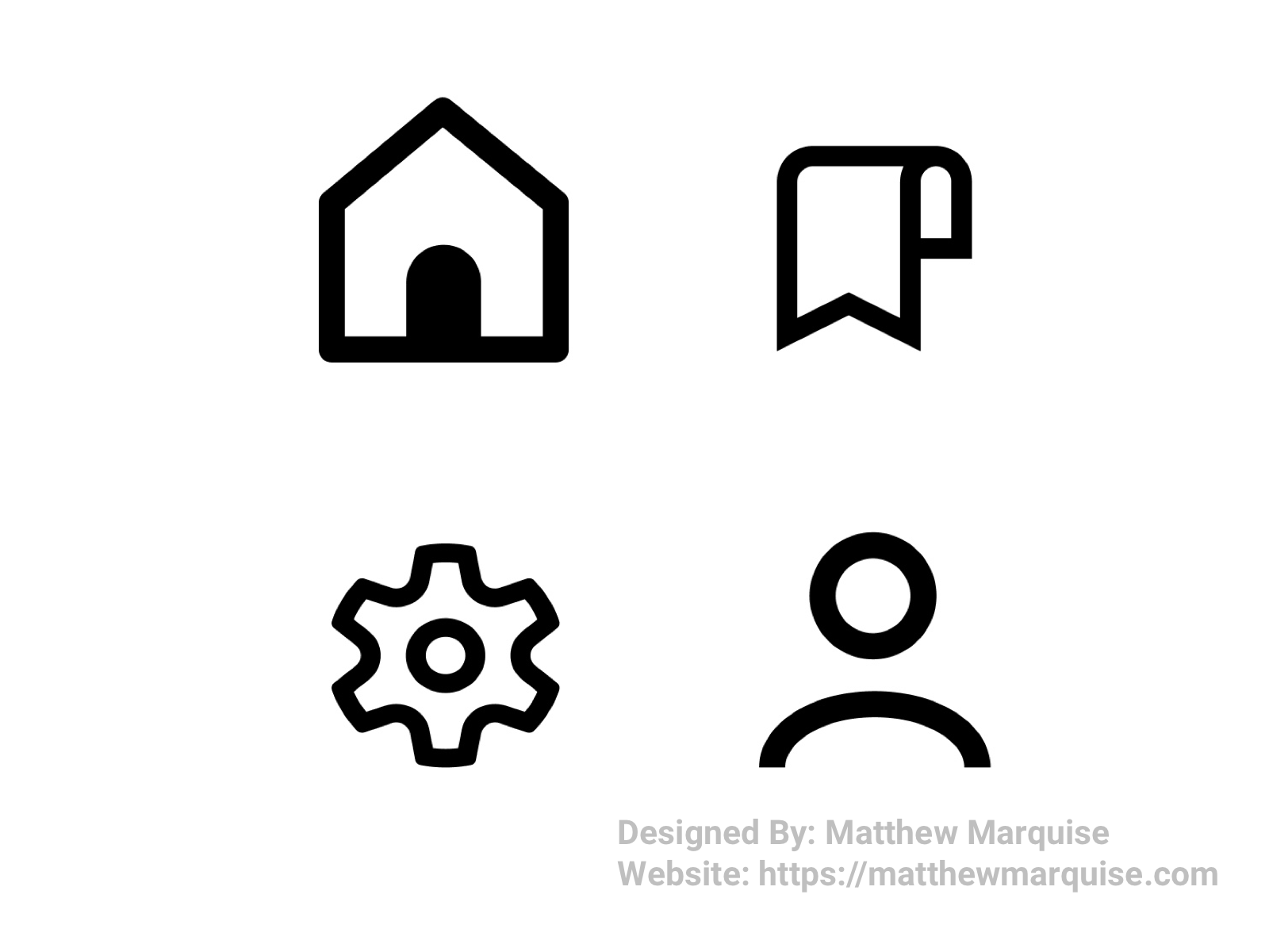
Daily UI 099 :: Categories
Deisgn Notes:
These are filters based on categories or topics a user might be interested in. The simple use of emojis as icons, and a medium font size can be helpful in understanding what each topic covers.
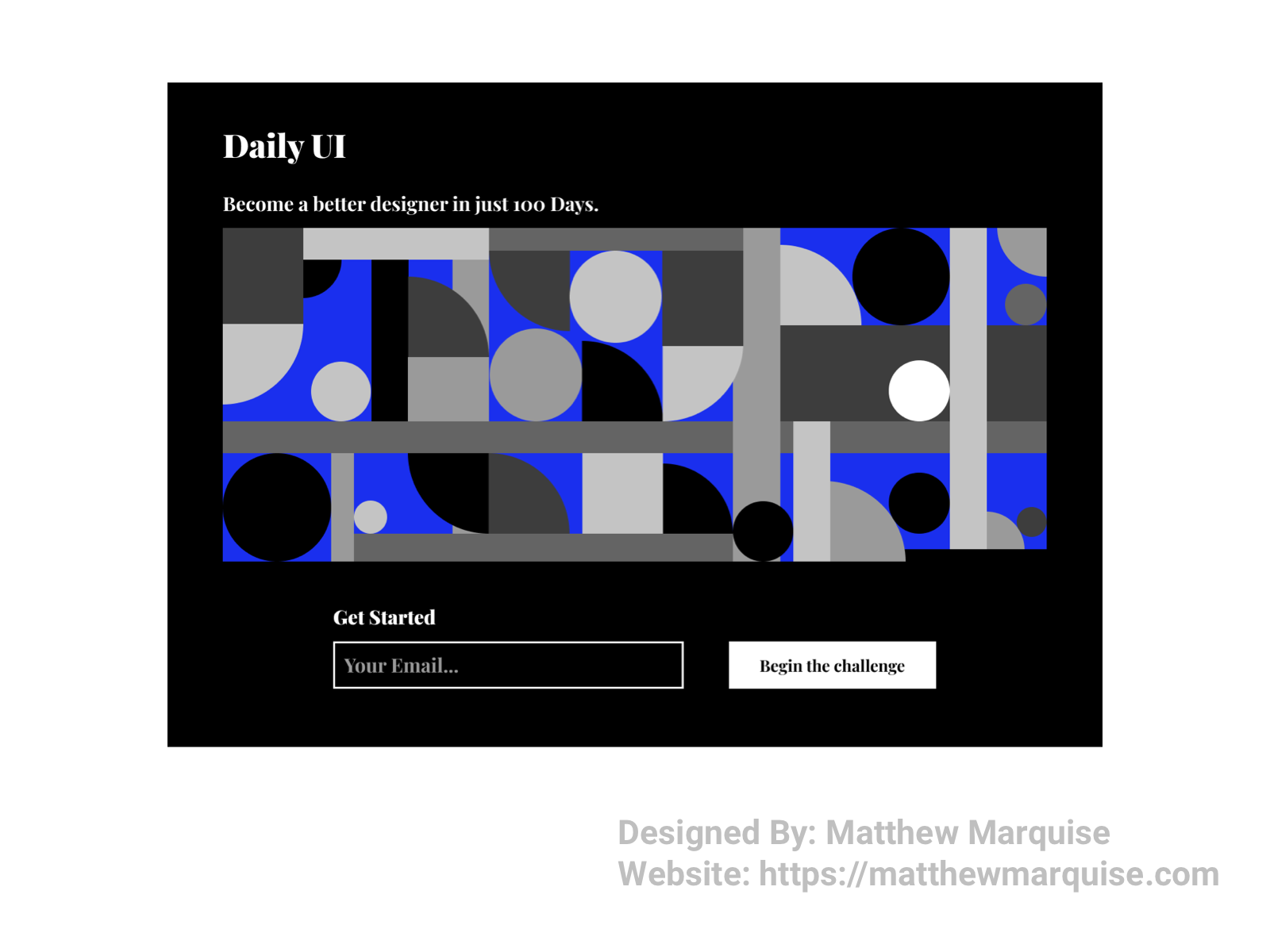
Daily UI 100 :: Redesign Daily UI Landing Page
Deisgn Notes:
For the final Daily UI challenge, the task was to redesign Daily UI's landing page. I wanted to go with a modern, minimalistic design that encompasses their brand and also makes it easy for users, who desire to take on the 100 day design challenge, to begin.
Explore all 100 designs on Bēhance and Dribbble and consider following to stay updated on any new projects...
Explore My UI/UX Designs on Bēhance
Explore My UI/UX Designs on Dribbble
- Front-End Development:
- - Html
- - CSS
- - JS
- - Laravel
- - Experience using Squarespace, Shopify, and Wix Editor
- - Responsive Web Design
- - Rapid Bug Fixes
- UX Design:
- - Research
- - Writing
- - Wireframing
- - Design
- - Prototyping
- - User Centered Research, Design, Testing
- - Experience using Figma & Adobe Xd
- Marketing:
- - Social Ad Campaigns
- - Mailchimp Campaigns
- - Photography
- - Graphic Designs
- Other:
- - Music Producing / Songwriting
- - Digital Photography & Cinematography
- - Digital Designs For CNC Machines
- - Hardcore Tennis Player
Freelance / July - December 2021
Tasked with designing and developing a modern, minimalistic website for Island Property, a real estate and vacation rental agency serving Islesboro, Maine. Using Wix’s advanced editor and database management tools, I iterated on vdesigning the user interface, researching, and developing the website keeping usability in mind.
Part-Time / 2020 - Present
Selected to lead the sales marketing & customer experience (CX) for CQC, utilizing and increasing my knowledge of Mailchimp email campaigns and website development/maintenance with Shopify and Squarespace sites and DNS and CDN management. Enhanced their online presence by scaling social media presence and conducting SEO keyword research by analyzing the target audience.
Part-Time / Dec 2020 - Apr 2021
Designed & developed a modern, user focused website while using graphic design skills to create high quality advertisements used in various marketing campaigns across their social media profiles.
Google - UX Design Specialization Certification
Google Digital Garage - Fundamentals of Digital Marketing
HubSpot - Content Marketing
Goldsmith's, University of London - Mathematics for Computer Science
Harvard CS50 - Introduction to Computer Science
Achievements
Daily UI 100 Day Design Challenge
Hacktoberfest 2021 PR Challenge
Hacktoberfest 2020 PR Challenge
This site is powered by pure HTML, CSS & JS.